We may earn revenue from the products available on this page and participate in affiliate programs.
“As anyone with small kids already understands: Everything is everywhere,” says Robin Heller, one half of the Baltimore-based interiors firm Surrounded by Color. So when local clients Samantha Williamson and Robert Travieso came to Heller and her partner, Jen Levy, with an aim to overhaul their upstairs quarters and add a new room off the kitchen, the designers knew the brief included camouflaging the happy chaos of everyday family life, too.

The couple, who has two young sons, wanted a zen feeling, explains Heller: “But they also love art and color, and they didn’t want anything boring.” So the SBC duo got to work on a plan to make over three bedrooms, update the primary bath, relocate the laundry room, and build a smallish but mighty addition from the ground up—all the while incorporating their signature use of saturated hues, inventive patterns, and textural touches.
The final result? A layered home that balances vintage accents and contemporary comfort—and also gives the family of four plenty of room to grow. “Every time we go over there, there’s a new lizard,” says Levy, laughing. “They’re really living in all these rooms.” Here, the two designers share how they pulled it all together.
Keep the Kiddos Happy—And Create Coziness


The concept for the children’s bedrooms was straightforward: Make them memorable and cozy. “We went hard in terms of patterns, fabrics, and wallpaper. At this age, kids are creating these visual memories that give a frame of reference for design, which is so cool,” says Heller. The boys, who shared a room during the months-long reno, chose the finishing touches for their bedrooms. They outfitted each one with a reading chair, storage shelves, and a plush rug on top of cream wall-to-wall carpeting. “Wrapping a room conveys this feeling of safety and coziness, like being in a little tent,” she adds.
Less (Square Footage) Is More

The couple wanted to keep their king-size Blu Dot bed—a challenge in a space with a modest footprint that was about to get slightly smaller. Levy and Heller commissioned utilitarian boxes from a local millworker to extend the depth and width of the headboard, fitting them with sleek reading lights and hidden outlets.


Heller and Levy chose a deep jewel-toned blue paint to create a sense of serenity and separation from the rest of the house. “The ceilings, the walls, the doors—everything—there’s no touch of white or unpainted surface,” explains Levy. “[The monochrome look] makes everything feel softer.”
When the rooms were being reframed, the pair willingly relinquished a few square feet to the bathroom and laundry zone—which took a lounge chair option out of the bedroom layout. Heller insists this is for the best: “Everyone has their own way and style of using a lounge chair in a bedroom—but most people just throw clothes on it. We wanted to help them proactively not have that experience. There really is no room for clutter.”
Turn Utilitarian Spaces Into Design Moments

The closet and the bathroom were both gutted and reframed, allowing the addition of a dedicated laundry room upstairs. “We are both laundry shirkers,” says Williamson. Moving the machines and building out a folding area has already made a major difference, thanks both to the convenience factor and because the design of the space improves the overall experience.
Sliding doors and a preexisting skylight (which extends into the bathroom) creates an airiness when you’re inside. “We can also close it off to hide big piles,” says Williamson. Levy and Heller took a very specific inspiration for the palette. “It felt very Barragán and Mexico City vibes, so we started with Backdrop’s Barragán Cito pink,” says Heller. The ceiling got a teal blue treatment, and Formica countertops in Earthenware complete the effect.

For the bathroom, Heller and Levy drew inspiration from the rest of the house, the couple’s art collection, and their affinity for mid-century modern aesthetics. They developed the shower wall pattern with the grout in mind, and specified wider lines than typical tile jobs. It raised some eyebrows on-site—but, in the end, turned out exactly as they’d intended.


“What makes something special is that it’s unexpected and different,” says Levy. “And in the end, everyone comes back and they’re like: ‘Oh, my God, you were right.’” And that wide picture window in the shower, looking out onto the woodsy backyard? It’s become a beloved part of the bathing experience. “It’s clear, which is potentially awkward,” says Travieso. “But it fogs up pretty fast.”
Neutralizing ‘New Build’ Vibes With Texture and Vintage

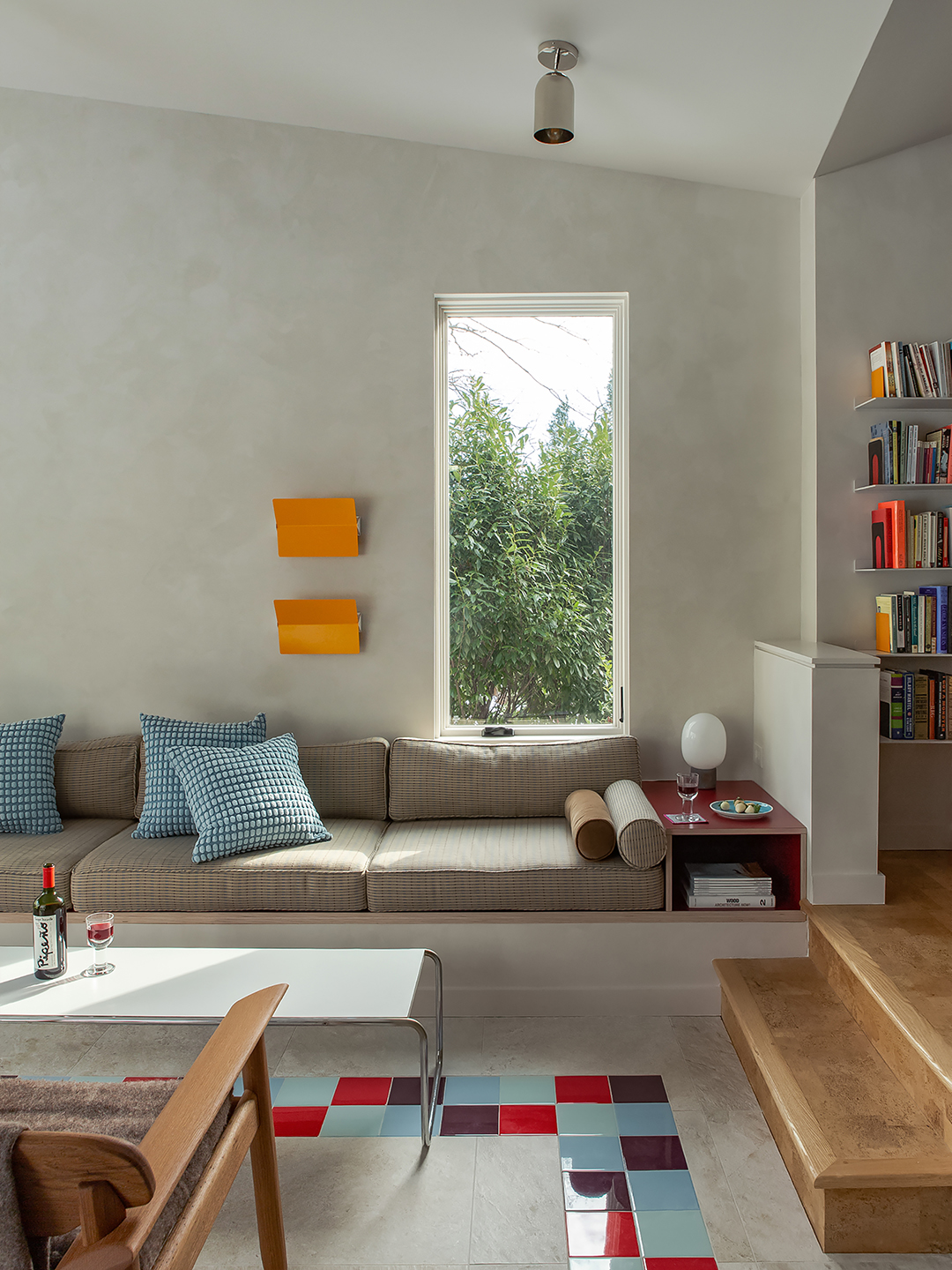
Local architecture studio Ziger/Snead stepped in to develop plans for the addition. “In that space specifically, we felt strongly that wood belonged in the mix, and we wanted different levels of texture in the room,” says Heller. “It has these beautiful faux plaster walls, big windows, the tile floor—if you took all the soft materials out of it, it could look very ’90s or very new and slick. So our furniture selections make it feel cozy and timeless.”
Most of the larger pieces were made by local craftspeople, including the white oak round table, lounger, and built-in plywood sofa. Other pieces are vintage: a coffee table that dates to the ’70s; a pair of orange Charlotte Perriand wall lights; and the Bruno Rey chairs, an iconic 1971 Swiss design currently being sold at DWR. Then there is the white electric Malm fireplace, requested by the client. (“It’s basically just a beautiful space heater,” says Heller.)


The homeowners refer to the new room as a refuge for everyone—overall, it’s Travieso’s favorite aspect of the renovation. “It’s a place where the kids can get some space from us or lay on the couch and read together while we do dishes or whatever,” he says, “But it’s also a place where we can get some space from them or hang out with other people we’ve invited over.” In other words, everyone wins.
