We may earn revenue from the products available on this page and participate in affiliate programs.
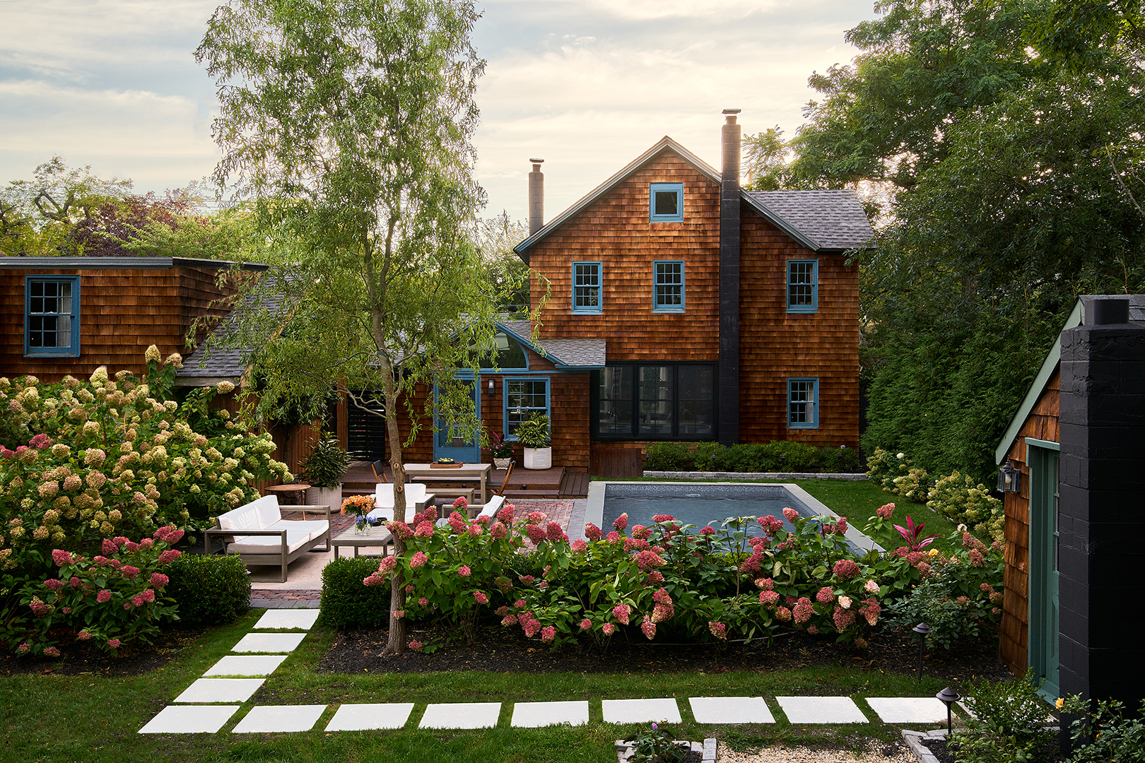
“Everyone was like, ‘Oh, you need to replace that,’” says Paul de Andrade, founder and principal designer of Studio Kestrel, of the exterior of his 1800s home in Brookhaven, New York. Instead, he ignored the outside voices and painstakingly restored the cedar shake to its former glory. “It was a super labor of love,” he says. But worth it: The wood pieces offered serious curb appeal, plus de Andrade trusted the original detail.


In general, keeping true to the 170-year-old home’s original intention was his vibe as he remodeled it—no DIY proved too tough to take on. “When I saw the house for the first time, it was like walking through a crazy treasure trove of anomalies,” he says. “Past the pool was a koi pond that had completely grown over. A bit farther was a little cottage that had this wild dollhouse inside.”
Still, de Andrade isn’t afraid of a project. The day the sale went through in 2016, he brought a mattress to the property and set up a sleep space in an upstairs bedroom. Then he got to work on making the home his. The roof of the living space was too short for the 6-foot-5 designer, and water-damaged floors meant living around joists for a not-so-insignificant amount of time. Not to mention there was an entire bedroom that was packed with hand-carved duck decoys left behind by the previous owner.


As he marked off projects on his renovation list, de Andrade made sure the home reflected his intent to live a happy life—something his late mother, who passed away just after he bought the property, had hoped for him. “She had terminal cancer, and the only thing she wanted was for me to be settled,” he says. “The house was this albatross that people were like, ‘What would you even do with this? There’s so much work,’” he says. Still, he knew it was the one.
Raising the Roof (Er, Ceiling)


While de Andrade worked his magic on the interiors—finding the perfect moody shade of paint for the dining area (Behr’s Pavement Gray), strategically placing mirrors to bounce light around the space, and sourcing art—he relied on the house’s original frame to pull everything together. “Architecturally, I wanted to hold onto something,” he says.
After pulling up the Sheetrock in the living space and finding massive beams, he ran into a mystery. “You could tell that the beams were over 150 years old because they were super-rough and splintery. I thought, this is so weird; how did they do that? And I found this huge, two-person saw on the property and realized that they probably used that to saw the timbers.” A coat of white paint later and they’re good as new.
The Pool, Part 2


It’s hard to name the biggest transformation in de Andrade’s project, but the pool is very high on the list. “I walked out the back door and there was a derelict pool with trees growing out of it—I was like, that’s going to be a pool again soon,” he says. The previous owner had built it for his wife who had multiple sclerosis, so she could exercise in it, so de Andrade didn’t want to alter that story too much—still it needed an update (in the form of tile) and landscaping, which he added by bringing in a perennial mix of flowers. “The blooms go season by season—as one starts to fade, another part starts to bloom,” he says. “There’s always something blooming.”
Death Becomes Him

A clear sign that you’ve bought an old house? The graveyard in the back, some tombstones dating back to the 1700s. “You’re wandering around and suddenly you see gravestones, but they had been toppled over and collapsed,” he says. Once again, he paid homage to the property’s history: “I righted all the tombstones and refurbished them—I created a spotless landscape for them.”
It’s Never Really Over


To anyone else, the home would be considered complete—but for de Andrade, there’s (probably) more change coming. “It’s just a constant evolution,” he says. “It really gives me an opportunity to test out stuff that I think is interesting that clients might not immediately go for. I call it my experiment chamber because I’ll do stuff and try it, and maybe it works, but maybe it doesn’t. Then I’ll tear it out and do something else.”
