We may earn revenue from the products available on this page and participate in affiliate programs.
One perk of moving back to your hometown is that there is a good chance you may know the person who sells you your house. Angela and Charlie, two creatives who recently moved from Chicago to the suburban area of La Grange Park, Illinois, were lucky enough to reap the benefits of returning to Charlie’s roots. The home they ended up purchasing near a forest preserve belonged to the parents of one of his high school friends, so they got the inside scoop on the place right off the bat: At one point, the property was a barn with a cellar and was added onto a few times to become a bungalow with a quirky triangular sunroom. Understanding what was original and what wasn’t helped inform their own renovation. “There was some structural gymnastics that went on,” says Ellen Whitehead, the couple’s architect and founder of DEW Design Co. “But we tried to keep a few of the really cool elements, like the hardwood floors in the dining area that have visible [peg] details.”

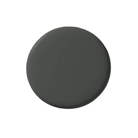
Whitehead worked with the pair’s contractor, Arto Interiors Inc., to make sense of the home’s quirky layout. They opened up the walls between the kitchen and the entry, and, after installing a huge steel beam, did the same between the kitchen and the dining room, leaving space for a banquette with a superdark bench painted in Sherwin-Williams’s Rock Bottom to match the trim work.


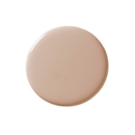
From there, the focus for Charlie and Angela was leaving their personal stamp on the space, like by wrapping the stairwell in a scenic wallpaper by Coordonne, which is a nod to Angela’s Chinese heritage, and swathing the walls around it in playful Pinky Beige from Sherwin-Williams. Ahead, the architect takes us behind the scenes of the Technicolor transformation.
The Two-Tone Green Bathroom

Upstairs, the main bath was smooshed next to a very small office, so Whitehead combined the spaces to make an en suite with a roomy shower. The couple was unable to decide between a dark or light green tile for the space, so Whitehead proposed a new route: Why not both? The windowsill served as the natural dividing line between the two shades. To make up for splurging on the wall tile from WOW’s Bejmat collection (the hues are Lake Gloss and Olive Gloss) and custom vanity, she went with more affordable flooring from Daltile. The classic hex pattern complements the bespoke glass partitions that are lined with screen-printed grilles that only look like steel.
The Cool Blue Entry


Previously, there was no designated foyer. Once you stepped through the front door, you found yourself standing in a wide-open family room. Whitehead blocked off the area by putting up a wall and carving out a mini drop-off zone painted a soft gray-blue dubbed Storm Cloud—a lighter version of the dark blue mudroom elsewhere. The millwork is complete with coat hooks and, most important, a cabinet with rattan doors that allows shoes and other outerwear to air out of sight.
The Sunshine Yellow Kitchen


Going with IKEA kitchen cabinet frames and paintable Semihandmade doors was all in the name of customization. The flat slab fronts are dipped in Sherwin-Williams’s Yarrow, a yellow shade, and the wood hardware from Nice Knobs is stained the exact hue as the superdark butcher block counters from Home Depot. Because Angela is a passionate cook, the couple decided to allocate the bulk of their budget to a farmhouse sink and stainless steel appliances.
The Streamlined White Living Room

The rear-facing living room previously had a “scary glow” to it, mostly in part to the dark red brick fireplace and sad ceiling fan light. Whitehead brightened it up instantly with Alabaster by Sherwin-Williams and a funky green chandelier by Currey and Company that reflects sunshine in all directions. Like each of the glass shades that had to be painstakingly reattached to the chandelier after it was delivered, this suburban home’s makeover is a compilation of bright ideas.


