We may earn revenue from the products available on this page and participate in affiliate programs.
When the design task includes completely demolishing a detached garage and transforming it into a cozy hideaway for you and your guests—well, you couldn’t be working with two more opposite vibes. And that was exactly what Atlanta-based designer Jessica Davis faced in the second phase of her home renovation. “It was something that I had been considering since we completed the main home renovation,” she says. “I knew we would do it eventually, which is why I didn’t put any windows in the kitchen. The day came sooner than I thought it would, though, because of COVID, when I realized we really needed a true guest space that wasn’t doubling as an office.”
After taking down the garage and building out the new wing—which includes a laundry room, storage, and a powder room; kitchenette; snug; guest bath; guest room; mudroom; and studio space—the mid-century property gained 1,500 square feet of space. Here’s how Davis made it happen.
Mimic But Don’t Match


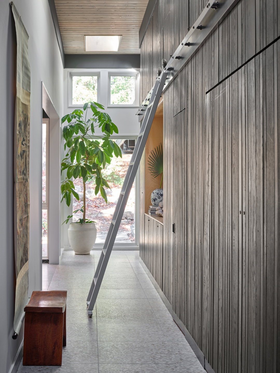
In general, the corridor leading from the main house’s kitchen and dining area into the new guest area is one of the hardest-working spaces we’ve seen in a while. “I wanted to echo the magnolia paneling of the existing home, but knowing I couldn’t match it exactly, I decided to do a wall of V-groove paneling in a black stain that ties back to [it],” says Davis. “It’s a nice nod and really adds great texture while hiding the doors to the various utility spaces.” Speaking of…
Hide the Laundry (and Powder!) Room

Nestled behind those grooved walls? A washer and dryer. The doors themselves open up and slide into the nook to create an open workspace. A splash of floral wallpaper from Spoonflower provides a rush of energy. And adding a sink made treating stains even easier.

“I love that the laundry and powder rooms are hidden in a paneled wall that is otherwise only punctuated by the plywood niches—one of which functions as a buffet and the other as a command center where we charge our phones, have our calendar, and all of the other junk that collects in family life,” says Davis. “Don’t be afraid to gang together different functions and think of them being unified by something like paneling or a common architectural language.”
Think Vertically
One of the biggest benefits of the corridor space is how tall it is—but it did provide an obstacle for reaching items at the very top of its height. “We got a library ladder from Rustica for the long hallway,” Davis says. “There isn’t enough space for the ladder to live there permanently, as it sticks out quite a bit, but ladders that retract are really pricey. My solution was to have the ladder roll off the tracks and hang on two hooks around the corner and out of the way…which also prevents the kiddos from pulling an Elsa library ladder stunt.”
Get Snuggly

Many of the spaces through the property are big and open. To provide a bit of balance, Davis dedicated space for a snug, a small, intimate area to relax in among cozy furniture. “The custom sectional is superloungy and soft, and everything is considered for a moody, warm TV-watching or reading space,” she says.
Take It to the Roof


In addition to creating a cozy interior space, the second half of the renovation also brought a roof deck and garden into the picture. Davis opted for a flooring system by Bison, which sits on top of the roof without puncturing or damaging the structure. She ran irrigation between the roof tiles (which are leveled off with pucks) and the sloped roof (drainage!) to support the many planters peppering the space. “We are growing various seasonal veggies up in the raised planters,” Davis says. “I can’t wait to take advantage of this in the spring and have client meetings outside.”
Create Continuity

Davis was choosy in curating matching moments in the new wing, opting for details like the terrazzo and cork flooring that can be seen throughout both sections of the property. “It was important to me that we tie into the existing architecture of the home so we reflected a lot of the elements that were already there,” she says. “We matched the tongue-and-groove ceiling, dark green and black beams, extended jamb window and door details, and terrazzo and cork flooring that we had done in the first phase of the renovation.” The details come together to sweetly remind guests they’re sharing a much-loved home, despite their delightfully private digs.
