We may earn revenue from the products available on this page and participate in affiliate programs.
A block from the beach and another from town, this retro motel just underwent a refresh that’ll make you want to book a ticket to Montauk (even in the off-season!) just to steal some ideas for your own home. Daunt’s Albatross Motel has been owned by three generations of the same family, who charismatically named it, and, until recently, the ’70s decor—seaside kitsch meets groovy wood paneling—showed it.

The goal for Leo Daunt, current owner and grandson of the O.G. Daunts, was to elevate the 24-room Long Island escape from motel to boutique hotel, while making sure “it still felt like Daunt’s” to his longtime regulars.
And it was a project with auspicious beginnings for designer Oliver Haslegrave, founder of Brooklyn-based Home Studios, when he met Leo and their dogs became besties on the spot.

Led by Leo’s longtime love for the area’s natural beauty paired with his city sensibilities, Haslegrave strove to toe the line between nostalgic and new, bringing all the materiality and “detail obsessiveness” to Montauk that he’s brought to decades’ worth of cool indie Brooklyn projects. “You go out there, and the landscape and environment are so great,” says Haslegrave. “Complement it with good materials and good ideas, and you create this comfortable, laid-back experience that has folks ready to relax.”

Here, Haslegrave shares how he spun up an update that’s at once attainable and aspirational—like your home away from home, only better.
Dream a Little Dream


Maybe you have the ability to change absolutely everything you want—or maybe you don’t. “When starting a reno, close your eyes and daydream,” says Haslegrave. “What are you thinking about or excited to see? This is where we start and these are the priorities we try to make happen.”

For him, that meant padding across the floor at Daunt’s and noticing the tactile feel of flagstone underfoot. And the wood—a mix of alder and pine that clads the pool chaises, kitchenette shelving, ceilings, and more—remains unstained and only lightly finished. “We always return to real materials,” says Haslegrave. “We like choosing materials that the client can experience in their natural form—not as a building material. We want to let a material just be what it is.”
Inspired by the graphic minimalism of artist Donald Judd’s famed installations, Haslegrave had select pieces—from beds to armoires—custom-made. “Using good wood in simple shapes is really achievable for any would-be renovator,” he says. “Even if you don’t have an unlimited budget.”
Get Detailed


Haslegrave believes that the more care you take with custom detail, the more your guests will “feel the owner’s generosity of spirit,” as he puts it. “When there’s an intentionality to the harmony of the design, your guests immediately feel like they’re going to be well taken care of.” At Daunt’s this meant pops of ceiling color (the green is Benjamin Moore’s Land of Liberty), whimsical updates (like a green towel rack from Shelfology), and painted claw-foot tubs.

He also wanted to make more space where there wasn’t any. “Hotel bathrooms are very small!” Haslegrave says. “You never have enough room.” But tiny spaces make fertile playgrounds for clever ideas. His take: “Design what’s essential and make it interesting.” You can do this by combining functions (towel hooks playfully built into window casings from The Little Oak Company) and maximizing a sense of space (the new glass walls of a walk-in shower let the mod green tile from Town & Country Surfaces show through).

Rethink “Art”


Sure, you could place a painting or photo above a bed, or instead you might, as Haslegrave did, hang a swath of fabric or textile. Here, shibori doubles as art and headboard and lends a tactile moment to the room, which calls to the greens and blues of the ocean outside. “It also adds a bit of softness to the space,” he says.
Create Contrast


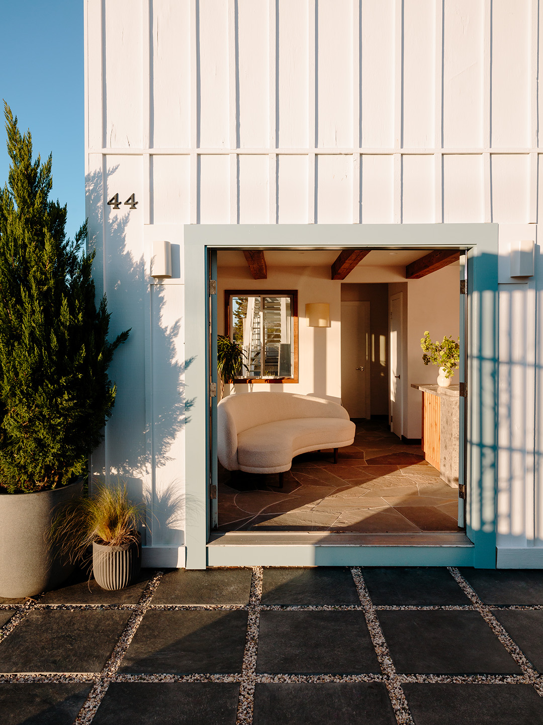
When it came to the exteriors, first came a fresh coat of paint, then the landscaping. “The building had been painted white in a previous refresh and we liked the white as a contrast to all of the beachy browns, grays, blues, and greens in the landscape and throughout the design,” says Haslegrave. “So we kept it white, but chose Benjamin Moore’s Chantilly Lace for its slight undertone of warmth and fresh crispness.” While he could have trucked in some gravel and called it a day, “the graphic quality of gravel lines between a grid of square paver tile adds a modern element that plays well with the existing building facade and layout,” says Haslegrave.
