We may earn revenue from the products available on this page and participate in affiliate programs.
Shortly after moving to Portland, Oregon, in 2014, Karie Higgins and her husband, Lee Gibson, started feeling a little homesick. They missed their native New Zealand and all the splendors that come with countryside living: roasting s’mores, skipping rocks, napping in a hammock. So over the course of two years, they searched (and searched) for a weekend getaway. Eventually, within a two-hour-drive radius, they found a little mid-century cabin on the Wilson River in need of TLC.

To be able to afford any of the changes they’d want to make, the creative couple (she recently launched her interiors studio and decor shop; he’s a footwear designer for Nike) knew they needed to list the place on Airbnb in between their visits to help fund the renovations. The fact that they have strangers frequently staying in the house has never hindered Higgins’s plans, though. She went ahead and splurged on pricey marble countertops, and it doesn’t stress her out one bit. “We want to create as beautiful a space as possible for our enjoyment,” she shares. “And honestly, the people who stay in our home are really amazing. We’ve never had any issues.” Ahead, she reveals how they streamlined their once-rustic cabin kitchen and made it a place everyone—themselves included—wants to be.
Slap a Band-Aid on It While You Save


To appease her budget (and her eyeballs), Higgins made a few simple cosmetic updates to the kitchen off the bat. While she didn’t love the dark granite counters, she kept them for the time being and decided to brighten the space by removing the dark wood upper cabinets and mounting floating shelves in their place. Like the counters, all the appliances were seemingly new and running just fine, so they hung onto those temporarily, too. In the corner, overlooking the river, Gibson built a dining banquette out of birch plywood to maximize the views.
Ditch the Fridge


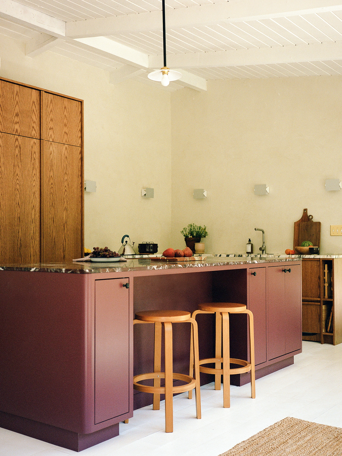
Then more recently, they gutted the space. And in the process, they gave up their French-door refrigerator altogether. With this being a weekend house that only gets used two to three days at a time, Higgins knew they didn’t need a massive freestanding fridge. To create a more seamless look, she expanded the island so they could fit a cooling drawer by Fisher & Paykel along with a Sub-Zero mini fridge and freezer with an ice maker—all tucked underneath the countertop. “It’s quite deceptive,” says Higgins. “You can get tall bottles of wine and milk in there.” On the other side of the island, she added tall cabinets that can hold both extra serveware and surplus groceries.
Lose a Window, Gain Some Sconces

Her other controversial decision? Covering up the vinyl window over the sink that looked out onto the breezeway. “We have so many windows that face the water—this one looks onto a black wall. It felt almost like a TV,” she shares.
Cabins are all about cozy design, but rather than clad the walls in pine, Higgins swathed them in a Venetian plaster treatment that is color-matched to Farrow & Ball’s Schoolhouse White. Against the creamy beige backdrop, she hung Charlotte Perriand sconces.
Mix Your Marbles

A longtime fan of furniture with mixed marbles, Higgins ripped out the sad granite counters and replaced them with a combination of Rosso Levanto and Calacatta Viola. The two-tone effect made the pared-back kitchen appear that much more dynamic. And even though doing the perimeter of the room in the Calacatta Viola was a significant splurge, because it’s still a small kitchen, they were able to justify the pricey stone. Plus they dedicated two offcuts to the pantry’s interior.
“That pantry had to be really special,” notes Higgins. The stained white oak doors are set on pocket hinges that allow you to tuck them inside the box, fully exposing the breakfast bar. The niche is intended for beautiful things only—no ugly stainless steel microwave allowed.


