We may earn revenue from the products available on this page and participate in affiliate programs.
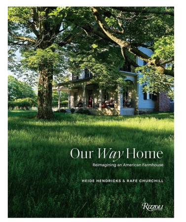
Heide Hendricks and Rafe Churchill spent 15 years preparing for the biggest renovation of their career (at least, the biggest so far). It was back in 2003 that the partners, in both life and business (together they run the design-build firm Hendricks Churchill), first laid eyes on Ellsworth, an 1871 farmhouse in Litchfield County, Connecticut. It had originally been a working dairy farm with multiple barns on the property, and the owner at the time had lived there for 50 years. Despite its state of disrepair, the couple would drive by the property frequently and dream of it one day being theirs. In the meantime, they lived through three major home renovations, raised two kids, and worked on a range of projects for clients, both locally and in New York City. So when Ellsworth came up for sale in 2018 and the couple decided to buy it, they were unfazed by all that needed to be done—they saw it as their family’s forever home. The pair’s debut book with Rizzoli, Our Way Home: Reimagining an American Farmhouse, is dedicated to their long-awaited restoration. Steal a glimpse inside with this excerpt on their kitchen transformation.
The Kitchen

Rafe Churchill: Although we approached the interior renovation conservatively, with a desire to retain the plaster walls and existing trim, we did need to fully gut the kitchen and bathrooms. A kitchen renovation requires all of the trades and eventually becomes the most invasive scope of work for a single room. In the end, we kept the existing heart pine floors; everything else was removed and replaced with new items.

Once the mechanical systems were complete and walls insulated and eventually sheathed, it was a pleasure to watch the room transform from what was considered by most to be a terrifying mess. The custom Statuarietto marble sink really demands attention and prompts our guests to ask why it’s so big. Having done a similar sink for a client’s farmhouse, it was clear we needed to have our own. Heide’s desire to hang our new Falk copper pots on the wall was a move both practical and beautiful. Concerned about the potential clutter, I did push back a bit, but mostly I didn’t want to damage the newly plastered walls. Eventually, we settled on beadboard paneling for two of the walls.

Heide Hendricks: In the kitchen, my focus was on finishes and lighting. One of my approaches is to establish a recurring palette of colors throughout the house. I especially like to carry at least one or two colors from one room to the next. Here, Farrow & Ball’s Dead Salmon on the island is a nod to the Setting Plaster pink in the den just down the hall. The gloss finish helps bounce the light around the room. De Nimes blue, also from Farrow & Ball, on the cabinets and beadboard is used in the adjacent pantry as well, demarcating utilitarian functions in the house.


I challenged a convention by picking blue, knowing it is not recommended as a kitchen or dining room color since it is said to be an appetite suppressant. In fact, we came to admit that the space always felt cold and a little too utilitarian. We didn’t even seem to linger longer than getting our work done or our meals made. Even so, I wasn’t ready to give up the pretty shade of blue—especially the way it worked with the Original BTC pendant lights and Heide Martin’s stools—so instead we opted to install Soane’s Dianthus Chintz wallpaper on the small areas of white plaster in the room. Its delicate floral block print warms up the entire kitchen, enveloping you in a fresh, summery vibe.
The Pantry
Churchill: The previous owners used this space as a laundry room, but because of its proximity to the back terrace, we wanted the walk-through to be a bit more special. We needed a pantry that would maximize storage while conveniently concealing the actual use of the space.
Originally, we had planned for floor-to-ceiling cupboards, but that didn’t work with our budget. Instead we opted to build out three closets with open shelving behind closed doors. As a simple flourish (that also adds a bit of natural ventilation), we cut out a decorative motif in each door. Following the precedent of the kitchen walls and giving the pantry a more connected feel, we continued the beadboard throughout to define the spaces being utilitarian. The tombstone glass door that leads to the back terrace was relocated from the dining room. It had been used as an exterior door to the front porch. As in most of the house, the pine floors were repaired and sanded to expose the fresh tone of old-growth Eastern white pine.
Hendricks: We first painted this room in Farrow & Ball’s Borrowed Light, a lighter version of the kitchen’s blue tone, and intended to bring a fresh, clean feeling to the pantry. Or so I thought. Rafe disliked the shade, which always felt too cool and quiet to him. I didn’t want to spend the time and money repainting, but really I still loved the color. So one morning over coffee, we came up with a compromise. We would bring the darker shade of De Nimes from the kitchen and run it up the Borrowed Light wall to look like a waterline. Problem solved, marriage saved!
It also sets the stage for the artwork on the wall, including the Colleen McGuire painting of our last house and a steamship painting by Duncan Hannah. Off the pantry, you can see the little powder room with its chestnut wallpaper by Marthe Armitage. We love Waterworks and used its porcelain Alden pedestal sink and clean-lined Henry faucet (also seen in the kitchen). Rafe designed the built-in cupboard to make paper goods and cleaning supplies accessible, denying us any excuse for not cleaning up.
