We may earn revenue from the products available on this page and participate in affiliate programs.
There was no need for the young couple to search far and wide on Pinterest to illustrate their vision for their en suite bathroom renovation. Designer Amanda Jacobs’s latest clients already had a space in mind, one with a trippy patterned floor, textured walls, and clever wet-room layout that combined the tub and shower. Jacobs was extra-familiar with the design—she was the one who created it.


Of course, the duo, who live in Louisville, Kentucky, weren’t out to copy and paste every last detail from Jacobs previous project—it was more so the warmth, the ample storage, and the smart space planning they were interested in re-creating in their own Craftsman home. “And with more privacy,” adds Jacobs. The area the couple intended to convert into their en suite was a narrow spare bedroom–slash–bath on the top floor, across from their bedroom. Up to that point, the pair had to trek downstairs to shower and get ready in the morning, so turning the attic area into a functional bathroom with a double vanity was critical. Here’s how Jacobs did her thing, this time with 250 square feet.
Make Way for Your Morning Routine


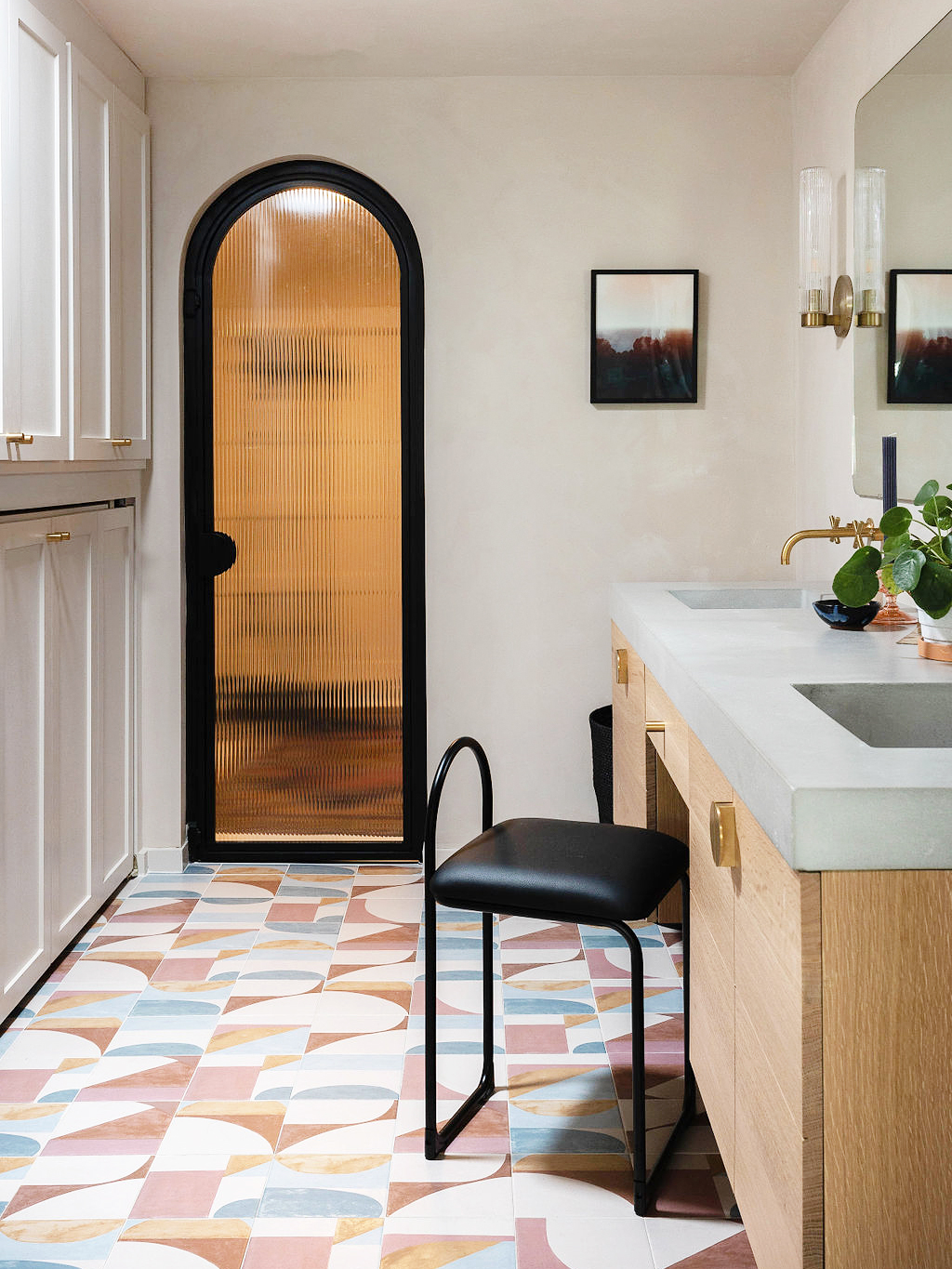
The project hinged on raising the ceiling height to make room for a double sink vanity. “No one wanted to be standing at the mirror bonking their head,” says the designer. Fortunately, the contractor, Alex Grisanti of Honeycomb Construction, found wasted space behind the slanted walls that allowed them to do just that without majorly altering the home’s bones. On one side of the room, they situated the streamlined oak and concrete vanity under one big frameless mirror; on the other, they snuck in a water closet with a pocket door.
Flip a Switch for Privacy


By moving the vanity into the old bedroom, Jacobs was able to dedicate the original bathroom entirely to a soaking tub and shower. The arched opening and curb nixed the need for a glass door, which immediately made the space look bigger than it is. A sense of privacy, however, needed to stay. Jacobs and Grisanti applied a smart film to the long rectangular window for $800 that allows the couple to switch it from clear to tinted glass with just the press of a button.
Multitask to the Max


As aesthetically pleasing as the new bathroom is, it ticks off all the utilitarian boxes—what looks like a floor-to-ceiling linen closet is also part laundry station. There’s a washer and dryer hiding behind the lower bifold doors, with a pull-out surface on top for folding clothes.
Play the Waiting Game When It Matters Most


“In a bathroom, your tile is kind of everything; that’s usually the shining star,” says Jacobs. The 8-by-8-inch ceramic pieces they sourced through Roca Tile quickly became the main event: The designer wanted to lay the abstract squares everywhere, including the sides of the shower curb. The catch was the glazed porcelain tiles are made in Spain. “I knew [my clients] were drawn to the shades of pinks and mauves in the other bathroom I designed, so it was worth the four-month wait,” she says.

While the tile itself wasn’t wildly expensive per piece, the fact that they wanted to cover the entire floor in it qualified it as a splurge. Another addition at the tippy top of the budget was the fluted glass and steel door that leads to the bedroom. “It closes off this area, but it still feels like part of the bedroom because it’s not completely solid,” says Jacobs. To save on cost elsewhere, she departed from the expensive blush plaster finish she had used in her previous bathroom reno and swathed these walls in similarly textured limewash paint. Unlike a leopard, a designer can change their spots.

