We may earn revenue from the products available on this page and participate in affiliate programs.
Behind every beautiful “after” photo is a hard-won lesson (or three). In our series “Gutted,” renovators share the biggest mistakes they made on a recent project, how they fixed ’em, and more wisdom they gained along the way.
Deciding to paint a room is one thing, but picking the actual color is a whole other (overwhelming, scary, intimidating) thing. There are so many slight variations that you could spend hours reading articles about the go-to shades and brands of your favorite designers and still not have a clear winner for what white paint should live on your walls. Even newer paint brands like Backdrop and Clare, which both emerged in the past decade with a curated offering to simplify the process, haven’t saved us. And even when you nail the color selection, there’s still the application that’s so easy to mess up. In the spirit of getting it right every single time, we tapped designer and paint pro Drew Michael Scott of Lone Fox Home, who was happy to share his paint mistakes and the painting best practices he now uses as a result.

If You Choose Wrong, Don’t Restart From Scratch
Scott’s current process includes buying tester paint pots, swatching a large area of the wall (like, larger than you think is necessary to get a real feel for the color), then selecting a shade, buying a single gallon (even though he usually needs two), and painting the first coat. From there, you’ll be able to tell if you like it or not. If you’re not loving the first coat, it’s almost guaranteed you won’t like it more with a second. This is where his process gets interesting. “If I’m sticking in the same realm of color, so if I’m still doing a green but I’m changing the tone a little bit, I can typically get away with painting the second coat a new color,” he says. By layering a new color, you’re creating a custom shade, and maybe more important, avoiding the cost and labor of priming a second time.
Use Your Peel-and-Stick Samples to Their Fullest Potential
There’s no denying peel-and-stick paint samples have made the painting process easier. They are the definition of less mess and stress. But using them only on your walls is a missed opportunity. Scott recommends using them on hard-to-paint spots like molding, doors, furniture, and grooved cabinets to get a real feel for how the paint will look on a surface with some depth. Knowing that you love the color before you pick up a paintbrush to get into all the crevices? Genius!
Test—Or Else
Have you ever randomly committed to a paint without testing? It’s quite literally a rookie mistake. Scott recounts being in the hardware store watching people choose a color under the industrial yellow lighting and cringing. “I’m like, oh my gosh, I cannot believe you just chose that right there, right now,” he remembers. But he’s guilty of doing the same thing, in a slightly different, more design-forward situation. Specifically, he’s been tempted by new colors and their fun names. When Farrow & Ball came out with a set of eight new colors, he selected a silvery blue shade called Sardine to use on a bathroom vanity with no swatch in sight. But it wasn’t the right fit. He ended up making an impactful switch to a more moody color, Aurora Brown, which “completely transformed the look of the bathroom.”

Take the Time to Properly Prep Your Space
The drop cloth exists for a reason. Whether you’re comfortable with scratching dried paint off your floors or overconfident in your ability to paint without dripping, this is your reminder to prep properly. We’re all one paint adventure away from accidentally ruining our floors, just like Scott, who discovered tiny flecks of a special supergrip primer for plaster on his newly refinished flooring after the fact: “I was like, okay, what do we do? So I looked it up online, and it was like, you should get lemon juice and alcohol and soak towels in it and put it on top of it to loosen it. So we did that, and it ate away at the floor finish, and then it literally melted the primer into the finish of the floor.” The solve: Covering the affected area with a credenza.
Make Your Painter’s Tape Work Harder
Scott swears painting stripes on your walls is easier than you think, even though he estimates his latest project, a breakfast nook, took him around eight hours to set up. He has two tips for getting a crisp, sharp line. First, after you apply your painter’s tape, go in with a dry washcloth to massage the wall—“like, really pushing the tape onto it.” All walls are uneven and you get seepage wherever the tape is not firmly pressed. Next, do a quick light coat of your current wall color before layering the new paint for the stripe on top. “The first coat of paint is what’s going to bleed under the tape,” he says. “And then the second coat that you apply is what’s going to sit on top.”
Take Risks in Less Used Areas of Your Home
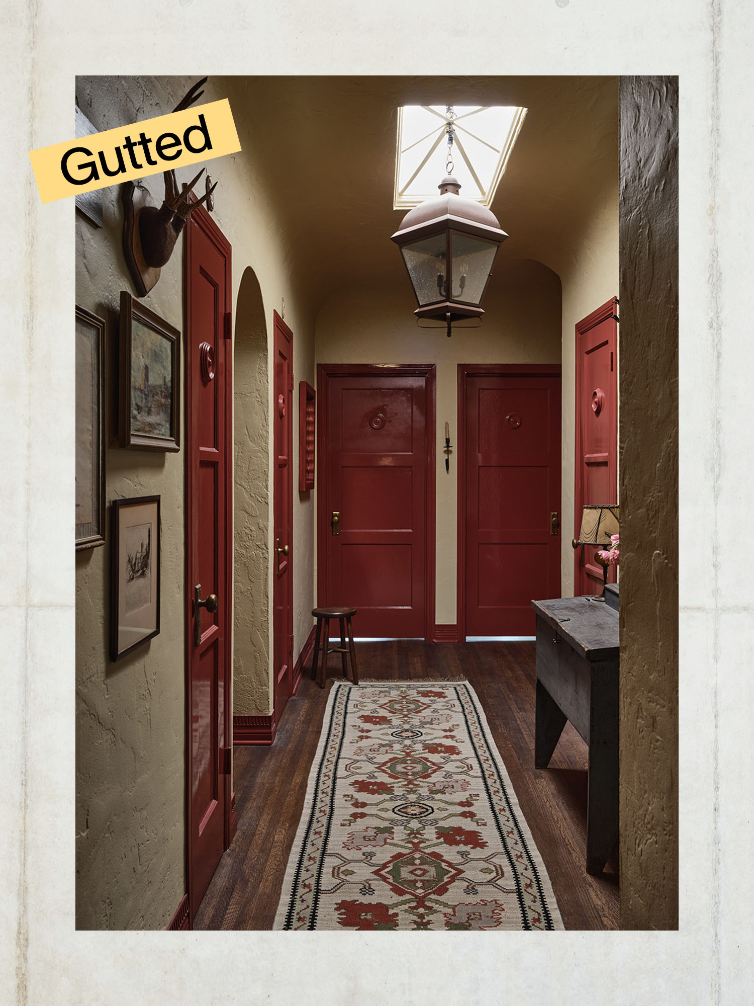
Paint regrets range from selecting a shade that’s too soft, too dark, or too densely pigmented. As you flex your decision-making muscles and learn what you like and what works with the light in your space, take a risk with a bold color in a less frequently used room of your home. Scott suggests trying out an area like a laundry room to gain confidence. In his current home, he added a high-gloss red paint to his hallway trim and doors, “because I felt like it was like such a transitional space between all the rooms that didn’t really get much love.”
