We may earn revenue from the products available on this page and participate in affiliate programs.
Boil it down, and every interior designer is essentially an artist. Like most creatives, the best can turn just about anything into a masterpiece—but instead of a blob of clay, that thing is a soulless spec house or, in Zoe Feldman’s case, a stark, builder-grade kitchen. The founder of Zoe Feldman Design’s clients bought the 6,100-square-foot home sight unseen during the COVID-19 lockdown when the family, a husband and wife with two elementary school–age daughters, relocated from Utah to Washington, D.C. Their only two requests: a little personality and a lot of storage.

The kitchen came with all the standard contractor classics: white quartz counters, a white subway tile backsplash, and lots of—you guessed it—white uppers. So when the wife found two towering stained-glass doors at a secondhand shop called Community Forklift, it became clear that the entire reimagined room needed to revolve around them. The vintage pieces were transformed into a pantry entrance (where the fridge once was) with the help of bespoke framing from Custom Home Productions. Then Feldman got to work on the supporting details.
Make Neutrals Fun Again


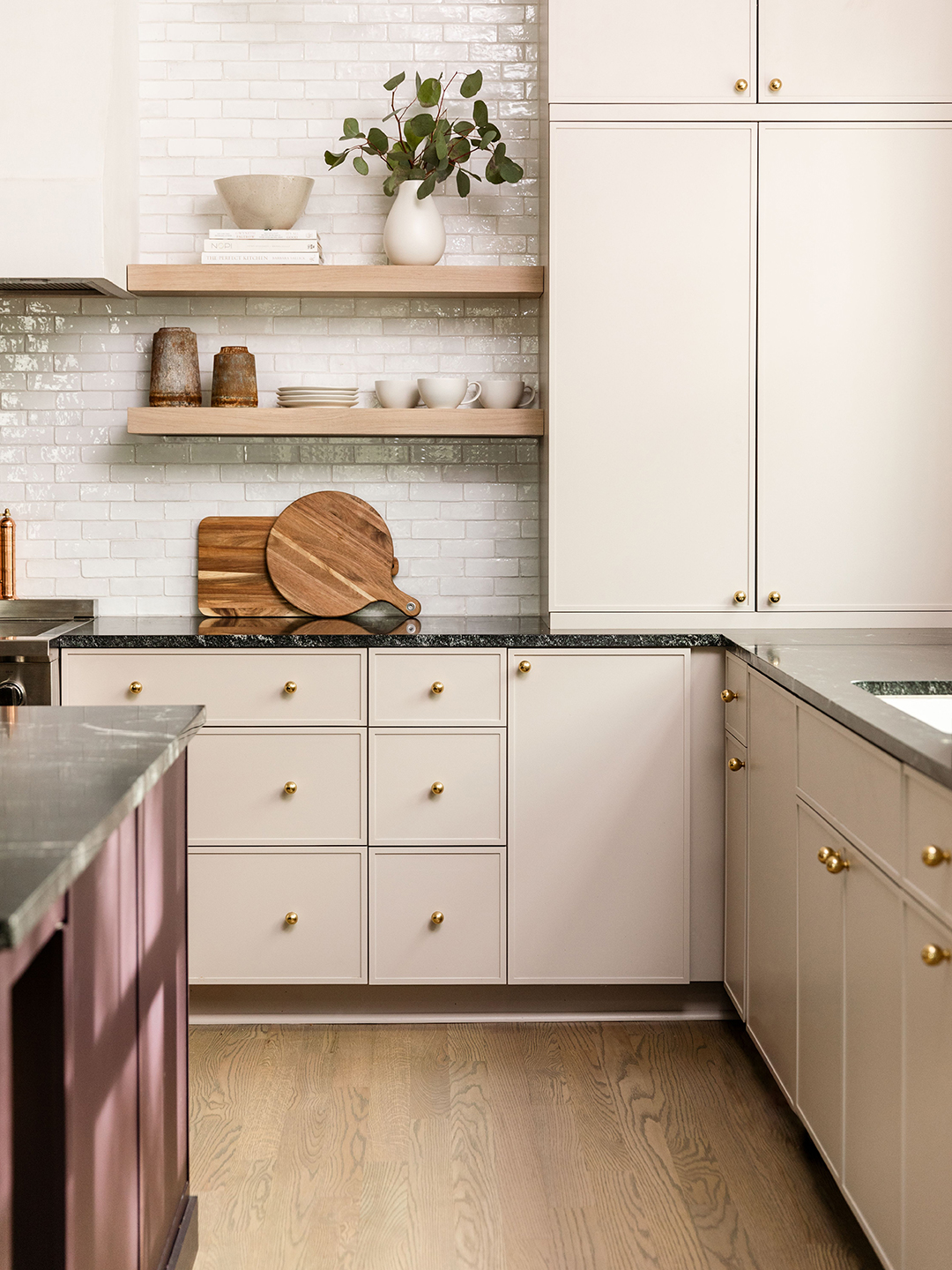
Feldman knew she wanted to play off the marbly green and blue glass but didn’t want the space to be too splashy (and therefore overwhelming). Her solution? Swap out all of the white for a “new neutral.” It’s the nuanced tone that adds interest, she says. The kitchen’s custom cabinetry, from the designer’s collaboration with Unique Kitchens & Baths, is painted a warm gray-pink (Farrow & Ball’s Elephant’s Breath), which became the anchor of the room. Its impact is felt in the “quiet details” like the Lily line’s modern take on classic Shaker cupboards (the frames are slightly thinner than usual) and understated hardware (more on that later).
Take the Storage to New Levels…


Funny enough, for a project centered on cabinets, all of them had to go. The team instead opted for a combination of open shelving, drawers galore, and two full-height cupboards flanking the longest wall. The 10.5-foot ceilings presented a challenge for Tanya Smith-Shiflett, the founder of Unique Kitchens & Baths. “Anytime you get over 8 feet, there’s a tendency for the doors to warp,” she explains. “The design of the cupboard fronts was something we had to totally reconfigure and reengineer.” The answer was to reinforce the towering panels from the inside so that they wouldn’t need to split them into more doors.
…And Depths

As for the decision to go all in on pull-outs, Feldman says it just makes sense. Anyone who’s experienced the frustration of fishing for a Dutch oven in the 24 inches of a shadowy cabinet would agree. “That’s how things get lost,” she notes. These drawers, on the other hand, are decked out with peg systems, sliding racks, and adjustable dividers to keep everything from lids to table linens to bowls in line. “This is more accessible and easier to organize,” she adds.
Find Your Jewel-Box Moment

While visiting California, the wife fell in love with the Jade Porcelain tile from Heath Ceramics. Feldman found a place for it back in D.C. in their walk-in nook, a space that serves as an appliance garage and coffee bar. (They already knew the color pairing would work thanks to those vintage pantry doors.) Feldman calls it “the perfect little jewel-box moment.”
Tip the Scale

For the finishing touch, the designer says the “enormous doors and teeny-tiny knobs” were intentional. The cabinets are the star, so the hardware needed to be understated. Feldman puts it as any good artist would: “Some things are a canvas for another thing, right?”
