We may earn revenue from the products available on this page and participate in affiliate programs.
When Odai Sinokrot is walking the streets of New York City, he doesn’t look forward—he looks up. “I always say that if I die in an accident, it’s going to be from me crossing the street in SoHo staring into all the lofts,” he says jokingly. These days he doesn’t have to wonder what’s happening inside those glamorous, high-ceiling apartments. As of three years ago, he calls one home.
Sinokrot, a practicing physician, always had a thing for interior design—something he inherited from his construction-savvy dad growing up—but his obsession really took off when he arrived in New York in 2016. Unlike anywhere else he had lived up to that point (he grew up in Jordan, went to medical school in Ireland, and trained in Maryland and Ohio), suddenly art galleries, exhibitions, and furniture shows were at his fingertips. “It was like an explosion,” he shares. “I’ve always tried to make every apartment I’ve lived in special, but I really started to pay attention when I moved here.”


His passion turned into a full-on side hustle during the pandemic. Working long hours in the ICU (he’s a pulmonologist and intensivist) motivated him to find an escape. After binge-listening to podcasts like Domino’s Design Time and Debbie Millman’s Design Matters, he teamed up with a friend, an infectious disease doctor with a passion for DJing, to launch their own show: Prescribe Me Something Else. So far, they’ve interviewed 20 health-care professionals who have hobbies outside of medicine and were able to channel those interests into bonus careers. Those conversations continue to inspire Sinokrot to turn his daydreams into a reality: He has taught himself SketchUp and crafts layouts with decor suggestions for friends. “Nothing like a full home, but hopefully that’s next,” he says.


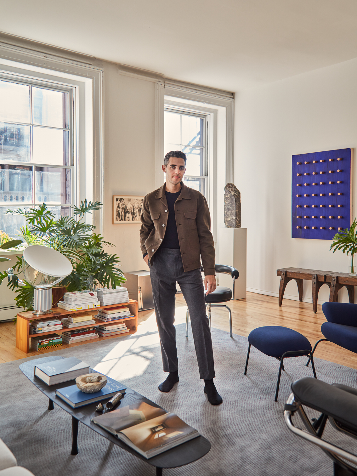
The apartment Sinokrot shares with his partner, Tom, a lawyer, is his working laboratory. “I can do whatever I want as long as he has somewhere to sit,” he says with a laugh. That includes treating the extra-spacious living room as if it were a lobby. “When you come in at night, I want it to feel like you’re stepping into the Ace Hotel in Brooklyn or the Standard or somewhere by Roman and Williams,” he says.


With that in mind, he paid special attention to the seating—both having enough of it (hence the massive 11-foot-long sofa) and arranging it strategically for easy conversation. From a distance, the placement of the accent chairs looks a little strange, like they are all facing different directions, but once you put a person in each of them, the dots connect. “Each chair talks to each other,” explains Sinokrot. “It’s circular in a way—they’re all centering around that area.”


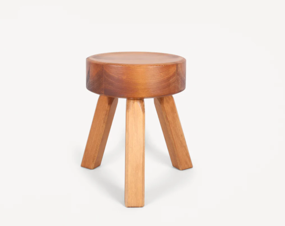
His extensive collection of stools can also substitute as bonus seating, but most of the time they’re just good conversation starters. The two medieval-looking ones underneath the cobalt 3D art—a piece by Sinokrot, who lives by the motto “until we can afford really good art, we’re making it ourselves”—were a $40 score from a nearby flea market that’s only open twice a year. (He also purchased the 85-pound chunk of marble displayed on the plinth in the corner during the same visit for $100.) “It’s so crazy how attached you become to things that don’t have a ton of monetary value,” notes Sinokrot.


The two modern stools by the bookshelves were another unplanned purchase, this time from an architecture student who had listed some items on Craigslist. Sinokrot went to his apartment to pick up a dining table (now Tom’s desk) and left also toting the sculptural seats, prototypes for the seller’s final project at school. The book-filled corner is a subtle nod to Sinokrot’s favorite independent bookstores around the city, including Dashwood Books in NoHo and Karma in the East Village. It’s modeled after another iconic NYC location: Jenna Lyons’s apartment. “She’s someone I’m obsessed with, so when I saw her bookshelf corner, I was like, what could I do with that?” shares Sinokrot.


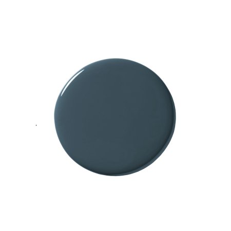
The most important lesson he has taken away from industry veterans is arguably the hardest to achieve: the value of negative space. “It doesn’t come instinctively in spaces that are big because you want to fill them up with furniture,” he explains. Sinokrot practiced restraint in the dining space—the first area you see when you walk through the door—by keeping the gallery wall off-center and minimal, and letting an oversize Noguchi lantern take center stage. “It really softens the space, because a lot of the other pieces have sharp edges,” he notes. In the couple’s tiny bedroom, Farrow & Ball’s Hague Blue is the sole focus. “It tricks your eye and makes the room look deeper, like the corners recede even further,” says Sinokrot. Even here, he’s never not looking up.

