We may earn revenue from the products available on this page and participate in affiliate programs.
Before Sarah Sherman Samuel moved her team into their new gleaming office and showroom, the space belonged to a medical device and technology brand that sells artificial knees. And before that, it was home to a concrete company. But when a friend showed her the 5,000-square-foot space in downtown Grand Rapids, Michigan, she knew it would be just the place to house her growing design business.

Mostly, she needed room to accommodate all aspects of her work: her design offices, warehousing for her SSS Atelier products, and a showroom to display it all. “We came to see it, and it was not in any state that we could move in, but it was basically sectioned off in three parts,” she says. “We had to do some construction, but it was pretty perfect.”

For example: The old carpet tiles had to go before giving the floors a coat of epoxy. And when removing the tiled dropped ceilings (you know the ones, an office staple) revealed a black ceiling above, Samuel brightened it up with a dusty pink Farrow & Ball shade called Setting Plaster. From there, she kitted out the space with smart tweaks that made the office all her own.
Rework the Classics

Samuel is no stranger to making IKEA look, well, not like IKEA—the designer has her own line of Semihandmade cabinet fronts, after all. She put her DIY Quarterline, a Shaker style, to work in two spaces: the shared kitchen, which she covered in Benjamin Moore’s Riviera Azure, and the sample library, a nook where she stores various clippings and materials to create mood boards for new projects.

Skirt the Issue

Throughout the space, skirts and curtains add a soft touch, even around the shared desks, which aren’t desks at all, but IKEA kitchen cabinet boxes topped with the brand’s wood countertops. Samuel then added electrical staples around the edges and used curtain hooks to affix her Lulu and Georgia Painterly Stripe Linen Fabric. She used a similar method for her Organic Shapes Linen Fabric under the sink.

In the bathroom, where she couldn’t staple the skirt to the sink, the designer got creative and attached it with adhesive Velcro. Now she can swap in a new fabric whenever she’d like—though the Painterly Stripe in black is pretty perfect next to her Checkerboard wallpaper.
Rethink Flooring

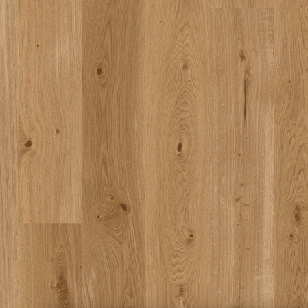
There’s no wood flooring in the office—well, not any you would walk on at least. When Samuel felt like the space was lacking warmth, she stocked up on Stuga’s Happy Hour, an unstained white oak plank that clicks into place. She placed it on the walls of the kitchen and seating area before securing it with a nail gun. “It’s supereasy to install,” Samuel says. She also added the planks around the base of a built-in L-shaped bench to make it look more like a piece of furniture.
Go to the Dark Side

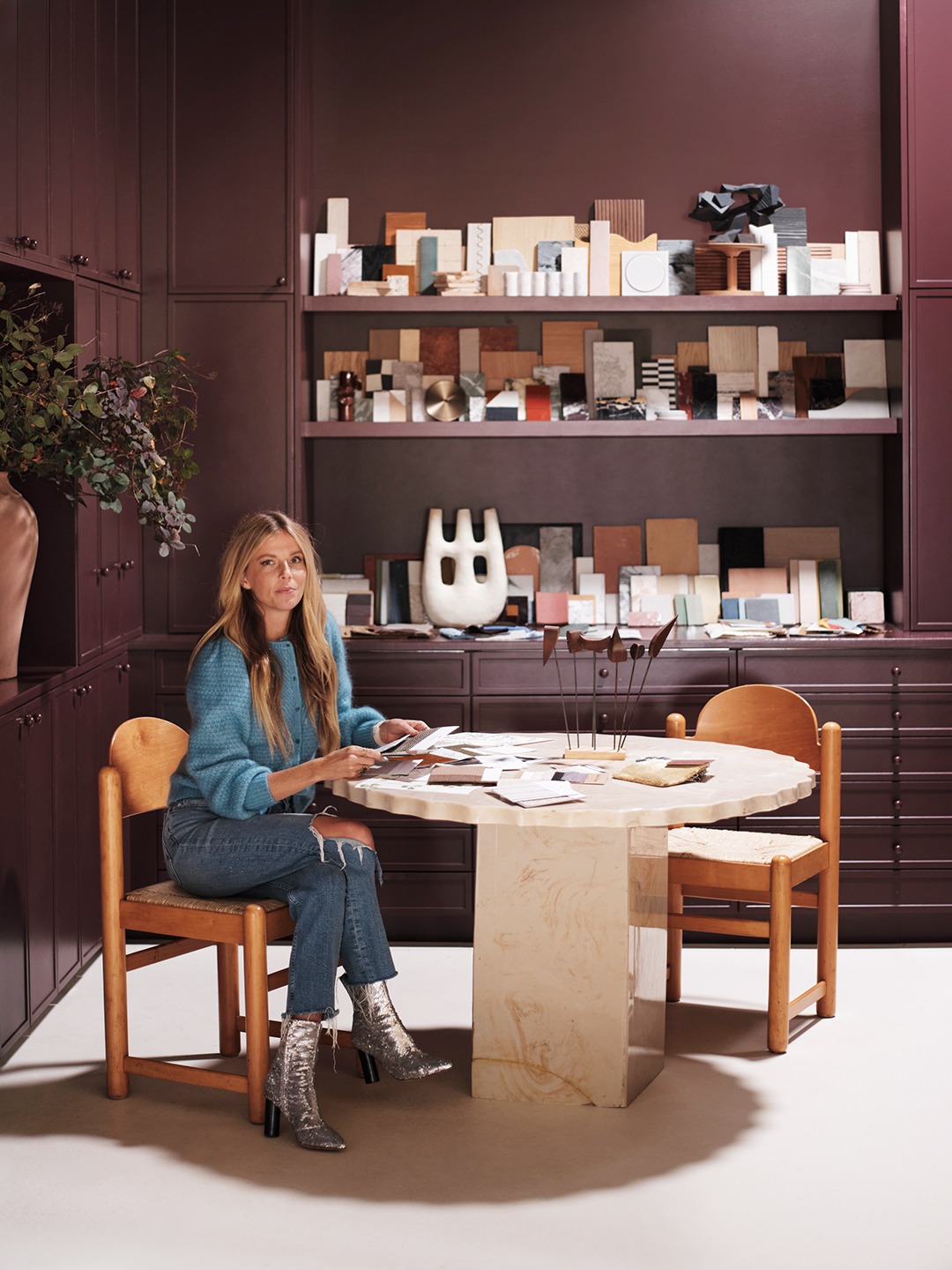
Samuel drenched an alcove—formerly a private office, now her sample library—in Sherwin-Williams’s Rookwood Dark Red. “I have clients who like color, but some still really like light and bright, so it’s nice to be able to say, ‘Look how pretty this can be if you really go all out with one color.’”

And while the team is still waiting on final office lighting—“Maybe don’t take out the track lighting until you have actual lighting,” Samuel says with a laugh—the space already feels like a place where they can celebrate their work while surrounding themselves in it, too.


