We may earn revenue from the products available on this page and participate in affiliate programs.

Four years before furniture designer Rachel Donath and her husband, Michael, bought their first home just outside of Melbourne, she impulsively purchased an extra-large round Danish table without anywhere to put it—yet. She tucked it away in her parents’ garage for safekeeping, but never stopped thinking about it, so much so that she often checked on her prized possession, making sure it hadn’t warped and that the covering remained watertight. “It was just a dream I had, to be able to one day have a space the table could fit in, to have people sit around it,” Rachel says with a sigh.

As luck would have it, her dream wasn’t delayed too long. “I was looking through some junk mail and I spotted a magazine in the mailbox with some properties for sale. I would have normally never read it, just chucked it into the recycling,” recalls Rachel. But there it was: a 120-year-old, double-fronted Edwardian like the ones she often passed on neighborhood walks with her son, Toby, now 12 (he was later joined by Luca, 10, Hamish, 6, and Grace, 3). “It was very old and falling over, but I could see right away that it had beautiful bones,” she says. A closer read, however, revealed the auction had been held the day before: “So I thought, forget it. I must have missed it. I’ll just drive past it and see it.”

Though, when she did, there wasn’t a “For Sale” sign to be found. She dialed the agent, just in case. “It was probably the most spontaneous thing I have ever done. We didn’t even have financing organized. Nothing!” she says. But much like the dining table, she couldn’t let the property go, even after realizing it was practically in its original condition—down to the outhouse in the backyard—except for a few ’70s-era upgrades, like shaggy carpet and flowery wallpaper. Saying it needed a lot of work was an understatement. And yet, “it just had such a nice energy. I remember it smelled like a holiday home,” she shares.

The next thing Rachel knew, she and her husband were selling their small apartment and figuring out how to move in as soon as possible. Among all the chaos, she made a point to pick up her beloved table: “It was the first thing we moved in, even before we brought in clothes. It was like: First comes the table.”


But it would be a while before her family could enjoy it to the fullest. Phase one of the renovation involved a lot of grunt work: They had to re-stump the house (an Australian term for repairing a foundation made with wood stumps), redo all of the plaster and electrical, and replace the plumbing. In other words, the things that eat away at your budget, quickly.

One of the most terrifying things her builder, JT Todd, told her was he didn’t know what they were going to find once they pulled up the floorboards. “We had rotten wood in some areas and, my goodness, that was expensive to fix,” she says. “Not only that, there’s the risk of termites…all sorts of unknowns. But I wanted to do it all at once, properly, and deal with the consequences of having to pay the bills.”


Those first three months of structural updates also meant having to sacrifice some of the fun stuff—fixtures, finishes, and furnishings. But just when everything was finally coming together—i.e., it was enjoyable to live there—her growing family had to suddenly relocate to Sydney for Michael’s job. “I have to say that the hardest thing was having to leave my house. For me, home is so much more than four walls and a roof. It became a part of who I am,” she attests. “It really is my comfort zone, the breeding ground for my creativity.”

But it wasn’t goodbye, just see you later. They moved back less than a decade later—and Rachel had big plans.


After feeling rushed the first go-round, she made sure to carve out enough time during stage two to find bespoke solutions. This included custom-made steel frame doors that line the wall of the living room and lead directly to the back garden, drawn up by Rachel herself.

“I went around to a few different steel manufacturers, asking them for a quote, and it was a fortune,” she recalls with a laugh. Thankfully, her builder had a connection. Determined, Rachel drove out to the countryside, about an hour and a half away, to visit the artisan, and together they designed the panes to go all the way up to the ceiling.


It wasn’t the only time Rachel held fast to her vision: She went to manufacturers directly after being told to go with a gas fireplace instead of a real, wood-burning one; she had a local business sew her seamless, 100 percent linen blinds; and found unused space in the pitch of the roof with her architect to make sure the house’s second-floor extension—crucial in order to fit the now family of six—would be approved by the city council. (Disguising any additions happens to be one of the many rules when one owns a heritage home in Melbourne.) And though it was just an extra 300 square feet, she was able to squeeze in a kid-focused space (or what she lovingly refers to as the rumpus room) into the final project they completed in 2021.

The ceiling height may be just 1.5 meters high, but Rachel took advantage of every bit. “It was actually the builder who had the idea to use it and keep it open as a seating area. Together, we designed the low benches with built-in bookshelves underneath. It has given us so much more room,” she notes. It’s the ultimate reading nook.

Pregnant with her fourth at the time, Rachel was in need of all the extra space she could muster for her family. In addition to the hidden upstairs, they extended the property line to increase the downstairs footprint where the kitchen and dining and living rooms now mingle openly—and she also tacked on an extra bathroom. Most important, the move enabled her favorite table to assume its destined position as the focal point of the home. It’s where they gather daily for mealtimes and every other moment in between.

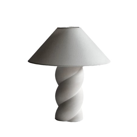
Now Rachel swears she’ll never leave again. Every detail, she stresses, was researched to the ninth degree, from the quarter-circle headboard (it looks most natural with her son’s bed pushed up against two walls), to the sculptural lamp on her kitchen island that doesn’t even have a lightbulb in it, to the Murano vases her kids may or may not topple over some day, as well as her own furniture designs. “There are pieces around the home that were bought with intention for their beauty,” she notes (and often before she had anywhere to put them, a risk that always seems to yield reward for her). “And that’s a good enough purpose for me.”

The Goods
Architect and builder I loved working with: Elements of Home and JT Dodd were a fantastic team that collaborated to bring my vision to life. I really felt they allowed me to have a say and were very open to my input.
Object in my house that gets the most use: Our vintage Danish dining table.
Where I always go to for vintage scores (and inspiration): Old auction house catalogs and local flea markets.
Coolest discovery I made: How much opportunity for additional living space existed in our roof cavity!
Item that is so me: The custom plaster light fittings by local artist Anna Charlesworth. They have a rawness to them, which is what holds their beauty. I believe that it’s in our authenticity and imperfections that our power and potential lie. They also give off incredibly gentle light. I hope that I, too, through genuine connection and sharing of my craft, provide gentle inspiration and light.


