We may earn revenue from the products available on this page and participate in affiliate programs.
You can look through a fan deck and make an argument for liking just about any shade in there. The hard part is figuring out what to do with it after you’ve decided to use it. Not all hues play nicely together, which is why professional color psychologists and paint consultants exist. But when it comes to Pantone’s 2025 color of the year, Mocha Mousse, you won’t have to wrack your brain.
“From a colorist’s standpoint, I can tell you, there is nothing that would clash with this,” says Leatrice Eiseman, executive director of the Pantone Color Institute. As she sees it, the reason you can’t get Mocha Mousse wrong is because it’s an earth tone that we’re all so accustomed to seeing out in nature.

It’s no secret interior designers are loving brown across the board right now: They’re using it on kitchen cabinets, kids’ beds, sofas, and even Christmas ornaments. But this soft shade, which, as its name suggests, is indicative of cacao and coffee beans, isn’t one we’ve seen a lot of…yet.
With an unconventional tone like this, even we needed a little help visualizing how Mocha Mousse would play out in a home. Fortunately, when we sat down with Eiseman and Laurie Pressman, vice president of the Pantone Color Institute, to chat about all things 2025, they offered a few tips for pulling it off.
Colors to Pair With Mocha Mousse

For Pressman, white isn’t just a safe partner for Mocha Mousse, it elevates it. “White completely changes the feeling and modernizes it,” says Pressman. See the combo at play in Clare Vivier’s Los Angeles bathroom (her wool shag rug is from her collaboration with Schoolhouse).


To make things supereasy, as usual, Pantone rolled out a series of complementary palettes. If cool neutrals are your speed, look for colors like Dull Gold, Laurel Oak, and Warm Taupe. For a jolt of energy, consider punchy oranges and pinks like Bonbon and Peach Cobbler. Our favorite recommendations fall under the Uniquely Balanced palette, which spans shades like Blue Jewel, Spicy Mustard, and Opera Mauve.
Where to Use Mocha Mousse
Based on the homes we’ve seen putting this warm neutral into action, the bedroom is a no-brainer. In one couple’s Austin home, designer Taylor Clouse embraced the hue on both the groovy channeled bedding and the woven headboard, setting a serene scene for sleep. Meanwhile, journalist Kate Watson-Smyth let her mocha-tinged bedding go in a cottage-y direction by pairing it with hits of navy.

The entryway is another prime spot to use Mocha Mouuse, says Eiseman. “When someone walks into your home and says it feels so warm and welcoming, that’s the ultimate compliment you can get,” she shares. It’s an especially great color to have on the walls if the first space you enter is the dining room. The Hamilton Weston wallpaper designer Emma Ainscough used in the dining space pictured above is proof the hue also works well with light pink.
How to Shop Mocha Mousse for Your Home
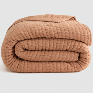
Pantone has made it easy to get the look ASAP by partnering with Joybird for a collection of seating and Spoonflower for wallpaper. In the meantime, we tracked down a linen quilt and velvet shams to make that aforementioned brown bedroom a reality. Eiseman’s other hot tip: “It shows off beautifully in glassware and ceramics.” Here are the Mocha Mousse–inspired picks we’re loving.


