We may earn revenue from the products available on this page and participate in affiliate programs.

As a kid, Alvin Wayne would get in trouble for rearranging the furniture. “I actually broke my bed because I was pushing it with my hip,” he recalls. Now he gets paid to do it, and he ultimately has the TLC series Trading Spaces to thank for that. “When I first saw the show, I was like, this is a career? You can actually go to school for this?” says Wayne. At the time, he was studying health-care management at Florida A&M University, so he quickly transferred to the Savannah College of Art and Design. Then the 2008 recession hit. Given no one was hiring interior designers, Wayne applied his degree to luxury retail and worked in the visual department for fashion brands for more than a decade. It wasn’t until June 2020, when he moved into his 800-square-foot Long Island City, New York, apartment that he tapped back into his decorating roots. He began documenting the progress of his space on Instagram and YouTube and quickly accrued a client list. “I was showing the why behind the process, because a lot of people think interior design is just beautiful images, but they don’t know the reasoning,” says Wayne.
Lesson one: the living room. His sun-drenched space looks like a welcoming five-star hotel lounge, and it’s not an accident. To achieve that feeling, Wayne knew he’d need to stick to low-profile furniture. After sourcing his Mario Bellini–inspired sofa, he worked with an Italian fabricator to create two nesting coffee tables (one is around 12 inches high; the other 14) to match the couch’s proportions. “I’m obsessed with pink and red marble,” says the designer. “It’s instant luxury.”

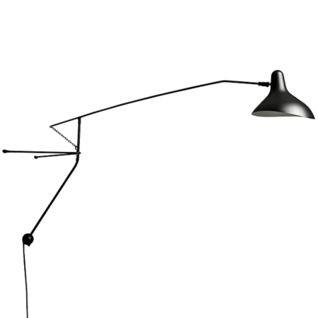
Because he’s in a rental, Wayne has had to deal with a number of issues, like the lack of overhead lighting and the immovable column in a far corner. The designer made the most of the structural pillar by mounting an articulating sconce halfway up it and custom-designing another marble-topped table that perfectly fits around its curves. Nearby, he hid the apartment’s unsightly electrical panel with a large, frameless piece by his artist friend Ronnie Williams. Meanwhile, in the kitchen, Wayne covered the plain upper cabinets in $9 sheets of contact paper he bought on Amazon that look like solid brass. “It’s just a big sticker and you smooth out the air bubbles with a debit card as you go,” he says.

While the designer admits he doesn’t cook much, he loves to entertain (he recently hosted 21 people for Easter Sunday). “I did a little tea party and put moss on the countertop with bud vases,” he shares. The dining space didn’t need much help in matching the garden party vibe—it’s already swathed in a landscape wallpaper, and the shades on the staggered pendant lamp resemble clouds. “You’re looking out the window and can see the Empire State Building, but at the same time you’re in here and feel like you’re sitting in a field,” shares the designer.


When friends come over, that’s when Wayne will usually turn on the neon “Kiss Me Karl” sign in the entry. The designer snagged the piece from a friend who had worked on an event for Karl Lagerfeld—the plan was to trash the piece unless someone wanted to take it home. “I was like, no, give me that!” recalls Wayne. The wall on which it now hangs only looks like concrete, but it’s another Amazon wallpaper steal. Wayne applied the same removable wall mural in the living room behind the credenza where, nearby, his monstera plant thrives. “It has to be my favorite houseplant,” he says. “It just does its own thing, and I love that because I don’t want my space to be too tailored.”


Wayne takes his plant parenting seriously; he’s always researching what type of lighting, watering schedule, and environment his growing buds will need to be happy, but even he’s made mistakes. “That beautiful black olive tree in my bedroom is dead now,” he shares. “In New York, the light alters drastically from winter to spring, so at one point it was getting at least 12 hours of light, but that changed once it started to get dark at 4 p.m.”

But what is working for him is the black and white color palette. The decision to use just two colors was a personal challenge of sorts: He wanted to see if he could make it just as visually appealing as a room full of color. The graphic wallpaper that stretches from the wall to the ceiling was a solid starting point. “It makes the room feel 10 times bigger,” he says.
For Wayne, this space encompasses a motto he learned years ago from Tyra Banks: “Different is better than better,” she suggested during an interview in which she talked about branding. “I apply that to my entire space, but in the bedroom it felt daring to say, I’m going to carry this black and white wallpaper across the ceiling and let’s see how that turns out,” he says. This time around, no bed frames were broken in the process.


