We may earn revenue from the products available on this page and participate in affiliate programs.

Growing up in an Italian family, Sara Matarazzo’s understanding of a timeless home was one where all the furniture was covered in plastic. “Stuff had to last,” she says. But when the Los Angeles–based music supervisor and her son, Lincoln (now 9), stopped by interior designer Jessica Hansen’s Santa Monica home years ago for a birthday party, she learned that wasn’t the only way. “Her home had this lasting feeling, but it wasn’t covered in plastic,” continues Matarazzo. “I didn’t really understand what was happening; I just knew it was beautiful.” She recruited Hansen, the founder of Tandem Design, to help her outfit her office spaces in California and New York City, before eventually asking the now Portland, Oregon–based designer to renovate her family’s Laurel Canyon house.
The cira-1950s home’s sunken dining room was something Hansen had seen in many California homes before. The awkward space, delineated from the adjacent kitchen, entry, and living room by a step, had clearly been a covered patio before being fully enclosed. Matarazzo was set on keeping the feature (it reminded her of a room in one of her childhood homes) while introducing a sense of flow to the zone, which leads out to the pool in the backyard. “We wanted to be able to see our children at all times,” she notes.


After streamlining the hardwood flooring throughout, Hansen and her design coordinator, Kate Totten, focused on connecting the kitchen to the sunken space with a semicircular island that straddled the ledge. “I laughed so hard, because I used to be a DJ in the ’90s and I ended up with a sink that looks like you could play a set at it,” shares Matarazzo. The counter-height stools arranged on the lower side of the structure act as visual markers to guests that they’re going to have to be cautious of their footfall, helping to keep the tripping to a minimum.

To ensure the new cabinets wouldn’t look overly busy, Hansen relegated oversized oak handles to the lower sage green fronts and went with seamless finger pulls on the highest cupboards. Behind closed doors, though, she employed a series of complex compartments. She hid unsightly electrical outlets within upper cabinets “because I hate poking holes in the backsplash,” she says, and stuck a second cubby within the trash pull-out so the family can snag a new garbage bag as soon as the old one has been taken out. It’s one of the reasons Matarazzo best describes her house as practical. “You hear that word and you think stuffy or khaki pants,” she says with a laugh. “But Jessica looks at it as everything has meaning. Everything has a purpose.”


The double-sided fireplace acts as a privacy and noise barrier to the adjacent TV room without taking away from the airy feel of the entertaining space. Hansen and Totten had the dining room side built out of metal and wood to create its unique, rounded shape before plastering over it with the same Limestrong finish used in the primary bathroom. “It has this sort of ancient feel to it that brings age to a house that you’ve just gutted,” says Totten.


The shelving unit in the formal living area is a time-tested favorite of Hansen’s (she first used it in her own home and subsequently in clients’ spaces). The piece isn’t actually attached to the walls or ceiling—it’s made up of retention poles. “Which means you can take it with you when you move,” she says. For Matarazzo’s office, however, the designer went with a more permanent, custom solution: lavender-stained wood shelving with an integrated desk. The planks are a porous ash wood, which means they absorb the pigment in a way that still reveals the texture of the grain (plus it won’t chip over time like paint might).


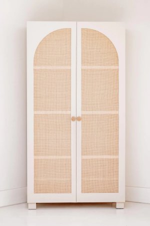
Given the home only spans roughly 2,600 square feet, Hansen and Totten had to work to find room for clothes storage, too. Totten stumbled across an Etsy shop based in Turkey that was selling kids’ wardrobe systems and asked if it could make adult-size ones with a few custom touches for the couple’s primary bedroom. The units shipped flat-pack with all the right parts…except an instruction manual in English. “I had to work with a TaskRabbit over FaceTime, due to COVID, to put them together,” she recalls.


The painting over the couple’s bed ultimately drove the home’s brown, cream, pink, and copper palette. “It transcends throughout the house,” says Matarazzo, who began collecting art back when she and her husband, Dan, lived in Portland, prekids. Leaving many of the walls blank was an intentional move by Hansen to showcase their pieces, as though the house was a gallery of sorts. That same thinking trickled into the bathrooms, where the designer introduced matte white plumbing fixtures to ensure the bold tile remained the focal point.

Finding matching white doorknobs was the easy part. But when it came to the hinges, Totten once again searched abroad and ultimately landed on hardware from Australia. The catch was, doors in the U.S. adhere to completely different specifications. “It meant that every door had to be either modified and bought without being bored, or bored on-site,” she says. It was a tough ask for their millworker, Christ Toavs, but he pulled through, including in the new third bathroom, which used to be a water heater closet.


While Matarazzo’s 3 1/2-year-old daughter, Arabella, didn’t have much of an opinion on her bedroom’s design, Lincoln’s top request was that a reptile be in his. He got his wish on his eighth birthday—his gecko’s name is Balloons. “I think that’s where a lot of the green and fun prints came from,” Hansen says of translating his interests to the decor. These kids luckily don’t have to sit on sticky, plastic-covered sofas or carry coasters with them from room to room. Instead they get to enjoy plush velvets, fuzzy sheepskin, and cozy wool, without fear that things won’t last.


