We may earn revenue from the products available on this page and participate in affiliate programs.

When designer Elina Mussakulova toured this 925-square-foot apartment in Almaty, Kazakhstan, she was first greeted not by her client but by a funky odor. “Somehow the previous owners made some mistakes while remodeling: The sewage in the bathroom was done incorrectly, which led to an unpleasant smell,” recalls Mussakulova, the principal designer at sdelaemremont.kz. But if she was going to make the place even the least bit welcoming for the new owner, she and her team would have to tackle more than just the plumbing.
“This long apartment appeared uninteresting and even ugly to us,” she continues. “At first, it seemed impossible to make a good hallway, and, generally, the flat [felt like] some kind of trailer.” Today, as you step into the (stench-less!) foyer, you’ll be greeted by handcrafted Metlakh floor tiles and the sound of music bumping from a retro GPO Bermuda record player. Ahead, in her own words, the designer reflects on how she turned an eyesore of an apartment into an escape.


The biggest design challenge:
We didn’t like the vast load-bearing transoms coming down from the ceiling in the living room and the bedroom (they happened to be in the middle of the rooms). We didn’t understand what to do with them or how to play with them so they could blend nicely into the interior. Another headache was the long corridor. Eventually, instead of trying to hide these construction elements, we decorated them! Now the transoms attract attention with plaster corbels, and the seismic hallway looks like a nicely framed passageway.

The extra-personal touch:
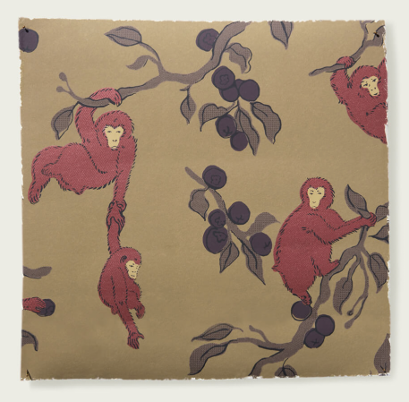
The kitchen started with wallpaper by Zak + Fox. I wanted to use this particular wallpaper with monkeys, as they reminded me of our client, Raushan, who is an active young woman with curly red hair. I was honest with her and said I saw the parallel between her and these monkeys while presenting this wallpaper. She laughed and said that she could see the resemblance, too. The purple fruit in the wallpaper gave us the color for the kitchen cabinets.

The decision that felt like a risk:
The layout was our biggest risk. In order to create a spacious entry hall, we connected the bathroom directly to the kitchen. But do you really want to have a toilet next to the oven? No! So we created a small room inside of the bathroom to hide the toilet.


The scrappy storage addition:
We found the yellow freestanding cabinet at a flea market. We liked its form and size, but the wood was not in the best condition, so we just painted it.
The detail the homeowner sold us on:
The soft bench in the kitchen. Initially, we wanted to install a narrow kitchen island with some stools.

The unconventional material that just made sense:
Our client infrequently cooks, and she wanted the kitchen to be more like a relaxed area for meeting with friends. When you have a brief like this, you can easily go for a tiled countertop.

The nonnegotiable:
The rolling library ladder was our dream. We really like ladders; they visually pull out the ceiling. So when we can, we add a ladder.
The coolest artisan we uncovered during this project:
For the first time, we worked with the plaster specialist who created the plaster corbels under the transoms. He wanted to go crazy with these decorations, [so much so] we had to stop him.


The trick to making art stand out:
In general, we really like to create unexpected effects with the wall art. The classic technique of placing pictures in the center of a bed or sofa is quite boring—twists like this corner are better.

The detail I’ll use again in a future project:
Stained-glass doors! We have never done them before, but we are so in love after this project. We blew up the whole city trying to find either a specialist or someone making ready-made stained glass (we went with ready-made glass). The colors of the glass were quite limited, but we like how we combined the chosen ones into one complete picture.


