We may earn revenue from the products available on this page and participate in affiliate programs.
Interior designer Kate Marker has been transforming homes for 20 years and is known for her signature mix of modern and traditional styles. She acknowledges that the most common source of anxiety among homeowners during (or even before) a design project is actually the most flexible and fixable part of the process: choosing paint colors. In her newly published book, The Love of Home: Interiors for Beauty, Balance, and Belonging, she dedicates a chapter to the topic, reminding her readers that it’s the easiest and least expensive thing to change when designing a home. To make it less nerve-racking, she also includes her 12 tried-and-true hues. See them in the excerpt ahead.
While I hope you feel energized and empowered to experiment with any colors that express what you want to feel in a space—get going with sample swatches!—I know it helps to have a solid place to start. The following whites, lights, and darks are the foundational paint colors I keep coming back to time and again, and here’s why.
Whites and Lights

Stepping into spaces with lots of white and neutral tones can feel easier to breathe in and open to possibility, and they also provide a perfect canvas for layering in pops of any color or pieces with interesting texture. But it can be a challenge to find whites and lighter paint colors that have no funky undertones and look beautiful in all different lighting environments. Here are some of my favorites that always deliver.
Oxford White by Benjamin Moore
Oxford White, Benjamin Moore

Closest to a true white—bright, crisp, and great for projects with a modern appeal. I used this color on the exterior of my Italianate-style home to freshen it up to today’s more modern look.
Simply White by Benjamin Moore
Simply White, Benjamin Moore

Strikes the perfect balance of being a fresh, bright white without being harsh. It’s my favorite trim color yet is equally beautiful on walls in nearly any room.
White Dove by Benjamin Moore
White Dove, Benjamin Moore

Creamier and warmer than Simply White, perfect for spaces that have a generous amount of natural light.
Swiss Coffee by Benjamin Moore
Swiss Coffee, Benjamin Moore

Cozies up a space with touches of gray and cream and is less reflective than other whites, making it a natural choice for a vintage space. I used this color not only in my 100-year-old home but in an abundance of client projects.
Classic Gray by Benjamin Moore
Classic Gray, Benjamin Moore

Offers just a whisper of color and is one of the best combinations of soft gray and warm white in one. I especially love this one cut to 75%, as it lightens the taupe-y white even a bit more.
City Loft by Sherwin-Williams
City Loft, Sherwin-Williams

Welcoming and muted, a pale taupe-gray that is especially wonderful on kitchen cabinets.
A Moody Blue and Darker Hues


For darker colors, I’m drawn to deep grays, dense hues of navy and inky blues, and a variety of greens. I love how dark color can ground and define a space in the best way, making the people in it feel a little more “held,” too. And there’s more diversity in this grouping than you may think, as the same paint color can present in a completely different way depending on hardware, light fixtures, the light exposure in the room, and art pairings.
Wrought Iron by Benjamin Moore
Wrought Iron, Benjamin Moore

Makes a stunning backdrop for gold, brass, or polished nickel hardware; it feels very classic but with a touch of green-blue.
Kendall Charcoal by Benjamin Moore
Kendall Charcoal, Benjamin Moore

Brings a smooth yet approachable sophistication to any space. This is a great charcoal with a hint of brown to it.
Manor House Gray by Farrow & Ball
Manor House Gray, Farrow & Ball

Evokes beautiful shades of grays and greens, and pairs seamlessly with bolder darks or subtle lights.
Studio Green by Farrow & Ball
Studio Green, Farrow & Ball

Yields a refined yet earthy essence, especially wonderful for pensive rooms or spaces.
Down Pipe by Farrow & Ball
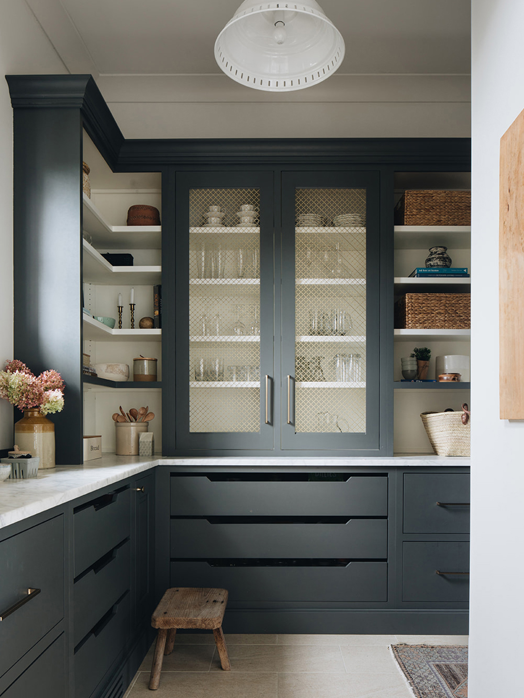
Down Pipe, Farrow & Ball

Presents differently in every setting, making it mysterious and a “most asked about” gray paint color from my followers and clients. (See it in the first image of this story, as well as on the cabinets with glassware.)
Hale Navy by Benjamin Moore
Hale Navy, Benjamin Moore

Pairs well with nearly anything—so versatile that I consider it a neutral. Just a good old classic, true navy.
“The Love of Home: Interiors for Beauty, Balance, and Belonging” by Kate Marker
Amazon