We may earn revenue from the products available on this page and participate in affiliate programs.
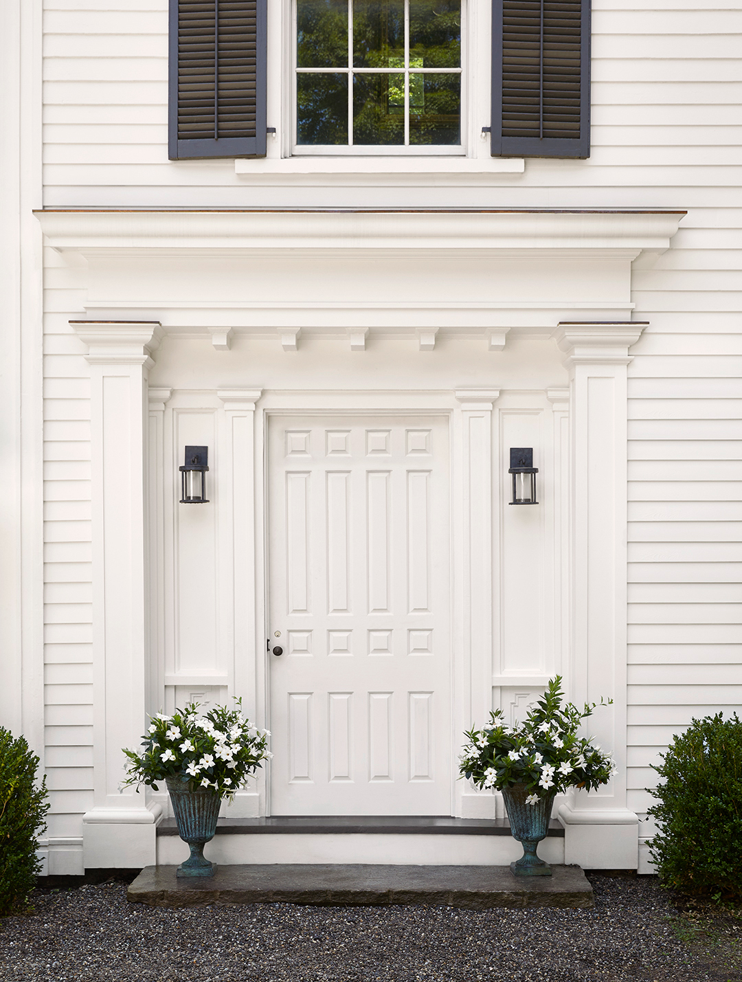
From the outside alone, Nina Garbiras immediately understood that restoring her repeat clients’ 1860s Greek Revival farmhouse to its former glory would involve more than a little TLC. “Every single one of the original rooms was covered by ’80s additions that were like barnacles hanging off the original exterior,” recalls the principal designer and founder of New York–based design studio FIG. Luckily, Garbiras knew just who to call: Joseph McGuier of JAM Architecture in Brooklyn.

Thanks to a shared design philosophy centered on honoring a home’s history, Garbiras and McGuier collaborate frequently—and happily. For this Pawling, New York, project, the designer and architect decided to start from the outside and work their way in. Here, they recount the process, from removing 1980s additions to discovering antique wood beams.

The thing we had to really sell our clients on:
McGuier: We could see there was this original beautiful Greek Revival farmhouse hidden underneath all of these bad decisions. So much of our work on this house was about the process of editing down and showing the clients how they could actually get more with less square footage—more natural light, more of the original character of the house, and more rooms that are proportionate to the home’s style, rather than these enormous, weird rooms that were tacked on. It was obviously more work than the clients bargained for. But they saw that the additions had to go because they had nothing to do with the house. They were hiding the soul of the place.


Our favorite material find:
Garbiras: The marble backsplash behind the range is one single piece of Paonazzo Biondo marble. Obviously, it comes down to whether or not the clients will respond positively to really dynamic stone—luckily ours did. I never want to be limited by my own imagination, and there’s this one marble yard that we both really like that gets a lot of slabs in that you’ve never seen before. We like a certain amount of drama when we install stone that’s going to be in the forefront. You want it to speak to you. This slab is dynamic in a way that’s not showy.

A little adjustment with big impact:
McGuier: The clients really hang out in the kitchen. They actually cook. In fact, multiple family members cook at the same time. So we wanted to give them room to all be there working together. Which is why we left more space than normal between the countertops. There can be someone prepping at the island and standing at the stove at the same time. And I think that adds to the airiness of the room. It’s more appropriate in an old country house without feeling too period.

Garbiras: That’s also why we designed the island the way we did, raising it up as much as we could while still giving them enough storage space. Storage is important, because there are no upper cabinets. But we didn’t want to have this monolithic island. We wanted it to feel lighter.

One of most challenging spaces to figure out:
Garbiras: The dining room was the one area that Joe and I both were a little nervous about in terms of how it was going to be used down the road. The clients really wanted a TV and a sofa in addition to a dining room table. There were many discussions about it, and we both hoped they would change their minds as we went along. They acquiesced and said, “Okay, we won’t put the TV there.” But our concession was the sofa. So we added seating that doesn’t overburden the space. We felt that we had done all this delicate, important work in removing the additions, and we didn’t want anything to overpower the view. They have 48 rolling acres behind them. There’s a creek and this beautiful tree. We really fought to keep it simple.


A pleasant surprise:
Garbiras: When we opened up the ceiling upstairs, we found these beautiful chestnut beams. We chose to expose them and then were able to repurpose a couple of them. One is above the kitchen range, and we had another made into a door.

Why we went moody and dark:
McGuier: One of the reasons we were so passionate about getting the home back to its original form is because it had these really spectacularly sized windows, since the house was built at about the time that lightbulbs were becoming available. Electricity was sort of a new thing. The house was designed to let all this light in on purpose. So we really had to get back to that.


Garbiras: Yes, the clients really wanted dark colors. We ended up using Farrow & Ball’s Hague Blue and Benjamin Moore’s Mysterious. But there was no way we could have done it without the light. Now it feels moody, warm, and inviting.

The “old” details that are actually new:
McGuier: We had to introduce some new molding to replace damaged or missing pieces. For that, we removed the existing moldings, stripped them down, took exact measurements, and reproduced them. Our approach from the architectural detailing standpoint was to introduce as little new vocabulary as possible, particularly in the dining room, living room, and library, which were fairly intact. In the kitchen, mudroom, pantry, and bathrooms, we had a bit more freedom because they were new spaces.


Garbiras: JAM introduced the board and batten in the entry of the mudroom and the butler’s pantry, which just ties together so beautifully with the rest of the house.

McGuier: I think of houses as people. My goal was getting this house back to a place where it could be a true expression of itself. That’s why we were really careful to add and introduce things that the house would be comfortable with. We want the house to breathe easily.

