We may earn revenue from the products available on this page and participate in affiliate programs.
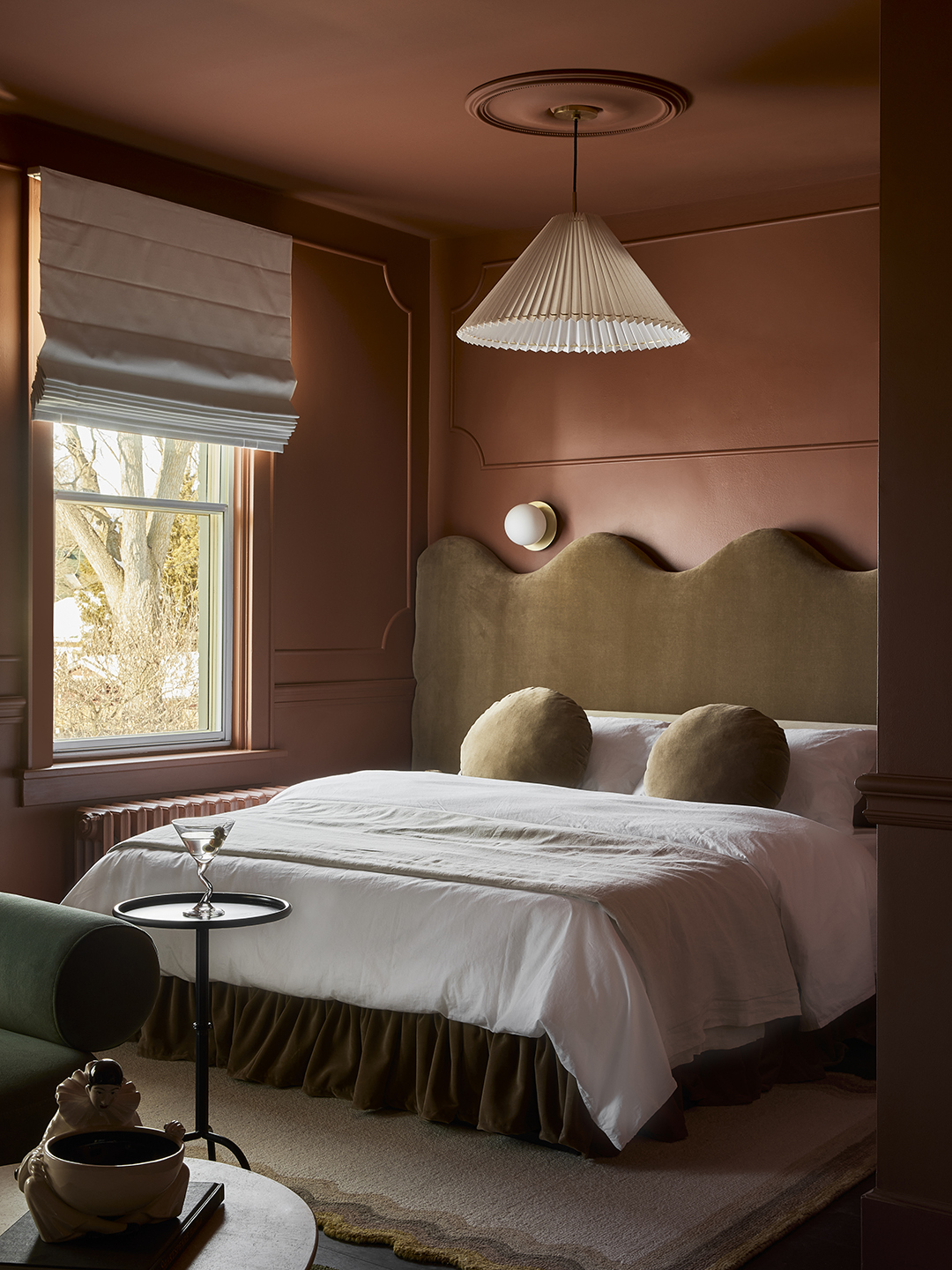
When Jake Tayler and Paula McFarlane decided to buy a 19th-century row house in the heart of Stratford, Ontario, a town known for its theater scene and Shakespearean influences, and turn it into a hotel, they called Autumn Hachey right away. The founder of You Should Stay Here has become a wiz at designing, branding, and marketing short-term rentals and vacation destinations. Hachey, playing a game of phone tag, then gave Jillian Smith-Moher, one of the interior designers behind Twenty-Two Twelve, a ring. Their two firms had collaborated twice before with much success, and if Hachey was going to create the nine apartment-style rooms that now make up Hotel Julie, she’d need some help.


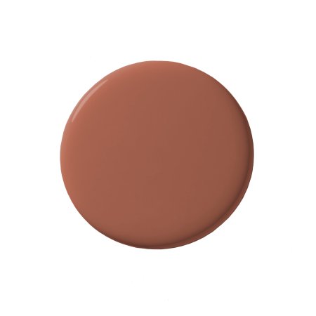
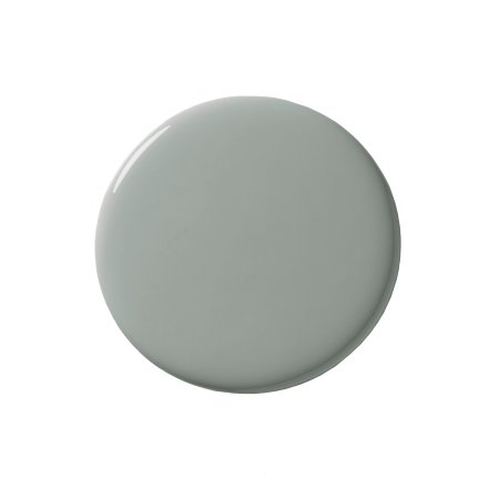
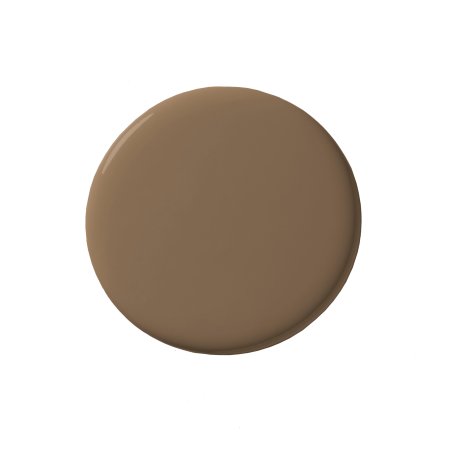
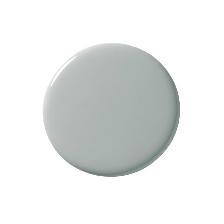
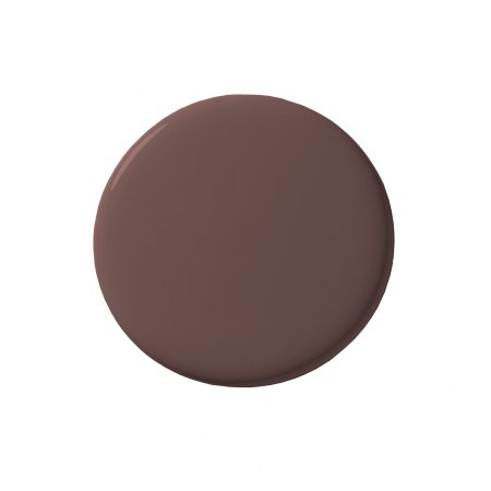
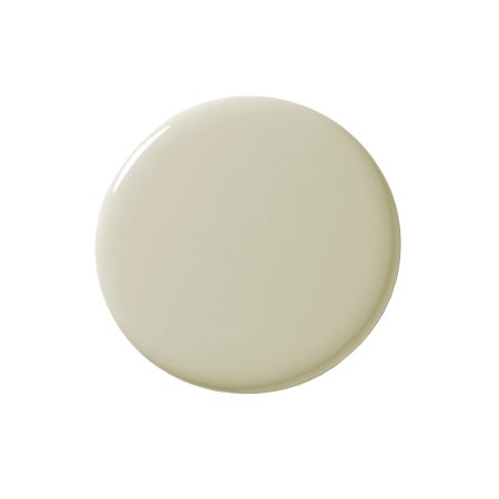
“Jake and Paula are property developers, so for them it was really important that the suites be able to operate as individual apartments in the future,” shares Hachey. Every single space, with the exception of one that was too small, has its own fully functioning kitchen and AC unit. If Smith-Moher and Hachey had wanted to save themselves some stress, they could have easily bulk-ordered white paint, quartz counters, and stock vanities and copy and pasted them into each suite—but they didn’t. Instead they gave each space its own bold personality. Fortunately, the pair documented the transformation of each flat in-depth in a 10–episode TV series for CTV Life. But if you want to walk away with all their bright ideas ASAP, read on for our favorite moments plus a list of the paint colors used throughout.
When You Can’t Do a Door, Try a Keyhole

Flat 4 proved to be a challenging one to design. The space was just small enough to not be able to fit a true wall with a door separating the bedroom from the lounge area. As a solution, the designers devised an extra-large keyhole-shaped opening with the help of Hemme that features velvet curtains that fit with the drenched-in-green theme. “It is an homage to Stratford and the theater, and it just has so much visual impact,” says Hachey.
Pick the Stone Cuts No One Else Wants

Diamond checkerboard floors automatically exude old-world energy, but you typically don’t see stone laid out in the same pattern anywhere else beyond underfoot. Why should the walls be left out of the fun? Behold: the kitchen in Suite 6. There, the design duo applied the same travertine and marble tile to the upper half of the room, almost giving it the look of wallpaper.
When selecting the travertine, Hachey and Smith-Moher specifically opted for a cross-cut version, which turned out to be the least popular style, making it a lot more cost effective. “It actually worked better in our space because we used burl wood [for some of the furniture], and they look quite similar,” says Smith-Moher.
Introduce Light to a Galley Kitchen in Creative Ways


For Smith-Moher, Flat 3’s color palette felt like the biggest risk: The deep violet and dark chocolate hues they chose for the space ticked the moody box, but the question was, would it make the galley kitchen feel dark and dismal? “Just because it was separated off from the space,” she notes. To introduce a touch more light to the galley, they carved out a round peephole in one of the walls.
Bring Together Blue and Burgundy

Smith-Moher is no stranger to the burgundy-blue combo they used in Flat 7: These colors exist in her own home. Although she didn’t realize the connection at first when they landed on the hues. “I wondered why I liked this so much, then I realized afterward, this is what I’ve done in my house,” she says with a laugh. The Rosa Levanto stone was one of the first options they found for the project, and it turned out to be a win for the budget. It’s significantly less expensive than Calacatta Viola, which they used sparingly in the hotel.
Swap Out the Top of a Store-Bought Table

When it came to picking out furniture for the suites, reupholstery was the name of the game. The plan spanned from a curvy vintage sofa now swathed in House of Hackney’s Artemis Moss velvet to bespoke wavy headboards by Kara Shuster from And Once We Were. The designers even hacked a CB2 outdoor dining table (now in Suite 4) by swapping out the round top for a green marble one that was originally intended for a coffee table. “It fit perfectly and just increased the way that the space looked tenfold,” says Smith-Moher.

