We may earn revenue from the products available on this page and participate in affiliate programs.
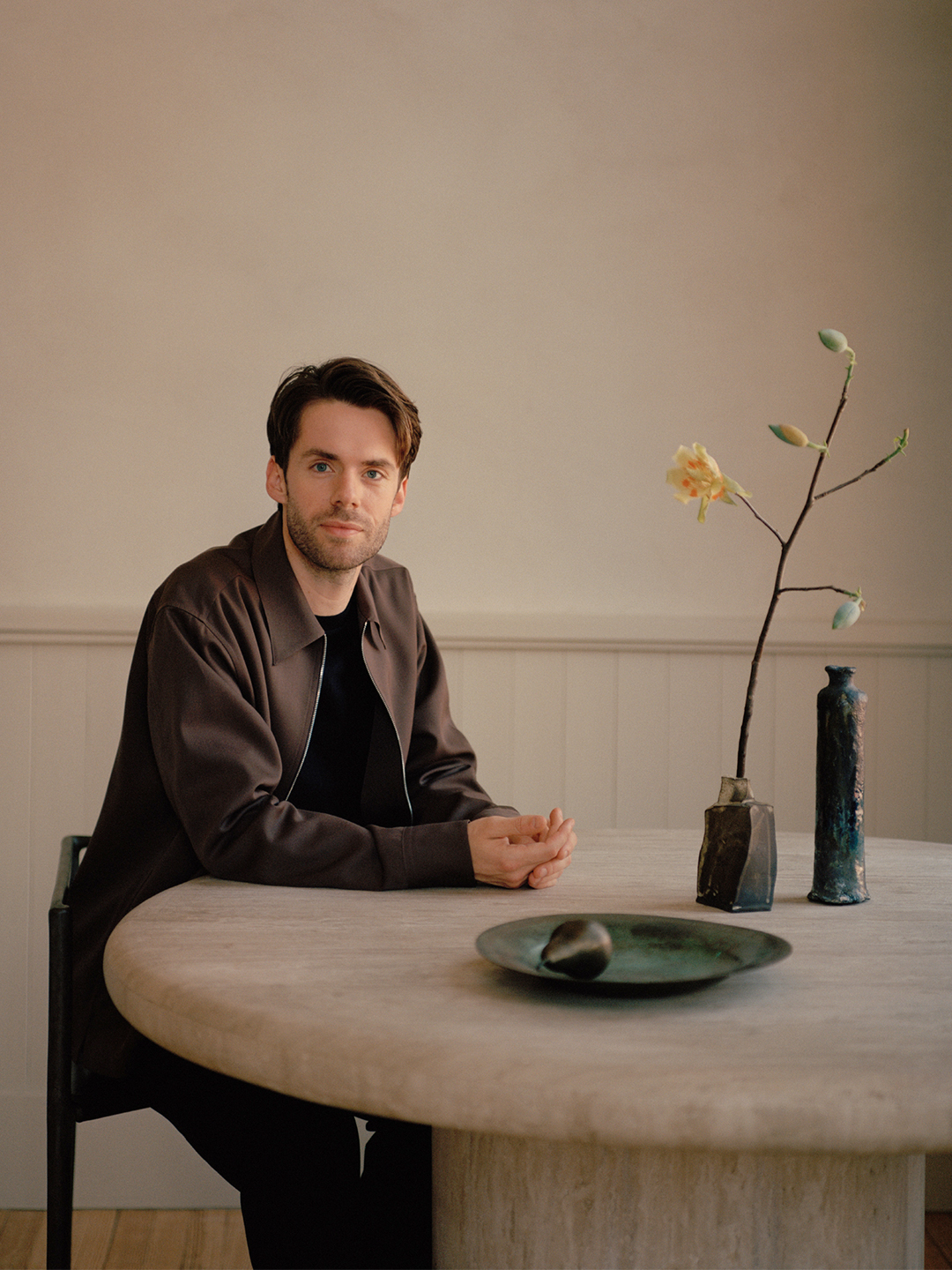
In his new book, Arranging Things, interior stylist Colin King collected images from his past work, his greatest hits, and even his iPhone to distill them into one highly teachable book that will make you want to stop scrolling and start marking pages with Post-its.

Sure, the coffee-table tome is a yearbook of sorts for King, who has styled the homes of Gwyneth Paltrow and Drake for shoots—and just launched a new Japanese- and French-inspired collection with Beni Rugs. But his book is also a guide on how to artfully arrange your own home. “I just hope people can really look beyond the intended use of their objects and see the things they already have,” King says. “I hope it demystifies styling a bit.”
Here, we ask King to elaborate.
Styling seems to intimidate people because there are a lot of rules. Do you think there are rules?
I feel like there are no rules. But then in a world of infinite possibilities, that’s the thing that probably intimidates people the most: Where the heck do I start? The first chapter is titled “Parameters,” because it’s about looking at your space as if it were a 1,000-piece jigsaw puzzle, starting with the border and working your way in to find little pieces that fit together. Then step away and come back to it. So much of it is trial and error.

Do you mean the jigsaw puzzle as a metaphor, or should someone literally style a bookshelf from the outside and work their way in?
It’s a metaphor. If I am looking at a bookshelf, first I like to take everything off, just so I can see the structure. And from a parameter standpoint, you are limited by depth and height and what can fit in there. You’re also limited with what you have. The book is not advocating getting new stuff. Look at the stuff you already have in a new way, and try it in different arrangements.

At Domino we always tell people to fill their homes with things they love, but what do you do when the thing you love doesn’t make sense with your other objects? How do you edit?
I’m a huge editor. Ruthless. I’ve never regretted not filling a space. I kind of love living with emptiness. When we get into the mindset of filling something just to fill it, that’s when we start making mistakes—or at least that’s when I make mistakes.
I hate to compare it to a wardrobe, but we all have our favorite shirt and our favorite pair of jeans, but we don’t obviously wear them every day. So just because you love it doesn’t meant it has to be on display all the time. Or maybe you find that it doesn’t play well with others, so it has its own moment somewhere. Maybe you find a planter pedestal for it. There’s so much power in singularity.

It surprised me to see a color chapter in the book because I think of your work as primarily happening in a neutral palette.
I have a lot of respect and reverence and fear of color. I love when it’s used really intentionally and in a very bold way so that it becomes what the room is about. I don’t love when color stops, like with a baseboard or crown molding. I’m so for color wrapping all the way onto the ceiling and then maybe it pours onto the baseboards and there’s tonal drapery. I really love when it floods the room. And then everything else can support that full dose.

Is there a color family that you gravitate toward?
I’m going to list every color of the rainbow. I lean toward dustier hues—it’s the saturated and primary colors that I tend to avoid. My bedroom is this deep reddish brown, and the end pages in the book are this aubergine eggplant. So I like either really deep versions of a color or, on the opposite end of the spectrum, dustier versions.

Have you thought about how people will style your book in their homes?
I’m very curious! I was actually pulling out some of my favorite books and seeing how it sat on all of them, and it sits quite nicely because it’s not a huge monograph. It has this cool square shape. I don’t know if it’s a solo piece, though, because I like the idea of it living with other books.


