We may earn revenue from the products available on this page and participate in affiliate programs.
When you walk inside this rental cottage in the English countryside, you half expect Hansel and Gretel or Little Red Riding Hood to greet you by the roaring fireplace in the living room. It looks like something straight out of a fairy tale, and that illusion was an intended one. “The brief as a whole was to create something quite whimsical and magical,” shares London-based interior designer Emma Ainscough, who founded her own studio in early 2020 and began working on this charming three-bedroom retreat, now dubbed Charlotte’s Folly, in November 2021. The “gingerbread-like” decorative barge boards that frame the roof, the lattice windows, the pastel pink facade—that was all new. But inside, Ainscough had to balance the vacation property’s playful dollhouse aesthetic with practical space-saving solutions.


In fact, the entire ground-floor layout changed significantly—the main living room now opens up to the dining space for better flow and boasts double doors leading out to the garden. Ainscough also repositioned the kitchen sink on a side wall to maximize counter space and tiled over slanted beams in the shower that couldn’t be moved for structural reasons. “Generally, a lot of the spaces were so small that it was a challenge to fit what we needed everywhere (my client wanted tubs in both bathrooms!),” she shares. “All the more reason to lean into the cozy cottage vibes to make it work.”

The first thing I bought for this home:
I knew the dining table had to be unusually slim to suit the small space. I was worried I wasn’t going to find something that would work, but then I stumbled upon this perfect farmhouse table from a lovely U.K. antiques supplier. The beautiful quality timber goes really well with the varying natural tones of brown in the room.

The moment I bet big on:
The dining room overall felt like a risk—the combination of the bold striped wallpaper against the bespoke dried floral installation. I briefed our clever florist on the colors of the flowers to ensure it wasn’t too overwhelming and that the tones worked in the space, and she got it just right. I did have a few sleepless nights that these design elements would feel too much in such a small space.


The detail I had to convince my client to go with:
The checkerboard tile on the entire wall above the kitchen units was a bit of a sell. Generally, they agreed that more was more, but this one took a little bit of warming to.


The item I will definitely use again in a future project:
I used Mark Lewis [hardware] on all the kitchen cabinetry as well as various hooks and bathroom accessories for the first time, and the quality is really beautiful.


The coolest source I discovered during this project:
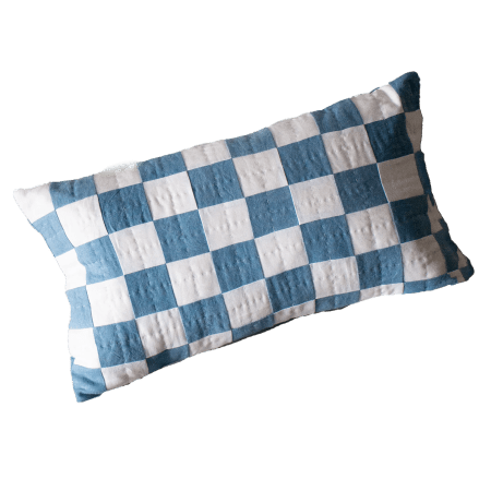
I was lucky that Glassette launched online during the procurement stage. In came a huge source of inspiration and exciting products from small businesses and artisans, particularly those smaller items such as table lamps, cushions, and throws that can really create the magic in a space and are often overlooked.


The area that pushed my space-planning skills:
The blue bedroom is very long and thin, and it was awkward when it came time to place the bed (the client was keen to have super-king-size beds throughout to maximize on luxury for the rental aspect). I decided to lean in on this and create a really cozy nook. You can close the curtains and be totally cocooned in the bed area. The tented ceiling was also a challenge, which my curtain maker took on with open arms—the fabric is gathered at a central point with a pendant lamp and drapes out to each corner and wall.

My biggest save:
I picked up a vintage kidney dressing table on eBay for 40 pounds [about $50], which my upholsterers re-covered, and I added a little matching stool. The bones were so cheap, which allowed for some lovely fabric work, and the end result still has that vintage feel about it.

The print that sums up the mood of the home:
The whimsical wallpaper in the green bedroom reflects the magical feeling of the cottage. I love the movement and delicacy it has. The small eaves offered the perfect home for it. Going up and over the ceiling with the paper added to the cost, but it is such a beautiful paper that it was worth every penny. It is definitely my favorite room.


