We may earn revenue from the products available on this page and participate in affiliate programs.
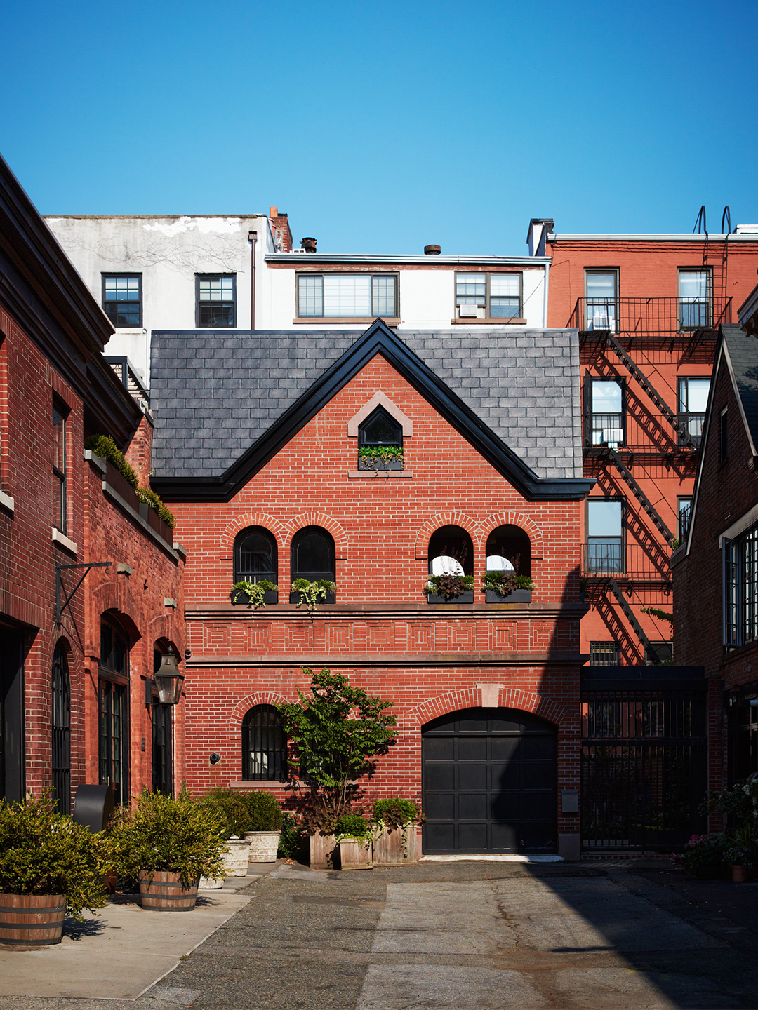
At the end of a quiet, leafy alley in New York’s historic Brooklyn Heights is a home that has lived many lives. Originally built in the 1840s, the structure was first used as a stable, then subsequently as a garage, before it was extensively renovated and expanded into a home in the late 1990s. And while the architect who took the project on more than 30 years ago received local historic preservation accolades for its facade design, the couple who bought the place in 2016—an author and a filmmaker—called on Ward Welch of NYC-based Studio SFW, along with cofounders Erin Fearins and Rachael Stollar, to give the interior a modern facelift.


The designers had completed the first phase of the remodel almost 10 years ago, but they returned to it in early 2021 because “there were still layers to be added to the interior,” says Fearins, noting that the existing space was very “‘90s mod” and disjointed in a way that made its 1,500-square-foot footprint feel disorienting. There was also nearly as much room outside (1,200 square feet, specifically) as inside—a curiosity that they decided to use to their advantage by building a pull-in parking area, a private back patio, a charming dining porch surrounded by arched openings, and a spacious roof deck perfectly suited for entertaining. Though, funny enough, the best view of the New York sky can be found indoors. An epic skylight casts the living room in an ethereal glow.


“It used to be this weird octagonal contraption, with just triangular pieces of glass caulked together in the form of a roof-mounted pyramid,” recalls Stollar. “Part of the brief was to replace it and stop the incessant leaking, condensation, and sun fading of the furniture and books directly below.” The solution? A UV-protected vented unit. “It might not sound sexy, but the resulting shift of light and thermal efficiency is spectacular. At just the right time of day, it forms a diamond on the bookshelves,” she adds. Here, the partners take us behind the scenes of what went down in the making of the home.

The first thing we bought for this project:
Erin Fearins: The vintage Murano globe pendant lamp for the new staircase. We knew it was perfect and would take advantage of all the natural light now coming into the space from multiple directions.

What we’ll take with us into the next house:
Rachael Stollar: We worked with several of our trusted collaborators on this project, including our contractor, Pilaster LLC, and our landscape architect, Liz Pulver. This allowed us to customize everything, including adding a green roof around the skylight, herbs for use in the kitchen, and evergreen hedges to provide privacy from the neighboring homes, which are all several stories taller. [All of this] makes it feel like an oasis in the middle of the block.


The standout storage moment:
Ward Welch: Being an author and a documentary filmmaker, the clients have a lot of reference material in addition to books on art and culture. Integrated bookshelves are featured throughout, a win-win for storage and display.
The biggest splurge:
Fearins: The skylight designed by U.K.-based company Glazing Vision was an investment piece, but because it’s thermally efficient and maintenance-free, it’s a surefire way to lower energy bills in the long run.


The brand we discovered (and will use again):
Fearins: We loved working with Hinterland Design for the mixed-media coffee tables in the living room. We customized the designs with black walnut and glazed clay, and the pieces turned out beautifully.
The detail we sold our clients on:
Stollar: There is a mini greenhouse on the top floor, situated behind custom steel and glass doors. One of the owners is a horticultural hobbyist and had been growing plants in an indoor DIY setup. It was tucked away but still an eyesore. We suggested absorbing the grow room into the floor plan, keeping the mess out of sight but allowing for easy management of the “garden.” Grow lights are integrated into a series of shelves that allow water to drip through to the bottom.


The game-changing choice:
Welch: A new staircase connecting the second floor to the roof was the final touch on opening up the interior. We knew it would make it feel more connected, but the transformation was even more significant than we thought.


