We may earn revenue from the products available on this page and participate in affiliate programs.
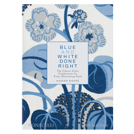
In Hudson Moore’s new book, Blue and White Done Right, the design editor examines one of the most popular and everlasting color combos of all time: blue and white. “It’s a match made in heaven, a classic pairing, the design world equivalent of milk and cookies—or better yet, champagne and caviar,” the book begins.
Ever since the ancient Mesopotamians used the pairing for pottery glazes (the earliest recorded use), blue and white have been inseparable. The best part? No matter your style, the combo just works. In this excerpt, Moore shows us two distinct ways designers have used the two colors over the years.
Modern

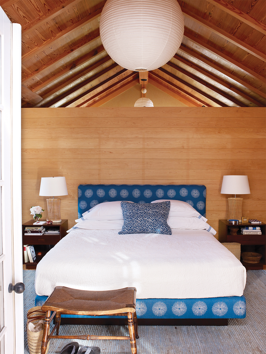
Even the best modern interiors can sometimes feel austere. Not so when blue and white become part of the equation. The duo lends a gimmick-free liveliness to any genre—and bends especially well to a contemporary, no-frills approach. Consider it a shortcut to keeping things light, no matter how strict the sensibility.

Spare & Sensual

The less-is-more camp of decorating can be deceptively complex: Your floor plans are so seemingly simple, your schemes so elemental that anyone from the maximalist school of thought might believe that furnishing with a minimum of materials is a piece of cake. But anyone who’s a proponent of editing knows that the more you take out of a room, the more impactful anything left behind becomes, which means those people have to bring their A game to the festivities or the design will fall flat. It’s also why blue and white should become a major tool in your pared-down arsenal: The combination will give you the depth and dimension you crave without a whiff of fuss.


Excerpted from Blue and White Done Right: The Classic Color Combination for Every Decorating Style by Hudson Moore with Mario López-Cordero. Published by Schumacher and Monacelli.


