We may earn revenue from the products available on this page and participate in affiliate programs.

Minimalists by nature, Natalia Swarz, Barefoot Living author and founder of Hôtel Weekend, and her artist husband, Armando Mesías, knew they could create a home reflective of their personal style regardless of its size—even if it was only 700 square feet and even if they were about to welcome their first child. So in December 2021 while Swarz was eight months pregnant, they bought their apartment in Madrid’s La Latina neighborhood, though they didn’t move in until the following summer after all the renovations took place. “The place wasn’t the biggest, but it had charming features, such as sunset light and views above the Viaducto de Segovia stretching all the way to Casa de Campo Park,” says Swarz. The couple’s take on minimalism doesn’t involve the usual stoic white backdrop and angular furniture, but rather muted tones, warm textures, and curves—a nod to their upbringing in Colombia. “We wanted all the materials in the house to be as natural and ‘rough’ in finish as possible,” explains Swarz.


With the help of Atrato Estudio, they wiped out the preexisting kitchen and turned it into their daughter Ceci’s nursery, adding a glass door so they’re able to see her playing in her room while they’re cooking in the new space. “In the original floor plan, there was an entrance and storage area that was a bit awkward and too big for the apartment,” says Swarz. Now when you walk in, you’re greeted by an aluminum island designed by Copenhagen-based kitchen company Reform. The raw metal won’t stay perfect-looking for long—it will oxidize over time, giving it a darker glow, and will show fingerprint marks—but that just makes it all the more interesting. “Armando loves to cook, so we wanted to integrate that with whatever is going on in the living room,” shares Swarz. To offset the quasi-monolithic structure, they opted for the brand’s Surface smoked oak cabinets along the wall.


In addition to the couple’s deliberate lack of clutter, their muted color scheme was pivotal in maintaining the home’s sense of tranquility. Mesías painted the walls and ceilings himself using Pampas by Bauwerk Color, a pale green-gray. The choice plays nicely with the Vetsak couch’s khaki-colored corduroy fabric. “The sofa is the comfiest on earth,” says Swarz. “It’s modular, so you can change things up if desired, and the covers are easily washable—both important qualities when living with a toddler!” The Noguchi-inspired rice paper pendant lamp (it’s actually Hay’s affordable version) adds another layer of softness to the space. The couple upgraded the super-lightweight find with a linen cord from The Fine Store.


In the bedroom, the pair set out to create a space for rest and relaxation, so they spared the room from overdecoration. The place they did want to foster a vibrant, energizing experience? The bathroom. They chose olive green zellige Moroccan tile for the shower because, combined with the dim lighting, it helps create a spalike tranquility. The shower was also toddler-proofed, in a sense. “The tiled bench was designed with Ceci in mind, and the way the shower is open without a glass door or curtain makes it so easy to slide her bathtub in there,” explains Swarz.


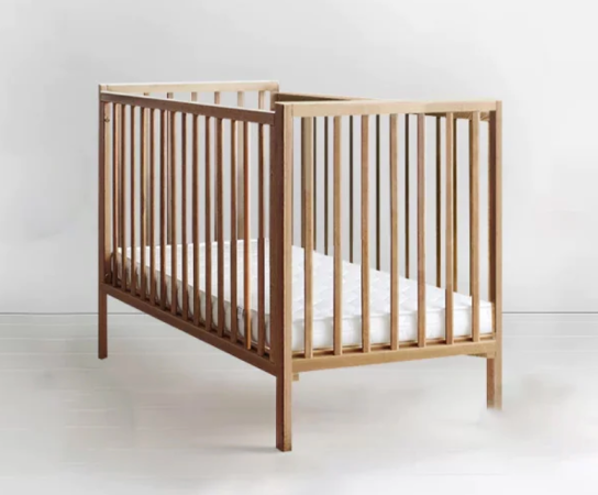
Many would argue that a child-friendly home would make it difficult to maintain a minimalist aesthetic, but by following the Montessori method, Swarz and Mesías were able to successfully sustain their vision even in their daughter’s nursery. “Honestly, the baby market says you need so many things, but in reality [they] just need love for the first few months,” says Swarz. “And as they grow older, you’ll see what they need little by little.” In addition to keeping things simple, the pair ensured that the room and items remained consistent with their chosen color palette, using warm cream textures, muted green walls, and natural materials—even carrying it into Ceci’s clothing and toys, which remain on display like decor.


“In the Montessori method, there’s an appreciation for natural materials like wood (versus plastic or battery-operated toys), so we’re lucky that it really fits with our home design,” shares Swarz. Still, Ceci’s room is always evolving as she grows, Swarz notes, so they change things up quite often. “Right now, we moved the crib to our bedroom, giving her more space to play in her nursery,” she says. “Nothing is fixed, so it’s easy to move and adapt according to her needs.”


