We may earn revenue from the products available on this page and participate in affiliate programs.

The first week that Kim West and her family moved to Austin, she drove past a Victorian with a roomy front porch and white picket fence and thought: What is that house doing here? “I sort of became obsessed with it,” says the interior designer and cofounder of Supply Showroom, a boutique fabric and wallpaper showroom. “I love old things and details, which is sort of the opposite of what the Austin architecture landscape looks like.” For eight of the 12 years she’s been in Austin, West drove by the unusual-looking property daily (it was only five blocks away from her house at the time). She eventually learned it had been transported from Marlin, Texas, decades ago by an architect who wanted to save it from being demolished.


Then one fortuitous day in 2020, a friend who happens to be a real-estate agent tipped her off: The Victorian was coming up for sale. Her husband, Dave, said he’d only go through the hassle of moving down the street if there was a view—West discovered one on her walk-through the following day. The large window in the attic bedroom overlooks downtown. “He got his view. I got my charm. Everyone’s happy,” she says with a laugh.


Part of the home’s allure was nostalgia: It looks like a life-size dollhouse. When West was living in London as a kid, she remembers her mom taking her out of school to go to Windsor to look at (and shop for) dollhouses. “It was our favorite mom-daughter activity,” says West. The home’s layout alone reminded her of the townhouses of her childhood, as well as the ones she and her family had more recently lived in when they were in Brooklyn. Plus when you design and sell wallpaper for a living, choppy rooms are a huge perk. “With all the little spaces, I could really explore pattern mixing,” she notes. Today there are a grand total of 13 different wallpapers in her home.


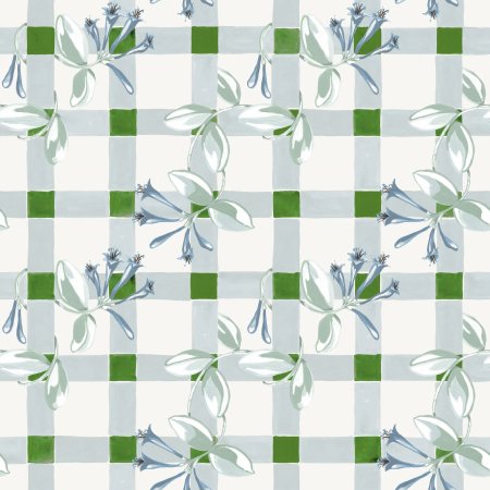
Like many designers, West started with a color story. As you make your way from the kitchen to the dining room and library, then over to the kids’ TV room, you transition through a sea of blush pink and green to soft blue and coral. “While they are choppy little rooms, they’re all open to each other,” West says of needing to create some sense of cohesion. Luckily, it never takes her all that long to make a decision. “I know what I like together,” she says. A few of her go-to pattern-mixing tricks include pairing a graphic motif with a floral repeat, such as the Thistle print in the bar room, or partnering a small-scale print with a larger-scale one. “I’m a sucker for a floral with something geometric going through it, like a stripe or a gingham,” she explains. The Honeysuckle treatment in the dining room delivers the best of both worlds: “That’s my love language.”

West isn’t one to relegate pattern only to wallpaper and window treatments, though. She also has a soft spot for patterned sofas—a passion she credits to her fashion industry days (she worked for Jil Sander and Marc Jacobs in wholesale for 10 years before making the shift to interiors). “I found that what all the best fashion people did is find this opposing marriage. Something has to be ‘ugly,’ something has to be weird. Let’s get weird,” says West. Reupholstering the two vintage sofas in the library in a paisley velvet ticked the box. There are three more patterned sofas elsewhere in the house, and West can attest that a print hides stains better than a beige couch swathed in performance fabric. “If you want a bang for your buck, pattern your sofa,” she says.


Even the sofa on the screened-in porch is covered in a whimsical print, except this one is both patterned and performance. “It can hold up to the wind and rain, all of it,” notes West. The cloud-inspired illustration was a fitting choice for being right next to the pool, plus West and her husband are suckers for blue and white.


“We’ve had a blue bedroom for the past 18 years,” West notes. The floral Abigail Borg wallpaper in their bedroom is a nod to Dave’s English roots (it’s made in the U.K.), and it was much more budget-friendly than some alternative designs West was considering. (She estimates they needed 60 rolls to cover all of the surfaces in the space). “I think I had my wallpaper hanger here every day for a month doing the house,” she recalls. But not everyone in the family was ecstatic about it. “My almost-12-year-old is rebelling and says she doesn’t like wallpaper,” says West. “She’s like, ‘Why can’t I just have a white room?’ and I’m like, you can…when you’re an adult.”


