We may earn revenue from the products available on this page and participate in affiliate programs.
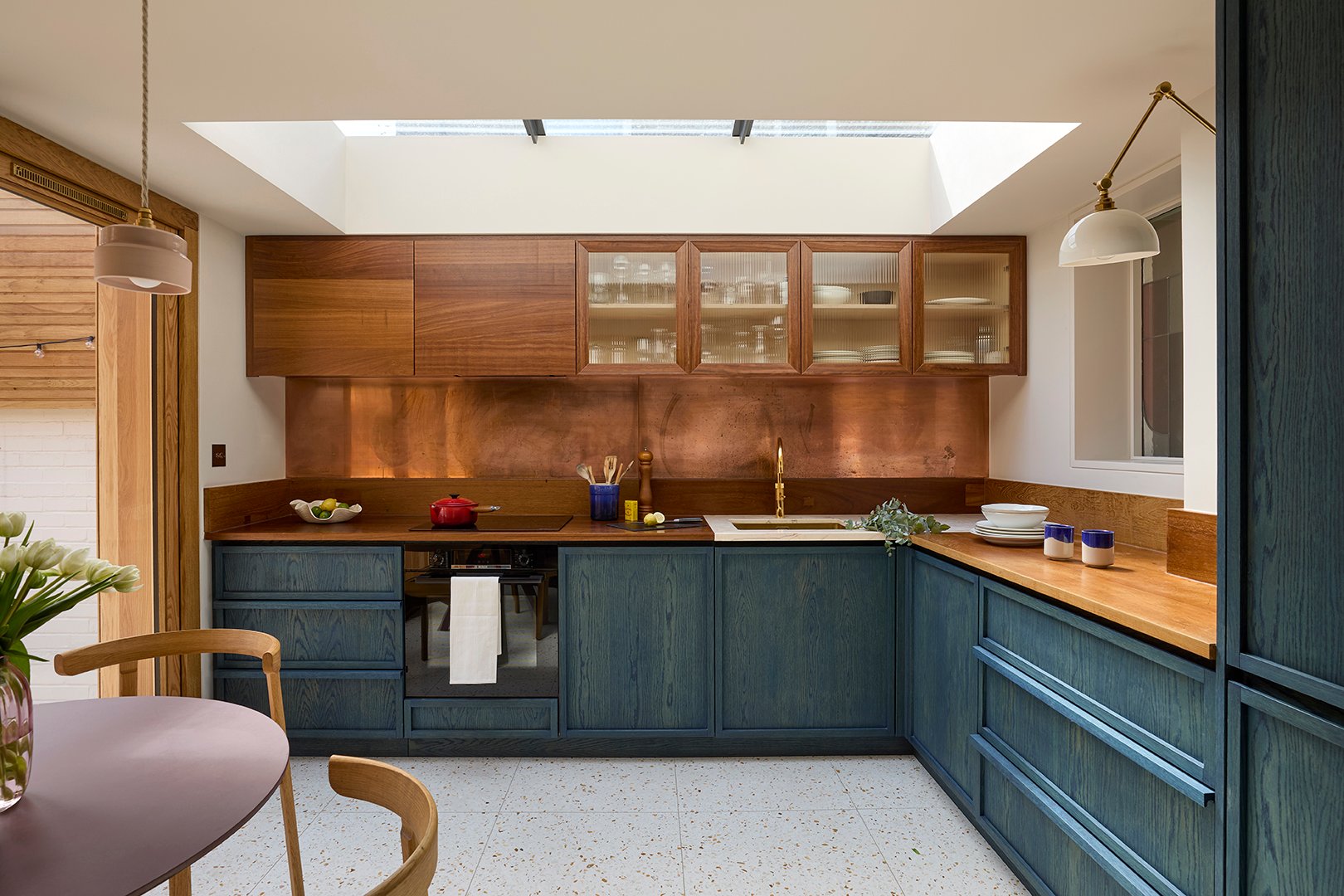
Blue kitchen cabinets aren’t necessarily groundbreaking. But stained blue millwork paired with a copper backsplash and countertops salvaged from a school science lab? That’s a different story. In this London dwelling, interior architect Anthi Grapsa took a homeowner’s favorite color and ran with it, creating a space that’s as rich in texture as it is in personality, and then adding similar splashes of color throughout the rest of the house.
The client, who works in the music industry and travels frequently, had purchased the home in Ealing a few years earlier. But the dated interiors and disconnected ground-floor layout weren’t exactly conducive to unwinding after a trip or hosting friends. Grapsa was brought in to rethink the flow, and over the course of a year, she replaced a poorly insulated extension with a new, light-filled kitchen, opened up the living spaces and patio, and gave the entire home a much-needed refresh.
The kitchen’s saturated fronts might be the star of the show, but there’s plenty of competition from touches like a custom etched-glass window to circus-inspired wallpaper in the powder room. We asked her about the renovation, the unexpected color combinations, and why, sometimes, the best design decisions involve looking up.
What were the main priorities for the renovation?
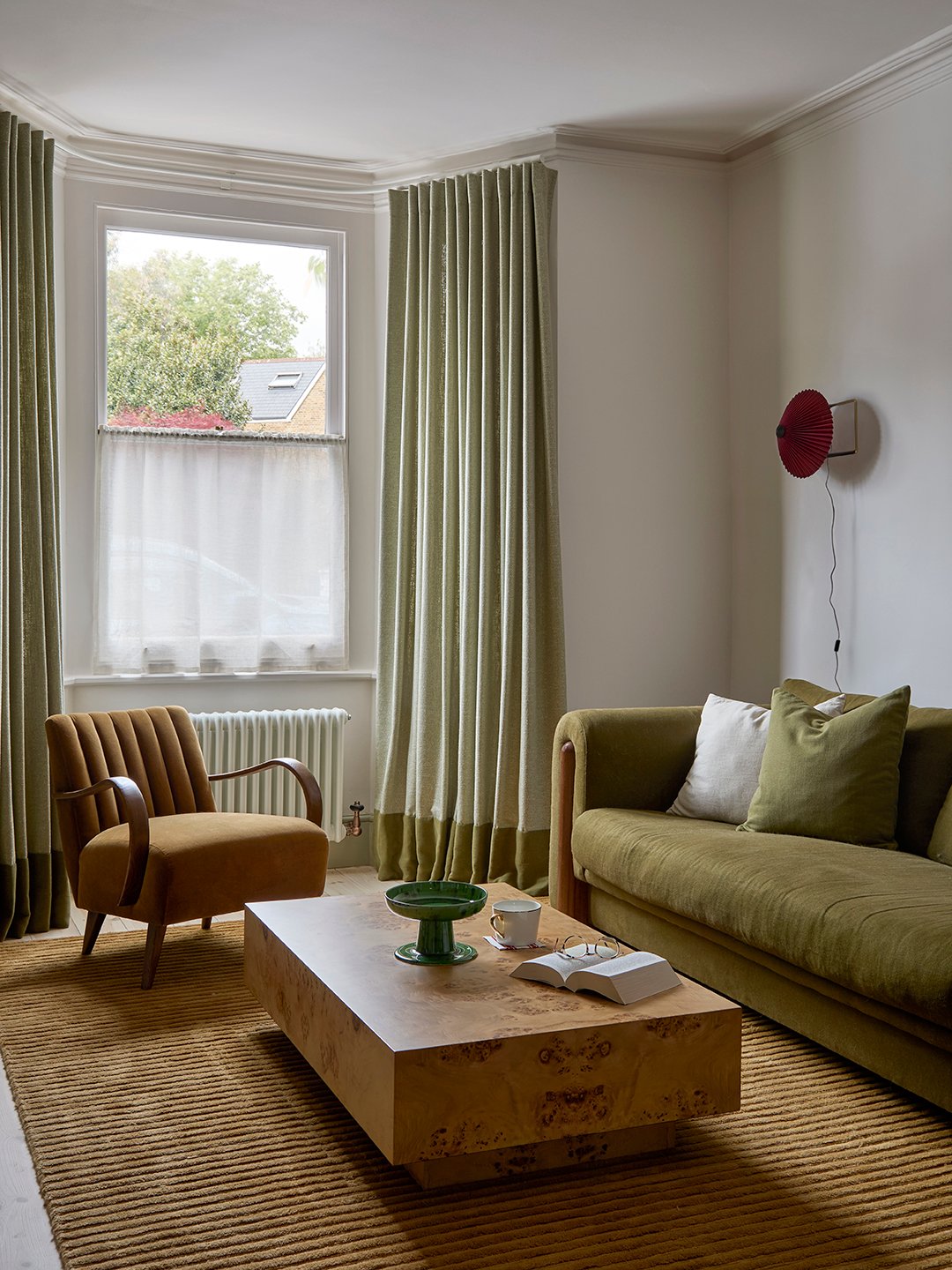
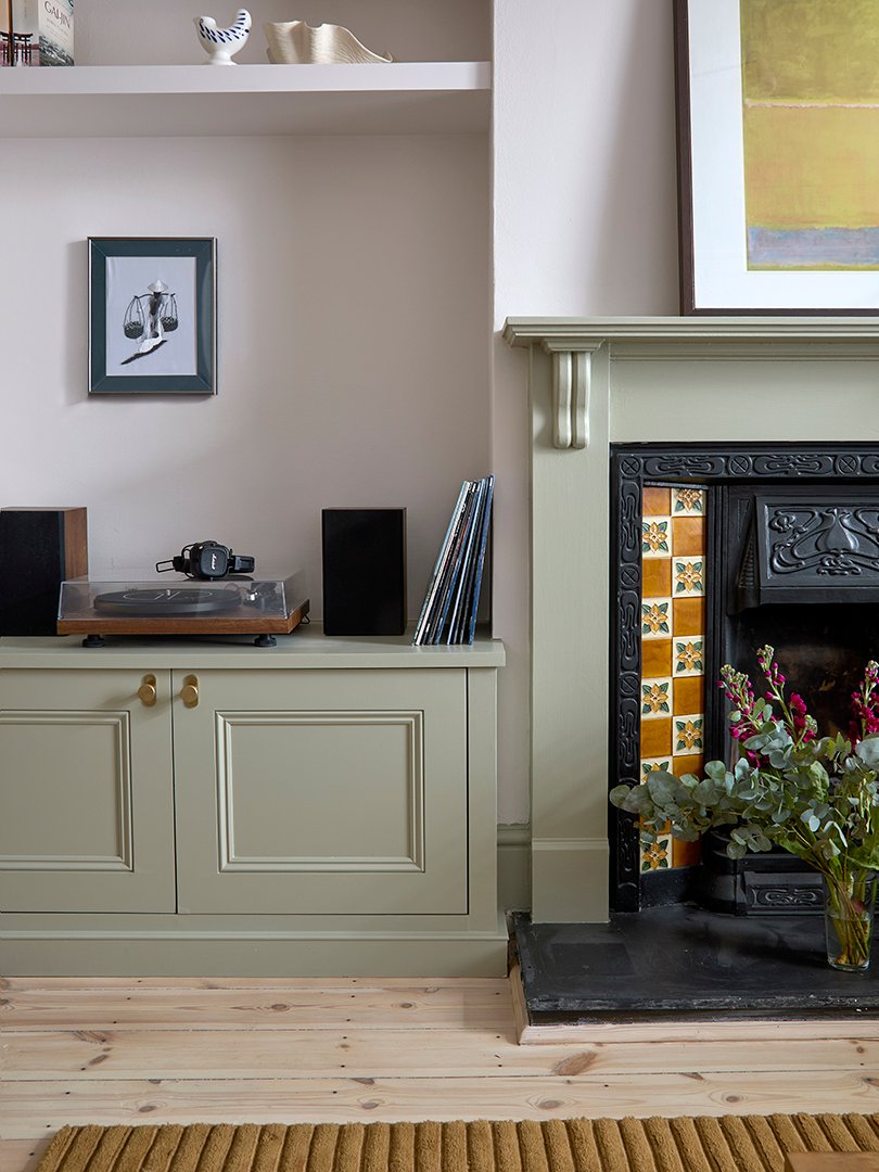
Rethinking the ground floor to create a more social space and make better use of the patio. I wanted to create a home that felt like a calm, welcoming retreat where she could unwind, recharge, and enjoy spending time with friends. The new layout is much more connected and better suited to entertaining, while the colors and natural materials bring warmth and personality to the space.
How extensive were the changes?
The cottage needed a comprehensive upgrade. There was a small glass extension at the rear that wasn’t constructed well. We replaced it with a new addition, which allowed us to open up the back of the house and create a new kitchen. This transformed the connection between that area, the dining area, and patio.
You worked with salvaged materials in this project. How did you incorporate them?
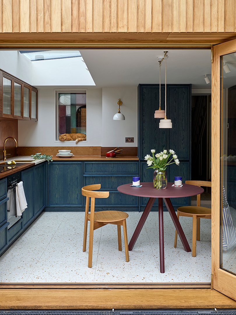
We repurposed reclaimed iroko wood from old school laboratory worktops for the kitchen surfaces, giving the timber new life in a completely different setting. I managed to salvage a piece of marble from a stone supplier I regularly work with and incorporated it around the kitchen sink, where it provides a practical, durable surface in the wet area. We also repaired and refinished the existing pine flooring rather than replacing it. I love mixing reclaimed materials with newer finishes. They bring a sense of history and individuality to an interior and stop everything from feeling too new or overly polished.
Why did you choose blue for the kitchen cabinets?
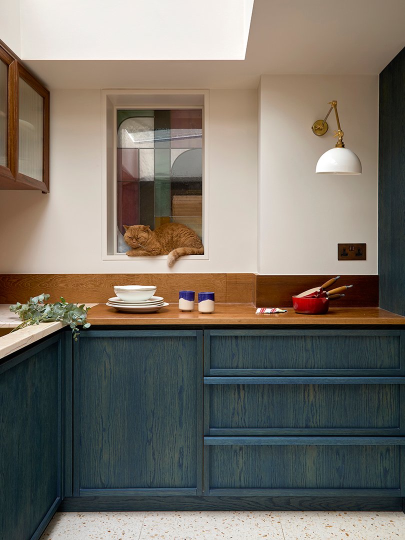
Blue is a color my client particularly loves, so it felt like the right starting point. Natural light pours into the new kitchen extension through a large skylight above, making it the perfect space to embrace a deeper, more saturated hue. The stain on the oak cabinetry was ideal because it allows the natural grain to remain visible, creating beautiful variations in tone, from brighter blues to deeper navy, rather than a flat, solid finish.
We paired it with a warm copper splashback; the rosy tones soften the cooler quality of the color. The terrazzo flooring adds another layer of texture.

What’s your advice for someone who wants to make a similarly bold color choice?
Consider the whole composition rather than the color in isolation. Think about the materials, textures, light, and existing elements that will sit alongside it. I also recommend testing samples in the actual space, as colors can look very different depending on the light and their surroundings. A bold shade becomes much easier to commit to when you understand how it will work with everything else.
The mood you want to create in each room and how the space will be used are also important points. I like to look at the palette as a whole, taking into account furniture, artwork, rugs, and any existing pieces the client wants to keep.
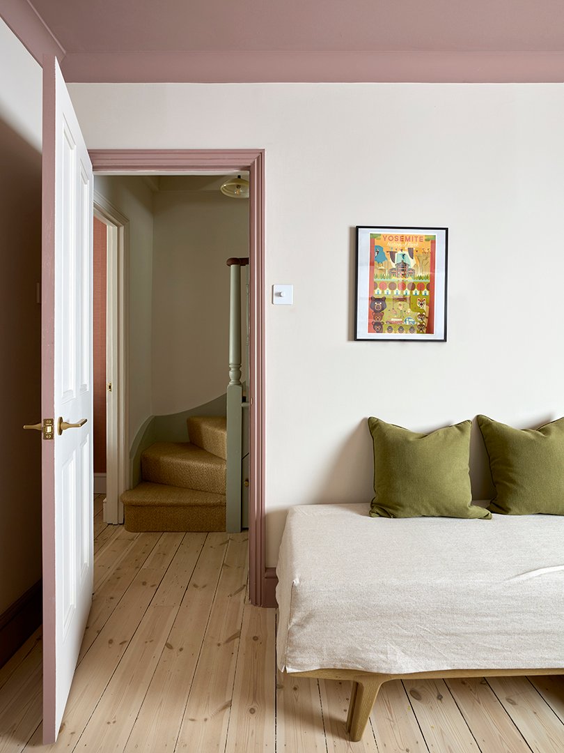
What inspired you to paint the ceiling and trim instead of the walls in the study-slash-guest bedroom?
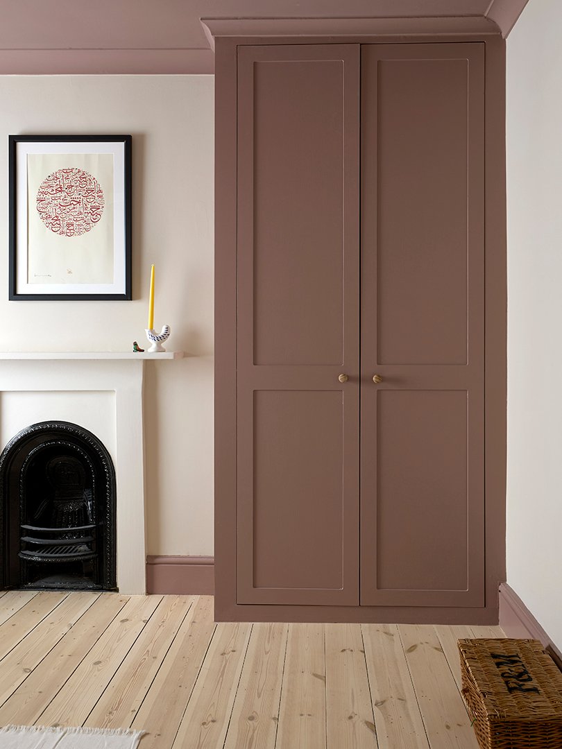
My client wanted it to feel as light and airy as possible. Rather than keeping everything neutral, I decided to use Rouge II by Paint & Paper Library on the ceiling, creating a warm, vibrant focal point without making the room feel too dark.
It’s kind of a reverse color scheme: Instead of introducing color on the walls, we bring it up to the ceiling and carry it through the doors, skirting boards, joinery, and trim. This creates a framing effect that adds depth and definition while allowing the walls to remain light. It gives the room character while keeping it versatile enough to function as both a study and a welcoming guest bedroom.
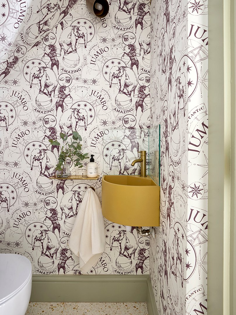
The powder room wallpaper is such a fun surprise.
I think smaller rooms are a wonderful opportunity to be more adventurous with color and pattern. You can create an immersive experience without overwhelming the rest of the house. The wallpaper is Jumbo by British designer Daniel Heath. I love how it captures the wonder and spectacle of the circus, with whimsical imagery inspired by the Victorian era. It has a playful, theatrical quality, which felt perfect for the powder room.
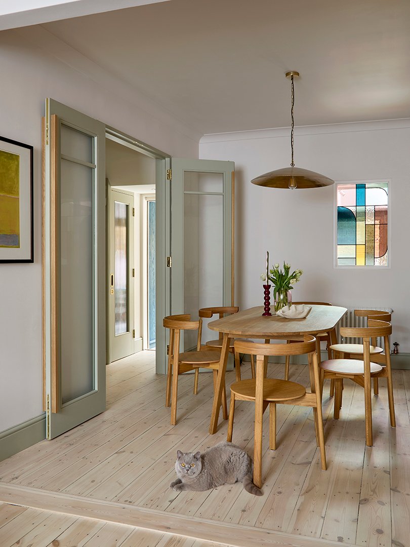
What inspired the custom etched-glass window between the kitchen and dining area?
The opening was originally a doorway, which we infilled as part of the new floorplan. I wanted to maintain a visual connection between the front of the house and the patio while also allowing natural light to filter through. We designed a bespoke etched-glass window for the opening, using a composition of curved and straight lines and a palette of colors drawn from the house.
It offers a degree of privacy without feeling solid or obstructive, and in the evening, the colored glass creates a beautiful, softly textured glow on either side.
Finally, what’s a detail you love that someone might overlook in the finished home?
The powder room, above that’s tucked discreetly beneath the stairs. We concealed it within the joinery, so it feels integrated into the design. And then there’s the ginger cat who claimed the sill of the new internal etched-glass window as its favorite spot! It’s little moments like these that make a home feel personal and lived in.