We may earn revenue from the products available on this page and participate in affiliate programs.
At the start of the pandemic, designer Julia Miller of Yond Interiors received a request for a remote project via Instagram (how very 2020). It was an overhaul of a house in Sun Valley, Idaho, for a Palo Alto, California–based family who bought the place to be closer to the great outdoors; Miller’s goal was to bring that through into the interior as well. “The inspiration was a mountain property—warm, cozy, and reflecting the landscape,” she says. After a year and a half of work, the completed space is a soothing oasis, with four zen bathrooms.
One important material for a mountain home is wood, but Miller didn’t want to go the typical rustic pine vanity route. Instead she embraced white oak in each room. “That’s the beauty of design, to use one element the whole way,” says the designer. Aside from the material, all the vanities have another key element in common: integrated hardware, meaning there are no fussy metal knobs or pulls on the facade. “Nothing is in excess. It’s beautiful and pared back,” she shares. Still, with originality top of mind, here’s how she made each design feel different from the next.
The One With Extra-Long Handles

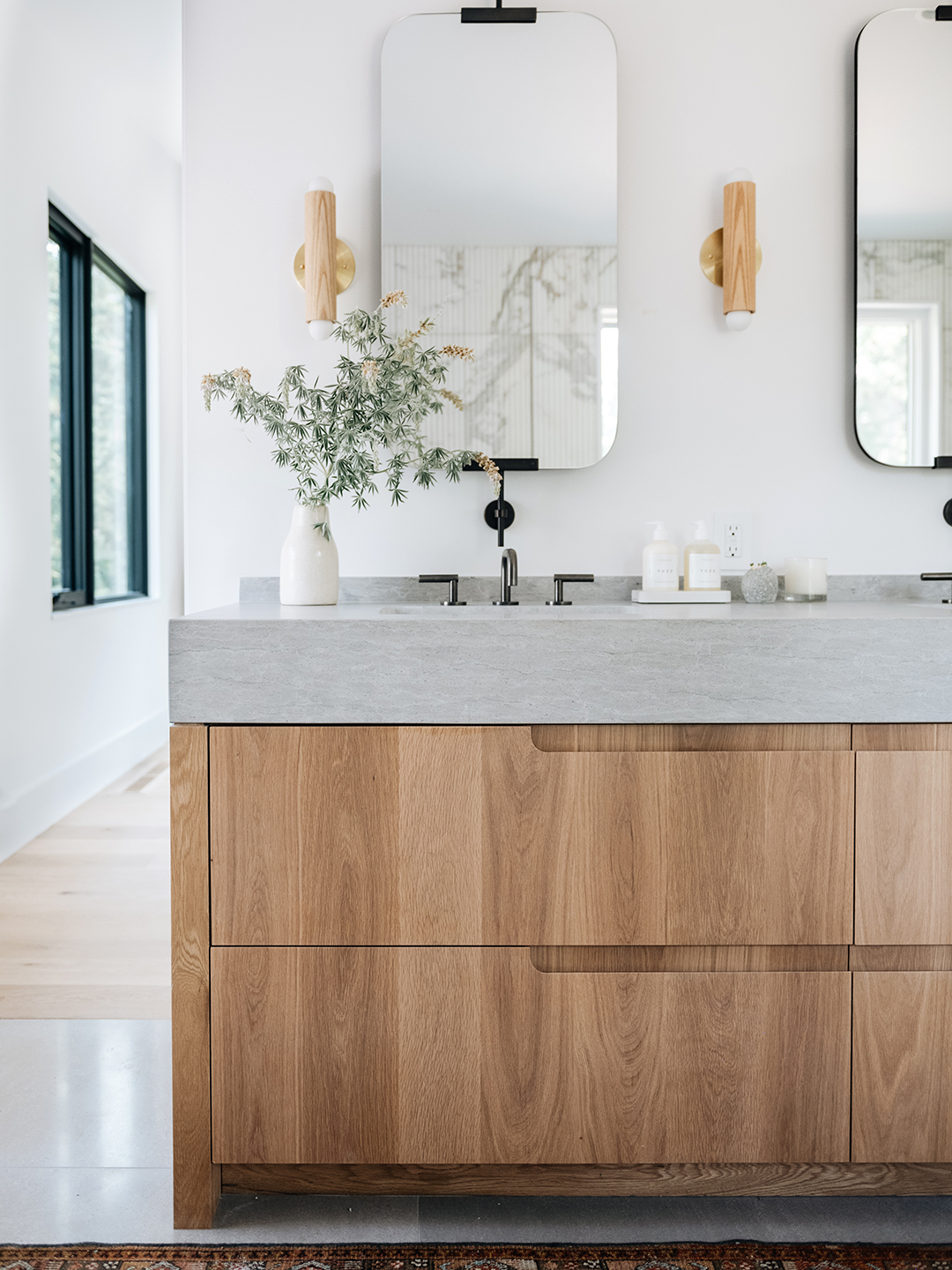
The house has two primary suites, which gave Miller two large bathrooms to work with. For the one the clients were going to use the most, Miller designed a vanity with four deep drawers and long, centered integrated handles. The homeowners had asked for a simple structure with plenty of storage for towels, and the integrated double sink was also a functional choice as it offers each adult their own zone. To mirror the wood of the vanity, Miller used white oak in an out-of-the-box place: the sconces. “We wanted to warm it up,” she says, “and minimize how many different materials were in one space.”
The Shaker-Style One


In the second primary bathroom, the vanity features very prominent rails and stiles that create a geometric look. “It was a texture opportunity: The pulls applied to the front in this way created dimensionality,” says Miller, noting that integrated ledge grips can also be found in the kitchen. Adding to the visual interest, the massive, 11-foot-long unit floats off the floor to give it a “lighter presence.” In this suite, the designer opted for vessel sinks, which are elevated from the counter rather than inset, and had the gold faucets installed directly on the wall. Separation was important here: Each basin has its own mirror and sconces with linen shades. “One long frameless mirror would have forced overhead [lighting], and we prefer side lights,” says Miller.
The One That’s Made for Sharing

For the kids’ bathroom, which will also serve as a guest bathroom, function was everything. A trough sink is the ideal option when multiple kids are brushing their teeth at once, and a taller “splash zone” was intentional to minimize cleaning. Underneath the six (!) drawers, a floating shelf allows easy access to towels. The vanity’s facade is clad in vertical panels, which lends a sophisticated touch and promises the space won’t read as overly kiddie to the young adults who also frequently use it.
The Artful One


While the downstairs bathroom will likely be the least used one in the home, Miller wanted to make it feel like a destination, “something unexpected,” she says. And so it’s the only one that features a paint color (Dead Salmon by Farrow & Ball). The warm, earthy tone covers the walls, ceiling, and trim, creating a cozy atmosphere. When it came to the centerpiece of the room, the designer chose a vanity that wavers between a standard single and a double size. She chose to install an off-center sink to allow for plenty of counter space and storage on the other side.
“The whole thing ended up feeling very sculptural, like a piece of art,” says Miller of the pull-like cup niches on the drawers. For the lighting, the designer wanted “something with its own presence,” given it’s a secondary bathroom and she wasn’t concerned about anyone using it to do their makeup. No rustic log cabin vibes here: By using natural materials in a sleek, contemporary way, the home is a beautiful example of the great indoors.
