We may earn revenue from the products available on this page and participate in affiliate programs.
Just as Emma Gurner finished up refreshing a family’s downstairs living spaces in their Hertfordshire, England, home, they decided to reassign bedrooms. Suddenly, their 7-year-old son had a new spot—a former office with gray carpeting and plain walls—that required some serious love. With the majority of the budget already spent, the U.K.-based designer and founder of Folds Inside had to use every trick in her playbook to create an imaginative space that wouldn’t cost a fortune—or feel like an afterthought.

Or as mom Chenta Patel puts it, “A design that was fun for a younger child, but one that he wouldn’t outgrow too soon.” Gurner made sure she got her wish. With the help of peppy paint, ample storage solutions, and a genius headboard, the bedroom captures the essence and magic of childhood’s various stages. “There’s space to include a small desk for a study area when he’s older,” Patel adds. The result is best summed up by the pint-size client’s two-word review: “Very cool.” High praise from the under-10 set.
Designate Zones With Paint

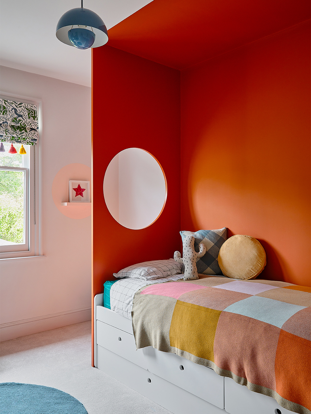
When you’re on a budget, paint is your best friend. Gurner quickly put it to work to carve out a distinct zone for sleeping. “We painted the wall behind the bed, the ceiling above the bed, and the bespoke floor-to-ceiling headboard a burnt orange, giving it a dramatic, tentlike feel,” says Gurner. Minus the headboard, all it took to make the alcove was taping off a few rectangles and painting inside the lines.

Centering the color-blocked feature in the middle of the wall had the added benefit of creating a cozy corner reading nook on the left-hand side. Above it, opposite the bed’s “window,” the designer even added a peachy pink circle, which casts a glow that looks like a sunset.
Find Your Inner Circle

Both kid and designer agree: The highlight of the room is the headboard, fabricated and installed by a carpenter. “There’s a rock-climbing wall on one side,” Gurner reveals, leading you to the round cutout. Unsurprisingly, this addition was an instant hit. “I love watching him climb and jump through the circle into bed,” Patel says.
Don’t Take Color Too Seriously

If you’re going to get experimental with color, your kid’s room is a low-stakes place to start. For Gurner, this project’s palette—olive and orange with a peppering of sky blue, pale pink, and mustard—evolved with the design plan. “The fireplace is original with teal tile, which Chetna wanted to keep,” the designer explains. Rather than go matchy-matchy with the surround, Gurner played around with different combos until she landed on the olive shade. Still in the green family, “it’s a nice complement,” she notes.
Supersize Shapes

Prints-wise, Gurner decided to keep it minimal. “Adding too many fussy patterns would take away from the simplicity of the design, which I like a lot,” she argues. By incorporating large-format motifs like oversize checks and a series of simple shapes—circular rugs, a round pendant lamp, half-moon wardrobe handles—she was able to keep the snug space from reading too busy.
Don’t Sleep on Washi Tape

To display Patel’s son’s latest Lego creation or favorite new book series, Gurner turned a few simple IKEA boxes into a feature wall, punching them up with—what else?—paint. “I also used black-and-white–striped washi tape around the edges of some of them,” she adds. So far it’s a hit. “He sits reading and playing in his ‘den’ every morning when he first wakes,” Patel says. We’re all about a design feature that gives grown-ups a few extra winks.
