We may earn revenue from the products available on this page and participate in affiliate programs.
Sometimes it’s what’s on the outside that counts. In “Front of House,” we dig into all the elements that give a home “stop the car!” kind of curb appeal, from main character mailboxes to much welcome yard transformations.
Molly Sedlacek, the founder of landscape design and outdoor product studio ORCA, has ripped out countless driveways. It might seem like an unusual request coming from Los Angeles residents, who famously depend on cars to get from point A to point B, but her clients are willing to lose a parking spot if it means gaining an outdoor entertaining space. “Our land is so valuable that having land for your car is becoming a dated concept for urban living,” says Sedlacek.

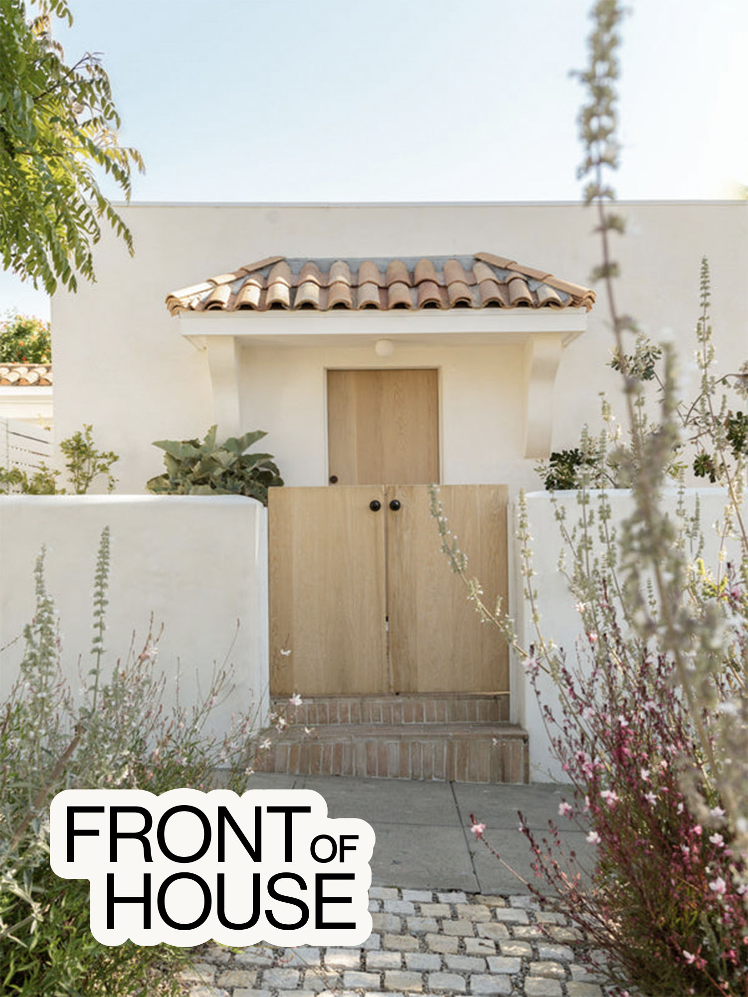
She’s the perfect person to go to if you hate your blah-gray concrete driveway: Sedlacek has built her practice on permeable landscaping, which allows water to flow freely underneath and around the hardscaping materials. So when this Echo Park–based client asked ORCA to replace her rarely used parking spot with an alfresco dining area, Sedlacek delivered an oasis. Between the reimagined front yard and the garage–turned–recording studio (championed by Design Assembly which handled the interiors and build), the 822-square-foot bungalow’s usable space was nearly doubled.
Laying the Groundwork for Future Cars

Digging up concrete is no joke and is best left to a seasoned contractor who understands how deep they can go without damaging essential plumbing lines. Once it’s all pulled out, ORCA’s recommendation is to put down materials that will allow for drainage. In this case, the company used a combination of bokara cobblestones and lodi pebbles. The former is installed in a fashion that can actually support low vehicular ratings, so if any future owners decide to treat the space like a typical driveway again, they can. “If you just do a pea gravel drive, your car is going to sink into it, and it’s going to be a lot harder to use it in different ways,” notes Sedlacek.
Putting One (Bare) Foot in Front of the Other

The lodi pebbles that surround the dining area are larger than other types of crushed rock surfaces like pea gravel, which means they’re ultimately more pleasant to walk on barefoot. They’re also more cost-effective than pavers. “You can use pavers in key areas and then transition to pebbles where it’s less of a [design] focus,” says Sedlacek.


So where did she allocate said pavers? The terracotta rectangles, laid in a traditional running bond pattern, now form a path that wraps around the front entry all the way to the back side, where they culminate in an outdoor shower. The sunbaked Italian bricks lent inspiration to the plant pots; Sedlacek chose terracotta vessels that felt in keeping with the home’s Spanish adobe-style architecture.
Filling in the Gaps With Greenery

Sedlacek used those same pavers to clad the built-in dining bench. When the handwoven cushions aren’t out, the seating area is meant to be walked on. “It’s actually the pathway to the back,” Sedlacek points out. The planter box behind the bench is more so there for privacy than it is for ambience, so the designer created hedgelike coverage with Acacia Iteaphylla (Willow Wattle) and Grevillea Moonlight. To fulfill her client’s request for something sculptural, she also introduced Kalanchoe (called a felt plant to some). “I wanted it to be superbillowy, because the planter is so upright,” says Sedlacek. “Kalanchoe gives you a little bit more structure with the Grevillea.”
Rooting for the Neighborhood

ORCA didn’t stop at the property line. Sedlacek and her team went “kind of rogue” and decided to extend their landscaping plans to the tiny little plot closest to the street that technically falls under the city’s domain. While this area usually becomes a breeding ground for weeds and a dumping spot for trash bins, they filled it in with low- to no-water plants like Guara and Salvias. The Mediterranean-inspired greenery not only gives everyone else on the street something pretty to look at, it creates the illusion that the house sits further back than it really does. “We wanted to give more depth to the house because the entry gate is right on the sidewalk,” says Sedlacek. It’s curb appeal that actually reaches the curb.

