We may earn revenue from the products available on this page and participate in affiliate programs.
We’ve seen designers evoke the idea of summer through interiors plenty of times before, but it usually involves citrus-print wallpaper, loads of wicker furniture, and nautical hits of navy. When Victoria Sass, the founder of Minneapolis-based Prospect Refuge Studio, decided to translate the feel-good season to her clients’ son’s bedroom and bathroom, she went in a slightly different direction: summer camp. “I didn’t want it to feel like Wyoming knotty-wood ski chalet, but more Wes Anderson,” she says. “It’s a little more whimsical, a bit cliché almost.”
The specific vision for the to-be-kindergartner was inspired by the treetop-themed, foliage-filled nursery Sass had previously designed for him—a space down the hall now inhabited by his 1-year-old brother. To get into the right mindset, the designer researched images of bunk rooms at national park hotels, eventually landing on a heavy dose of Douglas fir for the boys’ shared bathroom and nods to the Old West in the form of window curtains and bedding for the 5-year-old’s bedroom. “It’s a little cartoonish but oddly mature at the same time,” she explains. It’s the closest thing to feeling like you’re snacking on s’mores next to a crackling fire.
Into the Woods

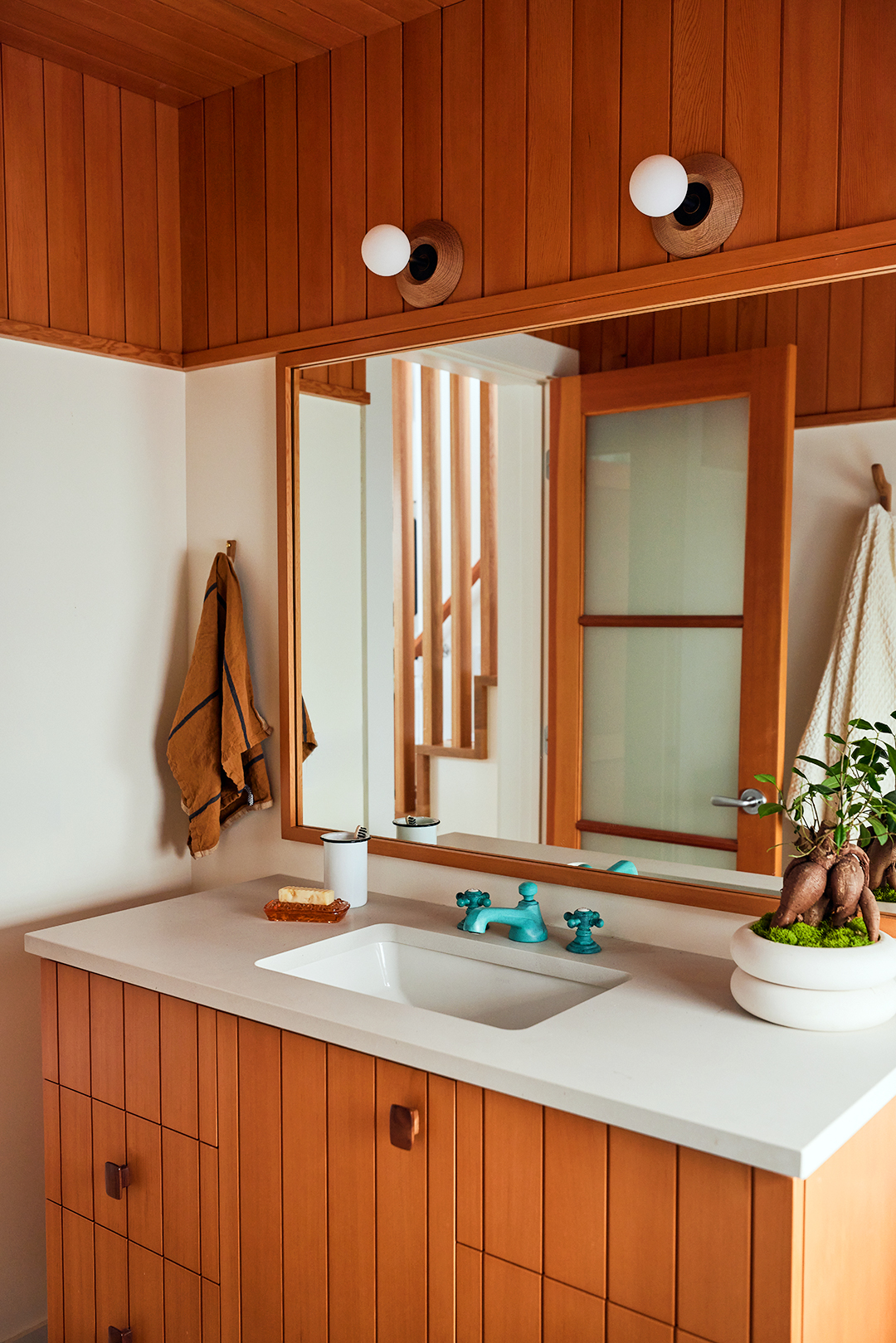
Sass landed on orange-toned Douglas fir for the bathroom wall paneling not just because it’s a historically inexpensive material, alleviating some of the costs of the renovation, but its soft texture patinas over time, giving it that gritty, cabin-approved look. “You can push your fingernail into it and make a mark,” she points out. The designer put an elevated spin on the boards on the custom vanity by adding knurled brass legs to the piece and a verdigris copper faucet. The knobs on the drawers are marine-grade teak—Sass has the exact same ones on her boat.
Swim Session


The top priority for the homeowners was to somewhere, somehow, squeeze a tub into the space so bath time can take place (previously there was just a standing shower in the room). “I told them it would be a teeny-tiny tub, and they okayed it,” says Sass. The designer estimates the soaking area of the new tub-shower combo is around 54 to 60 inches wide, which is just big enough for a very small person to bathe. “I can sit upright in it, but I’m only 5-feet-2,” she says with a laugh.
Sass looked to dormlike bathrooms for inspiration and landed on a white grid-patterned tile scheme, which she continued around the outside edges of the shower so it would look like a classic stall. The mix of squares and rectangles make the pattern a bit more interesting than your typical allover subway tile. “We wanted it to feel really elemental,” she explains.
Living for the Right Now

Sass’s clients are very well aware that the tiny tub setup won’t cut it when their sons are teenagers, but that’s fine by them. “We designed this bathroom for kids up to the age of 10,” explains the designer. “It needs to work for them right now. I love the idea of identifying what you need and giving it to yourself, rather than trying to predict the future.” It’s the same reason Sass chose a hand sprayer that can double as a showerhead, instead of a fixed spout, to make rinsing off a breeze.
Slumber Party

Continuing to focus on functionality, the designer brought two vintage brass beds into the bedroom. After all “they were eliminating their only guest bedroom,” says Sass. The double setup allows Mom or Dad to crash there when their little one has a nightmare, and it’s generally handy for when one of the adults in the house is feeling under the weather or simply needs a quiet, separate place to take a nap.
Curtain Call


Staying on theme, Sass had short curtains made out of a Kravet fabric featuring fox hunters, leaning into the realm of cowboy but with a sophisticated twist. And while the vintage ceiling light is a Scandinavian design from the 1960s (she had to have it rewired to meet U.S. electrical standards), the combination of the canvas and wood shade fits right in with the simple plug-in sconces from Urban Electric that are positioned on either side of the beds. “It’s charming and not so perfect,” she notes. Just like sweet summertime.


