We may earn revenue from the products available on this page and participate in affiliate programs.
There comes a moment in many parents’ lives when their children outgrow their nursery–turned–tiny bedrooms, feet dangling off twin-size beds and all. The choice then becomes: Do you move or add square footage to your existing house? For Paul Neaville and Marisa Luzzatto (and their two kids, ages 10 and 12), the answer was a no-brainer when the time came for a change in 2018. Marisa’s childhood best friend, Catherine Fowlkes (who happens to live down the road), owns an architecture studio with her husband.
The couple had no intention of leaving their home in Washington, D.C.’s American University Park neighborhood. It’s in a great school district with lots of mature trees, and the area has a friendly village feel. Plus they had just redone their backyard, adding a deck and an outbuilding. It would have been a shame to start from scratch.
Fowlkes, who worked on the yard renovation, wasn’t as charmed. “A lot of the houses in our neighborhood are these underwhelming center-hall Colonials where the developers tried to trim the fat and, as soon as you open the door, you’re basically going straight up the stairs,” she explains. On top of awkward proportions, this one also had ’90s builder-grade finishes and double-hung windows (a no-no in the architect’s vocabulary). It wasn’t anything Fowlkes couldn’t fix, though. It just required quite literally thinking outside the box.
Looking to the Front Yard


“There is a typical style of addition for this neighborhood. It’s on the back and it’s usually a family room,” says Fowlkes. The architect was against it from the start. The problem: It doesn’t solve the sectioned-off layout at the front of the house, which means the “formal” living room often goes unused. Plus she didn’t want to undo the yard work the family had just completed. So instead she flipped the extension to the front, where it would dramatically alter the classic-style facade. Not to mention it gave the oldest son a larger bedroom upstairs and TV area for everyone downstairs. “It was so flat before, and I liked the idea of having a dynamic structure that reaches out into the community, engages with the street, and activates the front lawn,” adds Fowlkes.


The addition gave way to a large front porch, which has come especially handy for 6-feet-apart outdoor gatherings during the pandemic. “Marisa has the type of house where people always gather wherever she lives,” says Fowlkes. “Every time I drive by now, I see her out there on the phone or with her laptop.”
Embracing Ugly Colors

The reimagination of the facade started with the window casings. “I like to use ugly colors,” says Fowlkes. A brown-beige never risks being too trendy. Bonus: It matches the mid-tone stain of the cypress siding. Fowlkes had the rest of the original brick painted a light gray (though it looks more white in the sunlight).
Finding the Light


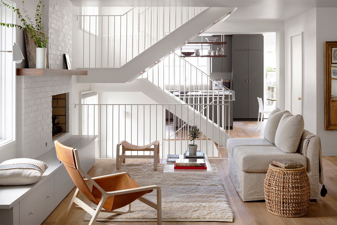
Meanwhile, Fowlkes had the staircase relocated to the other end of the house, which allowed her to create an open floor plan through to the new addition and bring in tons of natural light. “It completely unlocked the house,” she says. With a new white powder-coated steel floating staircase dividing the left side of the building, the architect was able to add large windows along one wall, which flood the newly excavated basement with tons of sun rays.
Putting Function First

Another bonus of the front addition: a side entrance that made room for a formal entryway and a tucked-away mudroom. “You barely even notice it’s there because the pocket door blends into the wall, but it’s been a great depository for backpacks and Amazon boxes,” says Fowlkes. At first, as a nod to Luzzatto displaying a “Resist” sign in her front windows when the Trump administration implemented the immigration ban, the two women had the idea of imprinting the Washington flag design instead—a true D.C. welcome.
