We may earn revenue from the products available on this page and participate in affiliate programs.
For Nancy Meyers movie fans, center-hall Colonial homes are the holy grail of residential architecture. Catherine and VW Fowlkes, on the other hand, wanted nothing to do with them. “There are tons in our neighborhood in Washington, D.C., and we know from renovating several how hard a nut they are to crack,” says Catherine.
The cofounders of architectural firm Fowlkes Studio were instead looking for a modest home with a side staircase (which Catherine notes makes it much easier to rework the layout down the road) in D.C.’s American University Park neighborhood, where they wanted to send their two sons, now 10 and 13, to public school. In the end, they landed on a 1,700-square-foot 1930s brick house with a charming front porch, a big yard, and plenty of old-growth trees. “It had a simple but sweet, old-fashioned feel,” remembers Catherine.
In 2012 the family (plus their dog, Levon) moved in—and lived happily in the house for five years without touching a thing. But eventually, the only bathroom started feeling cramped, the boys’ feet began to dangle off the bunk beds in their shared room, and they could no longer ignore that the kitchen was inconveniently small (it ultimately turned into a powder room). “I could stand in one place and reach everything I needed,” says Catherine.


The structure needed more than a gut job—it required extra square footage. So the couple designed an addition, complete with a new kitchen, living room, and side entrance for the boys to dump their backpacks and sports equipment. The original front of the house is now home to a formal entryway and a den with built-in bookcases. (To pad out the budget, they also transformed the basement into a rental property for extra income.)


On the extension’s second floor, the children got their own private space. “We gave them double-high ceilings so they can play basketball and hang hammocks,” says Catherine. Meanwhile, the kids’ old bedroom became a walk-in closet and bath for the parents. “I absolutely adore not sharing a bathroom with three guys,” she says, laughing.

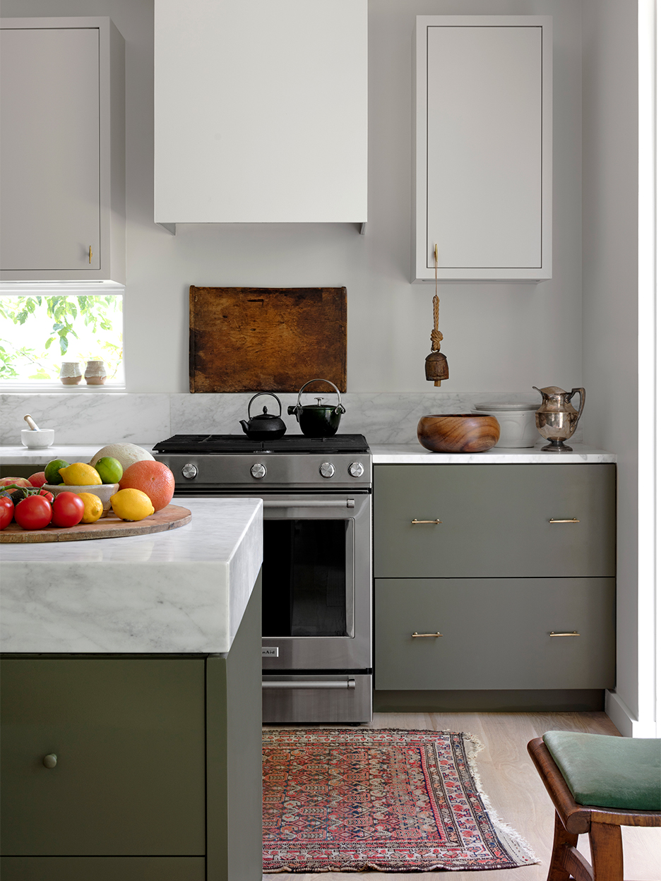
Catherine strayed from popular opinion once again in the kitchen, forgoing seating at the new island. “I wanted to keep our nearby dining room in use,” she explains. Instead she designed it to feel like a piece of furniture, with drawers to store the boys’ school supplies and a niche for cookbooks.


A back door connects the space to the garden, letting in the breeze, but Catherine went one step further: She designed a long, low ribbon window above the countertop to frame the swath of wisteria that grows on their side fence. “We love our neighbors, but we don’t need to be staring at each other while washing dishes,” she says. After sifting through a drawer filled with olive green paint chips (the architect’s favorite color), Catherine landed on Sherwin-Williams’s Garden Gate for the lower cabinets, which she paired with her most trusted neutral, Farrow & Ball’s Skimming Stone, on the uppers.

Paint also played a major role in the exterior overhaul. The couple painted the original structure’s red brick facade Benjamin Moore’s Gray to tone it down and blend it with the new architecture. In the yard, VW rented a Dingo machine to rip up a makeshift stone terrace. “It was literally a death trap,” remembers Catherine. Now a low retaining wall surrounds a grassy surface for the boys to play on. The neighboring peastone area is the backdrop for barbecues and bonfires.
Still, you’ll most likely find Catherine in the spot that first charmed her almost eight years ago—the front porch: “I can be alone there, even with everyone at home.”
Introducing Domino’s new podcast, Design Time, where we explore spaces with meaning. Each week, join editor-in-chief Jessica Romm Perez along with talented creatives and designers from our community to explore how to create a home that tells your story. Listen now and subscribe for new episodes every Thursday.
