We may earn revenue from the products available on this page and participate in affiliate programs.
Interior designer Alison Pickart never offers unsolicited decorating advice. She believes that acquiring a reputation for doing so leads to far fewer dinner invites. But one night at dinner, her friends, George and Cammeron McLaughlin, begged for recommendations on how to improve the flow of their kitchen. “There just so happened to be a piece of scrap paper and pencil nearby, and the rest is history,” Pickart told Domino.
This is how the McLaughlins, him a technology business development executive and her an investor relations executive for Restoration Hardware, became Pickart’s clients. Their home, a 1930s shingle cottage in Marin Country, California, already had good bones, but the flow and finishes needed an overhaul. “The floor plan of the house was really just a series of dead-end orphaned rooms,” says Pickart. “Opening up the kitchen was the starting point, and from there, everything fell into place with circulation and usability of the home.”
Ahead, Pickart shares her top tips for designing a home that feels well-crafted and classic but still fun and approachable for the young family of four.
Tackle the Floorplan First

The McLaughlins were hesitant to splurge on any decorative items for the home knowing that the original floorplan was all wrong, so they tackled the renovation first. “We had talked about decorative improvements earlier on, but the project always stalled because they didn’t have the stomach to spend money when they inherently knew the floor plan wasn’t right,” says Pickart.
“Once that critical issue was resolved, they felt like money spent on decorating wouldn’t be a waste.” To improve the flow, Pickart completely reimagined the kitchen footprint and opened it up to the rest of the house. She also replaced floors and windows and remodeled the master bath.
Be Open to Bold Choices


Luckily for Pickart, the McLaughlins were open to all her bold ideas, from a lacquered peacock-hued front door to a Martinique banana-leaf wallpaper in the bathroom. “The process was super fun,” she told Domino. “I would approach them with something that I thought might be pushing them, and they would respond ‘Yes! Let’s do it!’ They believed in the process and didn’t want to take anything away from what might be the next fun idea.”
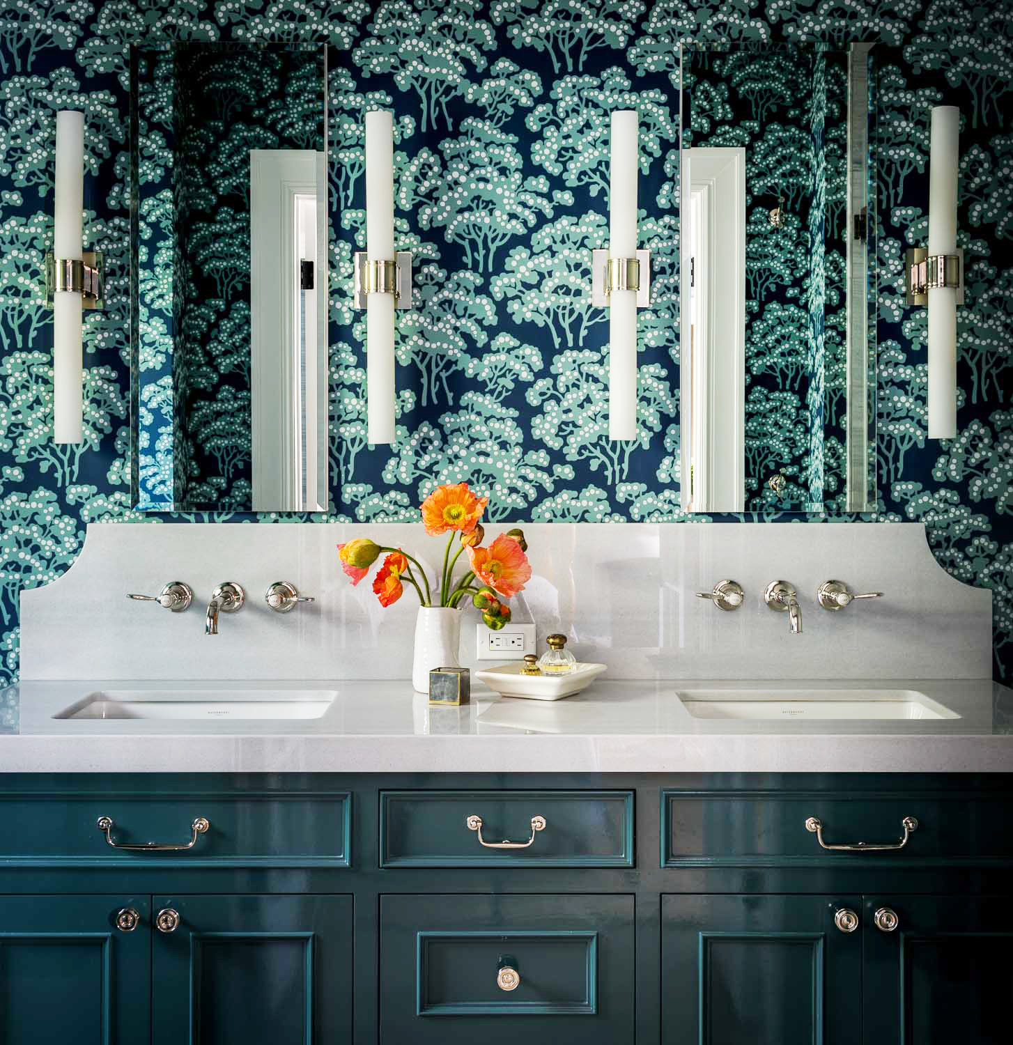
While they kept the kitchen light and bright, they tackled the rest of the house with a more daring approach. In the master bathroom, the designer picked a modern indigo floral Farrow & Ball wallpaper, which she paired with the paint brand’s Inchyra Blue for the vanity. In a hallway, the walls are covered in playful Dalmatian-like black-and-white spots.
Splurge on Quality Materials

Tackling a project of this scale with a sense of longevity instead of immediacy can make a world of a difference in the long run. “They were willing to splurge on quality materials with a real sense of permanence,” explains Pickart. “They definitely didn’t have a ‘slap it together in the cheapest way’ mentality. Instead, they wanted the interior to feel well-done and luxe but still classic and approachable.”
One of the main ways they achieved this was with quality paint and wallpaper. In the TV room, for instance, they wanted to create a dark and cozy place to unwind. In the den, a Phillip Jeffries wallpaper called Suit Yourself resembles herringbone suiting fabric, while in the hallways, a simple grasscloth warms up the space.
Find the Right Mix of Furniture


It’s easy to imagine that designing a home for a Restoration Hardware exec would involve a lot of the brand’s signature-style furniture, but Pickart and her clients approached things differently. “One of the challenges from the beginning was to use the Restoration Hardware furniture but not have the end product look like an RH Galleria,” explains the designer.
Instead, they mixed in statement lighting and vintage pieces that would give the home a warm, lived-in feel. “The first thing we bought for the house were lanterns for the kitchen. The Urban Electric ‘Ravenspoint’ sconces customized in their vintage heirloom finish were such a beautiful start to the whole decorating process.” The team also sourced multiple vintage pieces like red side tables and acid-washed mirrored glass pieces. “There is definitely a mix of materials and styles, lots of color and texture, and random vintage pieces, which I love.”
While the home functions beautifully, it now feels like a gathering place, which was the McLaughlins’ main goal. “When we think about the house, to us, it’s about family and good friends, from the amazing experiences of our kids growing from babies to pre-teens and their many firsts to the tradition of our best friends showing up at our door each Christmas in their PJs bearing treats to the many impromptu gatherings on our front porch and drinks and fun dinners with good friends,” says Cammeron McLaughlin. If great design serves any purpose, this is it.
Discover more colorful homes we love: This Hamptons Home Starts With a Pink Sofa and Only Gets Better In This Breezy Melbourne Townhouse, Laid-Back Life Is Key This Farmhouse Fixer-Upper Casually Has a Half-Pipe in the Barn
