We may earn revenue from the products available on this page and participate in affiliate programs.

From the outside, 56 Leonard, a 60-story residential building situated in Manhattan’s Tribeca neighborhood, looks like it might tumble. But that’s the whole point of the illusion. The structure has earned the nickname Jenga Building because it looks like the block-stacking game (cantilever bulges jut out on all four sides). Inside, however, all is calm—at least on the 21st floor, where Project AZ founder Ahmad AbouZanat recently finished designing a two-bedroom apartment for a couple inspired by the space’s next-level views.
“We wanted the interior to complement the exterior, and their windows look out onto some big buildings,” says AbouZanat. The designer’s take on indoor-outdoor flow? Channeling the tones of the neighborhood’s patched yellow-and-red–colored brick complexes and weathered gray cobblestone streets into the decor, like the abstract Stark Carpet rug in the foyer and the Cassina leather bed frame. “It feels like their background is really an extension of their own space,” he adds.

One perk of working with a building that’s barely five years old: The kitchen and bathrooms didn’t need any work. The only major change AbouZanat made in the cooking space was swapping out the shiny chrome light fixture that used to hang over the island for a simple beam. “It was almost as big as the island,” the designer recalls. “One of the main things I wanted to do was strip the space down.”

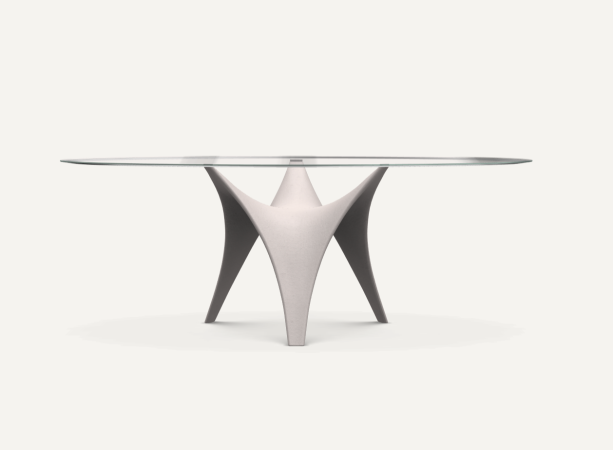
The downside of the circa-2017 architecture, which AbouZanat sees in many new buildings in Manhattan, was the colossal concrete pillar in the dining area. With no way to hide it, he focused on introducing furniture that would complement the structure, not compete with it. “I didn’t want anything that had four legs,” the designer says of choosing a nonsymmetrical table. The base of the three-leg piece is also made out of concrete, making its placement near the pillar seem all the more thoughtful. “It’s very sculptural, so it plays with light and shadow nicely,” he notes. AbouZanat sought balance by picking an asymmetrical pendant lamp with flexible discs that allow the homeowners to change the mood of the lighting in the room.

AbouZanat prioritized the view in the living room and chose a low storage unit that wouldn’t block the window. The staggered piece (it’s got its own Jenga-like look happening) houses board games and remote controls—items that can look like clutter when left out in the open. It was also important that nothing in the open-concept space was bigger or bulkier than the sectional (the only piece of furniture the homeowners bought before the project began).
“As much as I want a space to have my signature, I always tell my clients that this is, at the end of the day, their space. What really matters is these items are with them five, 10, or 20 years from now,” says the designer.


The rust-orange dresser in the bedroom continues the red brick theme, while also speaking to the high-gloss black and white cabinetry in the kitchen. Again, “I didn’t want to kill the view,” the designer says of picking the low-profile storage piece. When your backyard is essentially all of Manhattan, you’d do anything to show it off.


