We may earn revenue from the products available on this page and participate in affiliate programs.
There are trends that fade in and out of popularity (we’re looking at you, glass bricks). Then there are the ones that indefinitely stay at the bottom—and apparently, tile countertops are among the latter. In a survey of 1,500 Americans from February 2020, respondents voted on their least favorite home decor crazes from the past 50 years. Fuzzy toilet seat covers, ruffled bed skirts, and art with inspirational quotes also topped the list, but when it comes to the kitchen, the message is clear: Never, ever tile your countertops (or so say 30 percent of interviewees). Apparently, over the last three years, that sentiment has stuck. More recently, the National Association of Realtors released its annual roundup of “horrifying” trends and we’ll give you one guess what made the list. Even readers in the comments section who were not in agreement with the rest of the scary styling ideas were unified in their disdain of tile-clad surfaces.
So, what if your kitchen already has it? After all, plenty of older homes feature this so-called faux pas. Yes, the seams between the individual squares can create problems (chopping on an uneven surface is tough and the grout collects crumbs). And though it’s heat resistant, ceramic isn’t the most durable material on the block—the pieces can crack under pressure. But the bad and the ugly aside, tile countertops can be cool. Before you start replacing yours, consider these eight ideas.
Completely Commit

Autumn Hachey’s Airbnb in Whistler, British Columbia, is a lesson in going all in on a theme. The rental’s kitchen features tonal checkerboard tile that not only covers the top, but cascades down the sides and back of the peninsula, giving those sitting in the nearby living room a taste of the pattern as well.
Break Up Primary Colors

Interior designer Sophie Rowell, founder of Cote de Folk, kept the retro style fresh in this English flat with a palette inspired by a Wes Anderson vibe she spotted on Instagram. Influenced by a brightly colored lighthouse against blue skies, she sandwiched a chocolate brown countertop between the colorful cabinetry for a hit of contrast.
Choose a Contrasting Grout

Read between the lines: The literal glue holding your boring white tile together is your best friend. Simply dyeing the seams moss green, bright yellow, or electric blue will freshen up the dated feature. We especially love the peachy pink hue designer Tina Rich chose for the Prose office.
Bring It Down the Sides of a Sink

Starting from scratch? The dark green bathroom at the Kalon Studio L.A. showroom compels us to use tile all over. The small squares continue down the wall and over the front of the sink, creating a waterfall-like illusion. But why stop there? D-Tile’s curved pieces make it possible to work around turns and corners.
Paint the Trim

Most ceramic tiles can be painted as long as they’re not subject to water. According to Sherwin-Williams, you’ll have to clean and lightly sand the surface first (as you would a wall) and go over it with an acrylic primer before applying a high-quality latex-based paint. You don’t have to go overboard. The cobalt blue edging in Jesse Kamm’s Los Angeles kitchen is all that’s needed to make the surface seem intentional.
Take It Outside

Designer Annie Ritz of AndAndAnd Studio opted for rich green subway tile on all sides of her client’s outdoor kitchen in order to best blend in with the California landscape. While the Heath Ceramics rectangles were chosen for their color, they’re also able to withstand years of wear and tear—including the rare L.A. rainstorm.
Check In

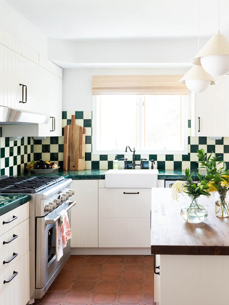
Lucky for you, tiled countertops pair perfectly with a hot trend: checkerboard. The motif in backsplash form ensures the countertop in Nicole Cohen’s 1920s New Jersey kitchen feel fresh not dated.
Stick to One Color

White doorless cabinets help the old-school tile fade into the background in this kitchen, designed by Layne Kula. The tonal palette gives the eye a visual breather, guiding you to take in the homeowner’s tableware collection—or the view of the backyard—instead. See? What’s old can be made new again.
This story was originally published in February 2020. It has since been updated.

