We may earn revenue from the products available on this page and participate in affiliate programs.
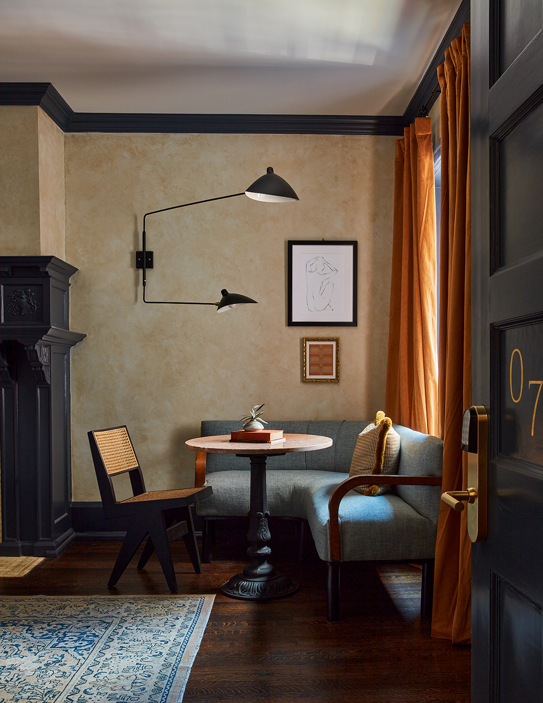
After walking through more than 7,000 square feet of an abandoned historic landmark in downtown Philadelphia with her clients, Kate Rohrer, head of design studio Rohe Creative, felt compelled to pitch a different vision. “They were developing it to lease as rentals—full kitchens with laminate cabinetry,” Rohrer recalls. “But there was too much history tied to the building. It wasn’t dilapidated; a lot of the intricate moldings, fireplaces, and shutters were still there.”
In 1906, the four-story row house became the headquarters for the New Century Guild, one of the first working women’s clubs in the U.S. “It was so special because this was a period of time when women couldn’t go anywhere unless they were escorted by a man,” explains Rohrer, who points out there was a theater, library, parlor, and billiards room. “Here, they could watch musical performances and plays. It was a place for them to feel creative without worry.”

It was that exact sentiment she wanted the building to still embody. In collaboration with ownership, they decided to divide it into 12 separate boutique hotel suites. But instead of copying and pasting every layout, Rohrer approached each space differently. “We learned so much during the initial design process about all of the amazing women who were members,” she notes. “I’ve lived in Philadelphia for 20 years and must have walked by this building a thousand times and never knew the story.”

Her design proposal to name each room in the Guild House Hotel after a prominent individual, emulating their life and passions through paint, color, and pattern while still celebrating the original architectural elements, won Rohe Creative the project. Here’s how they did it.
Take Color Inspiration From History

“It was really important for us to challenge ourselves, to go with bolder paint colors than we’d normally work with, in order to best tell the story of that woman,” offers Rohrer. The Edith, for instance, is painted in Benjamin Moore’s French Horn to mimic the yellow armband Edith Brubaker wore during suffragette marches. “That really stuck out to us,” she notes. And although, at first, the room was the least appealing on paper (the owners were unsure of the vibrant choice), in the end it became a favorite.

Elsewhere, Rohrer pulled palettes from preexisting details. For the Gabrielle, an original Delft tile hearth inspired the Hague Blue by Farrow & Ball walls, a hue similar to the shades once used by the artist the junior suite is named after: Gabrielle de Veaux Clements. “It’s the only blue room,” Rohrer adds. “We made sure to try a different color in every space.”

Look for Furniture With Good Bones

Rohrer and her team thrifted plenty of vintage pieces from local shops and flea markets, but if something just couldn’t be found, she wasn’t afraid to rework modern furniture frames to bring her vision to life. In the Eliza, named after the Guild’s founder, Eliza Sprout Turner, the group gave a contemporary CB2 Valmar sofa a classic twist by covering it in a tapestry-like William Morris fabric. For the Alice—the hotel’s largest suite, honoring Dr. Alice Norton, who scheduled musicals in the room—Rohrer reupholstered a plain rolled-arm design from the same retailer in a velvety graphic textile to follow the rock-and-roll theme. “Buy a sofa that resonates with you first,” she advises, and you can get creative from there.
Mirror, Mirror on the Wall


Also in the Alice, Rohrer installed an arched mirror that was originally out in the corridor to give the breakfast banquette opposite the bed a luxurious touch. “It not only does the usual trick of making the room look bigger, but it creates a nice focal point and can even help set more of a mood during meals,” she explains. Overscale reflective surfaces can be spotted in many other suites—above queen beds in the Mary Margaretta, on an unused door in the Emily, and in the middle of the Florence—for those very reasons.
Skip the Bouquet and Go With Dried Pampas

Not everyone is gifted with a green thumb, and in hospitality, live plants and flowers are challenging to take care of. Their dried counterparts, however, are maintenance-free. “Rather than just a green sprig of something, which is still beautiful, we were able to better commit to that color story,” Rohrer says of their benefits. In the Abigail, there are golden leaves; red blooms in the Ruby; in the Gabrielle, blue eucalyptus; and in the Mathilde, pampas grass.


Balance the Bold

Guests can feast their eyes not only on color but pattern and texture, yet no space feels overwhelming. “If I’m doing something really loud on the wall, then the bed in front of it becomes solid; then the chair or the rug features another pattern,” says Rohrer of the hotel’s modern-meets-Victorian style. “It’s layering something simple, then bringing in a crazy pattern, then something simple again. The energy and the frequency of everything starts working together. Even if it’s bold, it can still become a backdrop.”


