We may earn revenue from the products available on this page and participate in affiliate programs.
Tucked away in London’s Tottenham Hale neighborhood might be the city’s chicest short stay yet: the Gessner. But the 13 floors boast more than guest rooms—you can rent (fully furnished) apartments and get the same five-star treatment, just for months instead of days. London- and Los Angeles–based Fettle Design Co. (the minds behind the Hoxton and Marylebone hotels) has stretched its comfort zone with this project. Here, cofounder Andy Goodwin sheds some light on how he and his partner were able to balance staycation and vacation.
Hang Up to Hang Out

With 164 apartments (from studios to three-bedrooms), there’s a lot of people using the communal kitchen. A row of glass-front china cabinets make finding the abundant ceramic dinnerware easy. And if you look up, there are ceiling-hung shelves for all the stainless steel cookware. The storage solution is also mostly made from glass, which keeps the space from feeling boxed in from above. Off-white plastered walls assist in bouncing the sunlight around. And when you’re done whipping up a culinary masterpiece, just toss the cutlery into the paneled dishwasher, which hides alongside the lower cabinets.
Divide and Conquer

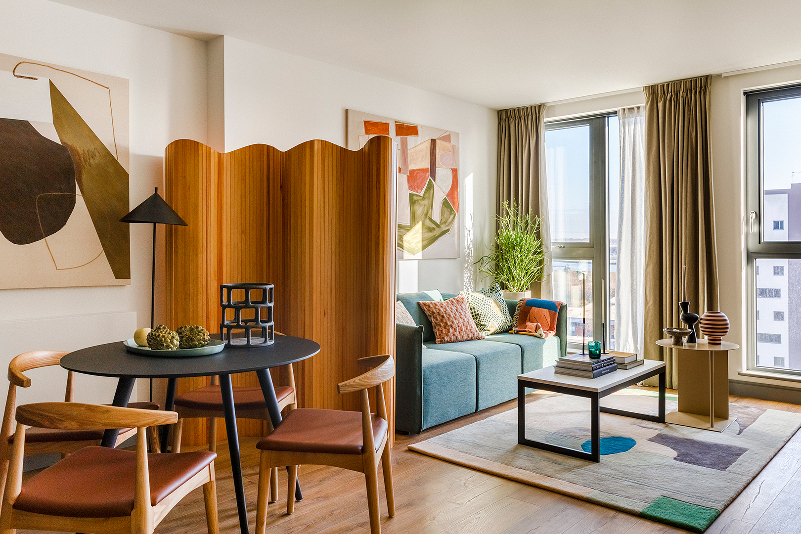
No matter how much you might love your roommates, alone time is always appreciated. Knowing that most of the Gessner’s guests would be living in two- and three-bedroom suites, a wavy room divider separates the more open-concept apartments’ living room from the kitchen, ideal for having a lazy Sunday (semi) all to yourself. For those living in the studios who just need a break from, say, their WFH selves, the media unit serves as a partial wall between the lounge area and the bedroom.
Create Boundaries Outside, Too

Most people think a view is the most crucial element of a grand outdoor space. But for Goodwin, that wasn’t enough. “You need to frame that view,” he explains. “Because otherwise you’re essentially exposed, and that’s not a comfortable feeling.” A long pergola, a line of white umbrellas, and tall local greenery pull the “ceiling” height down on the rooftop, helping guests to feel like they’re not floating in London’s dreary skies.
Go Moody With Paneling

The ground floor, where all of the common spaces for both the residents and hotel guests are located, has much taller ceilings than the rest of the building. Running with that feature, the team at Fettle decided to panel the hotel bar’s walls in tambour stripes. Often seen as a dated feature to be torn out, the timber treatment has a classic feel thanks to a dark stain. The space feels more like an exclusive members’ club than a ’70s basement. A glossy terrazzo on the bar offers a material contrast, keeping things luxe. So when can we check in?
