We may earn revenue from the products available on this page and participate in affiliate programs.
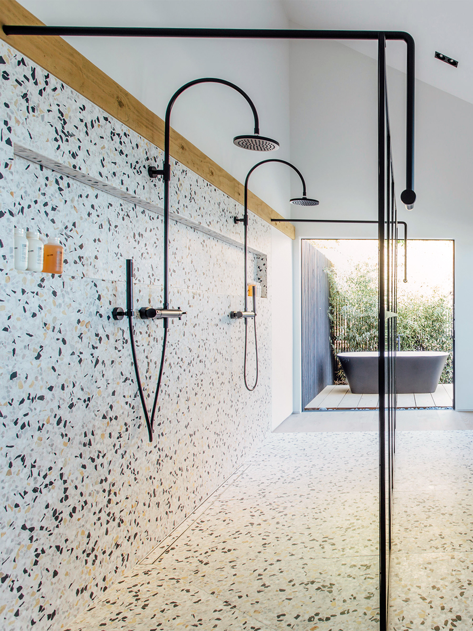
Rory Brown recently made an unsettling observation: It’s “not so hot” to have blunt recessed lighting shining down on you while you’re taking a shower. For that very reason, Brown, who runs San Diego–based design and build firm The Brown Studio with her husband, Lindsay, embarked on a master suite remodel that is as much about seeing as it is being seen: The open-concept bedroom, which overlooks a cove, flows directly into the terrazzo-clad bath, where a long, LED-lit wall niche emits a warm glow, perfect for a mellow, late-night rinse. There’s no such thing as a bad angle here.
“This was one of those rooms where we didn’t really save on anything,” Brown admits. The budget wasn’t much of an issue (the couple renovated the house for resale and the property sold within a week), but the square footage—er, lack thereof—was. Here, Brown explains their work-around for fussy permits, the importance of triple-checking measurements, and the art of creating ambience.
Fake Extra Space With a Smart Floor Plan

A home by the ocean certainly isn’t a rare thing in California, but start to make too many changes to one and you’ll need to get a coastal development permit. To avoid a yearlong waiting game, the designer stuck with the home’s original footprint, only expanding it by a few hundred square feet or so, and created the illusion of additional space with clever configurations.

The designers’ first drawings of the master suite featured separate sinks and the bed adjacent to the door, but then they saw the space in real life. “You walked into the room facing the side of the mattress. It didn’t feel master-y at all,” says Brown. Instead, they opted for a more unconventional layout, shifting the orientation of the room so that the shower, vanity, and headboard all faced the same direction: the water. Powder-coated steel and glass partitions make it possible to watch the sunset while washing up, even if it means forgoing a little privacy.
Balance Cool and Warm Tones
To keep the four-by-seven-foot shower stall from feeling too crowded, Brown took one of Concrete Collaborative’s custom terrazzo and alabaster marble mixes and ran with it, covering the walls, the floor, and the small partition adjoining the fluted vanity and the headboard. A black-and-yellow aggregate paired nicely with the matte platinum fittings from Dornbracht’s Tara line, but “when it went in, we were like, Oh, my God, is this good? Is this scary? The terrazzo was really picking up the black in the room.” Subtle details such as the brass pinstripe along the top edge of the vanity helped warm things up.
Find Your Materials Far in Advance

The tricky thing about terrazzo is the more it weighs, the thicker it needs to be to prevent cracking. So when everything was said and done, Brown realized the ¾-inch shower tiles were noticeably higher than the ⅝-inch white oak floors. “We didn’t want a small ramp leading to the shower, so we had to add a plywood sub-floor to the whole house so the transition would be flush,” says Brown. In a perfect world, she would have selected all the materials beforehand and known exactly how the height difference was going to pan out. But since when are renovations ever that seamless?
One place Brown made sure to be precise was on the other side of the sinks. She triple-checked her measurements before the electrician mounted the brass and wood sconces, knowing that any holes in the custom stone would be permanent.
Don’t Let the Hiccups Stop You

No designer looks forward to the day when a contractor utters the words “We need to put in a structural beam.” In Brown’s case, adding one over the vanity meant losing a good chunk of head height—and that two long-awaited mirrors from Italian manufacturer Cielo would no longer fit snugly between the two surfaces.
Her work-around: suspending the two pieces from woodblocks built into the wall. “I was so worried about how the back of the mirrors would feel from the bedroom side, but it was one of those magical things where they melt into the background and you’re left with an amazing view,” says Brown. The stars definitely aligned on this one.
See more stories like this: Iridescent Tiles Are the Disco Balls of Bathroom Design 11 Bathroom Design Ideas You Never Saw Coming If This Is What a Modern Versailles Bathroom Looks Like, We’re In


