We may earn revenue from the products available on this page and participate in affiliate programs.
Most potential homeowners would walk into the original kitchen in Kelly and Jeff Mindell’s Los Angeles home and promptly walk right back out.
While the 120-square-foot galley kitchen did feature a cool color-blocking moment in the coral and orange cabinetry, everything else about the space was dated: Dingy flooring, tile countertops, and retro light fixtures ruled. In other words, everything had to go.
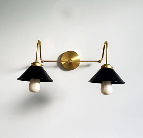
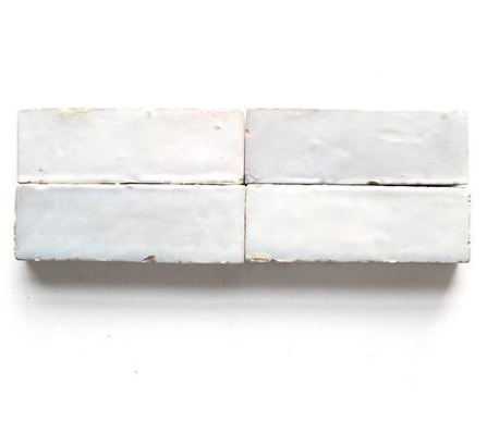
Undeterred by the challenge, the creative couple (she runs design blog Studio DIY; he is a photographer) scooped up the fixer-upper and got to work renovating. “I wanted the kitchen to feel like it got a major modern upgrade, while remaining full of character like the rest of our 1930s home,” says Kelly. To accomplish that, she blended old and new elements, creating moments of juxtaposition throughout: Sleek cabinetry is paired with aged-brass pulls, and rustic textured tile is pitted against contemporary light fixtures. The goal was to open up the kitchen to the rest of the home and to create a brighter, airier space where they could safely raise their toddler, Arlo.
Color played an important role in realizing this goal. Kelly kept the warm, vibrant colors from the original kitchen, paring back the palette to a more livable (and resale-friendly) blush tone. “Pink happens to be one of the colors Jeff and I can easily agree on in our house, so it pops up frequently in the rooms I do!” she says. “It’s still colorful, but in a much more refreshing way.”
Ahead, she shares her process for opening up and modernizing a dated kitchen.
Start with the paint
The single, easiest way to completely transform any room, paint sets the scene for the decor and makes it a breeze to pepper in complementary accent pieces. However, Kelly cautions that it’s definitely a trial-and-error process; for example, she had originally had her heart set on a deep ochre tone for the cabinets. “I had a strong vision of a moody mustard kitchen, but after seeing the paint in the space, it felt all wrong with the amount of light we get and the hue of our wood floors, so we had to quickly move to plan B,” she says.
Moral of the story: Live in the space and take your time picking out a color before settling. After all, paint may be the most transformative change you can make, but it’s not always easy to fix. Given that the Mindells had pops of pink throughout their home, opting for the dusty pink hue felt like a more natural choice—even though it wasn’t their first.
Consider the architecture
Given that the goal was to create a bright, airy space, the kitchen’s previously dated floor and ceiling were cramping its style. Kelly went all out, making as many structural changes as possible: She added skylights to the ceiling and replaced the door and windows with ones that had thinner frames to let more light stream through.
However, if there’s one thing that really transforms this space, it has to be the floors. “We chose to tear out the tile and match the original hardwood floors in the kitchen to reinforce the open feel we created between our three main living areas with the archway,” says the blogger. The hardwood creates a clean look for the kitchen—the perfect backdrop for colorful decor.
Get rid of clunky cupboards

“The old kitchen felt very heavy,” says Kelly. “Forgoing one wall of upper cabinets seemed like the perfect compromise, as we would still have plenty of cabinets to store our daily-use items.” While the transition from cabinets to open shelving may seem a bit stressful—the pressure to keep things organized! the functionality of shelves! the dust!—it’s actually not as daunting as one might think. All it takes is rejiggering priorities a little; for instance, Kelly decided to relegate lesser-used items, like pieces they use for entertaining or small decorative knickknacks, to the new open shelves. As such, their regularly used dinnerware remains dust-free…and the kitchen gets a pop of color via the shelves.
Do what makes you happy

If this means jumping on a controversial design idea, so be it. For Kelly, this meant including a rug; frequently touted as an impractical choice for a high-traffic area like a kitchen, popping in a carpet was a concession she was willing to make.
“I very much believe in making certain compromises for things that make you happy—I happen to love and collect vintage rugs, so having one in the space felt like the right choice for us,” she explains. “We made sure to pick a rug that had a lot of pattern and color, so inevitable small stains wouldn’t be super-obvious.” Opting for a low-pile carpet made regular maintenance even easier. All it takes is a quick shake outdoors or a hand-vacuum every now and then to get rid of messes, and the kitchen rug is well equipped to survive the hustle and bustle of the everyday.
Get the look:
See more kitchens we love: This Designer Put Her Floors on Her Ceiling—And We’re Totally Besotted You’d Never Know This Kitchen Transformation Was Done on a Tight Budget Before and After: Tour a Kitchen That Hadn’t Been Updated Since the ’60s


