We may earn revenue from the products available on this page and participate in affiliate programs.
Back in the Before Times, when cozying up in a one-bedroom was a charming idea, designer Christopher Kent of Studio CAK was preparing to do just that. After moving to Chicago from New York, he’d purchased a condo on Lake Shore Drive designed by legendary architect Mies van der Rohe in 1951. “I was obsessed with him for years,” Kent admits. Over the past half century, the building’s units were modernized and chopped up, drifting from the original blueprints. “I’d been fascinated by the designs forever and decided I had to downsize my life and tackle a renovation of a Mies apartment,” he adds.
But once COVID-19 hit—and every square foot mattered infinitely more—Kent postponed the move and decamped to a row house on the Gold Coast he had initially intended to flip. “My intent was never to stay here, but the pandemic happened. I’m a little woo-woo and believe the universe happens for us, not to us,” he says. Although he wasn’t living in his Mies-designed project just yet, the distance gave him ample time to put the work into restoring its original layout, while still keeping the apartment authentic to Studio CAK’s fresh, color-friendly style.

First, a major wall had to come out, making the immediate hurdle a meeting with the co-op board for approval. But compared to his Gold Coast home—where reno approvals took 192 days—the board on Lake Shore Drive was nothing. “I told them about how I wanted to respect Mies’s intentions,” explains Kent. He also came prepared with architectural plans to make his vision even easier to understand. “I guess they get how designers and architects living in these buildings will naturally want to renovate,” he says. The panel gave him the all clear.

The sledgehammers came out to take down the wall separating the kitchen and living room area. Immediately the confined row of appliances felt easier to cook with and light flooded in through the opposite glass wall.

In its place, Kent fashioned an island out of a big wood filing cabinet sourced at an antiques shop via a Michigan library. “Vintage pieces really bring soul to a place,” says Kent, and the furniture already had plenty of drawers to balance form and function.

If you assumed floor-to-ceiling windows solved every light issue in the place, think again. Because of the building’s age, concrete slabs sit between each floor, eliminating recessed bulbs as an option. “I decided to take a page out of the mid-century playbook and install track lighting throughout the rooms,” says Kent. “I had to break up those walls and add some contrast.” In the kitchen, a trio illuminates the countertop for precise sautéing and simmering; in the living room they cast a glow on the painting and gallery wall, as well as awkward corners of the apartment that don’t get light from the glass curtain wall.

“My brain works in color, so black and white is much harder for me,” admits Kent. “To be authentic to myself throughout, and respect Mies’s initial plans, I needed to get some color.”
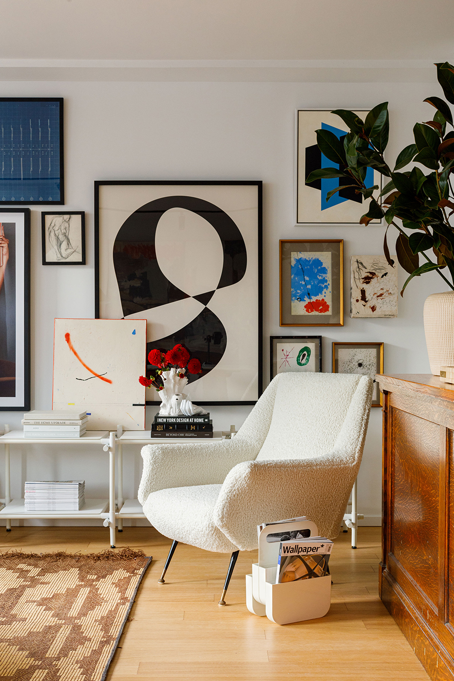
So while the natural tone and shape of Kent’s other vintage pieces—like the room divider hiding an awkward corner divot and the legs of the stone dining table—are great counterpoints to the angular lines of the architecture, they also ground his bolder choices: the gallery wall, a Colt Seager painting, and an orange velvet chair in the bedroom. The bedroom was also a place Kent decided to bring in his personality—simple lines, lots of color, and a few antique elements. He also included a spiritual deity statue for when he’s living there full-time soon.

The Goods
Go-to neighborhood decor shops: Nicholas Wolfe and Jayson Home. I always end up coming back with something from both.
Must-visit source for plants and gardening supplies: I love a trip to Gethsemane when I’m working on a project.
A tab I always have open: Goodee is constantly bookmarked.
The most affordable thing in my home that gives me the most joy: I’ve got tons of design books filling my shelves.
My biggest splurge: I bought a painting from local artist Colt Seager that I really like.
I loved working with: Vladimir Radutny, my architect.
Material magician: Gerry Mileva of Design Stonework.
The electrician who can do no wrong: Ziggy at 123Voltage.
Our Winter Renovation issue is here! Subscribe now to step inside Leanne Ford’s latest project—her own historic Pennsylvania home. Plus discover our new rules of reno.
