We may earn revenue from the products available on this page and participate in affiliate programs.
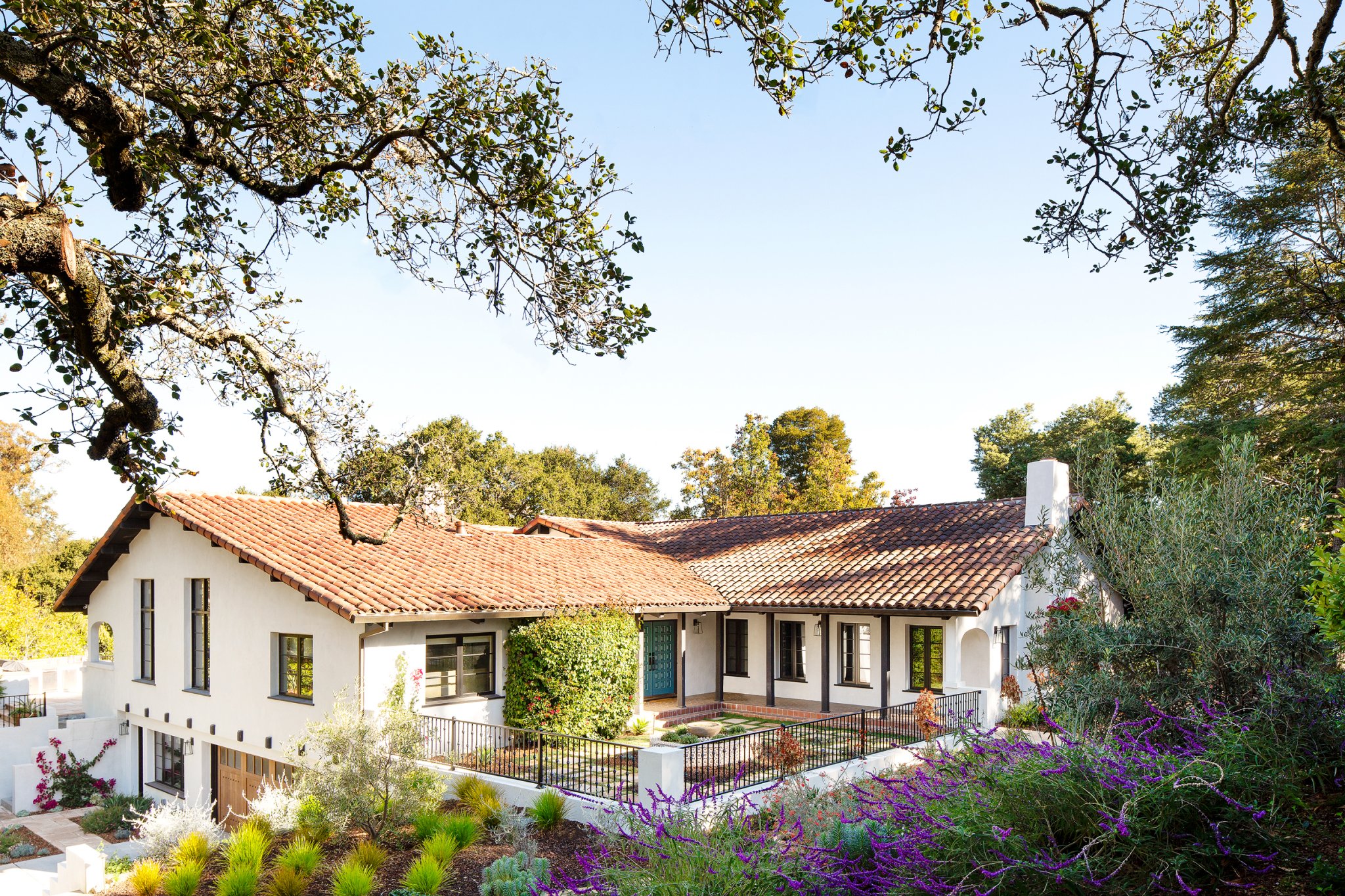
This sunny retreat comes with all the charm and ease you’d expect from a Spanish-revival home in California. The only catch is that the two-story abode wasn’t built during the great rebirth of Mediterranean-inspired architecture in the early 20th century—it’s a product of a groovier era.
“When I saw the pictures online, I kind of stuck my nose up at it,” recalls Nancy Scheinholtz, the lead architect on the project. “‘It’s a house built in the ’70s,’” she can almost hear herself scoff.
The home came with all the prerequisite quirks you’d expect from a 1970s home, but the bones were solid. “When I got there, I thought, ‘Oh, this is a really nice house.’ The rooms are spacious. The ceilings are high. There’s a courtyard in the middle,” she continues. “Even though it wasn’t built in 1926, it felt really good.”
Luckily, Scheinholtz was in good company. Interior designer Laura Blankstein also had big plans for the home (her blueprints included plenty of tilework, vintage rugs, and cool brass fixtures). “I personally love a Spanish-style home, so it was easy for me to draw inspiration for this. The main goal was to make it feel sophisticated but lived-in—[the owners have] two small kids,” shares Blankstein.
The pop of turquoise on the coffered front door perfectly sums up the transformation: surprisingly effortless and filled with soul. Ahead, Blankstein and Scheinholtz walk us through this sun-drenched transformation.
Ditch the White Kitchen for Character

While the project boiled down to a full gut job, the soaring ceiling beams were one of a handful of original features that stayed. The exposed wood would eventually act as a cohesive tie between the living room and the kitchen—two spaces that had been previously separated by a laundry room. To visually connect the two rooms, Scheinholtz and her team exposed the peek in the kitchen and continued the beams throughout. “Even though they’re not quite adjacent to one another, they feel like it,” she shares. “There was a lot of hocus pocus going on in there.”
The charming addition was only one part of the equation. Blankstein convinced her clients to go against the grain with a rich charcoal hue for the custom cabinetry. “White kitchens are beautiful, but this house makes so much more of a statement,” says the designer. “Once we found this Spanish tile for the backsplash, I knew it was going to fall short with white cabinets.”
Ground High Ceilings with Rich Textures

Natural sunlight isn’t lost on the living room, thanks to a slew of generously sized windows and the pitched ceiling. The sheer height of the space is further exaggerated by the fireplace and larger-than-life lantern. “Originally, we had the light installed before we put in the furniture, so everyone was a little nervous. I was like, ‘You have to wait for the whole story. When you see it all together, it’s going to be your favorite part of the house,’” says Blankstein.
Scale and balance go hand in hand. Two woven rocking chairs by Masaya give guests a reason to come back down to earth and stay awhile. “Once we saw the colors and textures, it was a no-brainer. They had to go in the family room,” says the designer. Still, the greatest accessory isn’t a vintage rug or wooden vessels. “You can’t beat natural sunlight,” she says. “It just makes that room.”
Invest in Good Windows

A sun-drenched courtyard sits at the center of the home. The bonus outdoor space is now framed by brand-new, insulated windows—an impactful choice the clients made in the name of efficiency. “Personally, I don’t know a good cheap window,” laughs Scheinholtz. While the home’s original windows were rare and, as Scheinholtz puts it, “hideously expensive,” the eco-friendly swap was worth the extra trouble.
“Spend your money when it counts,” suggests Blankstein. “If you don’t spend in the right places, you see it.” In addition to windows, the pair didn’t skimp on custom cabinetry, tile work, or light fixtures—high-impact moments that are bound to draw attention.
Let the Tile Run Wild
Nods to Benjamin Moore’s Stained Glass blue—the vibrant hue that punctuates the front door—lives on in the bathrooms. “When we were sourcing all the tile for this project, the clients were like, ‘Bring it on. We love the color. We love the pattern,’” shares Blankstein. An Ann Sacks floor tile exudes strong Seville vibes in the master bath. Scheinholtz completed the scene with an arched shower door. “They didn’t want to do something that was generic.”
We’re definitely not in the 1970s anymore.
See more stories like this: A Zen Oasis in LA with Minimalist Mediterranean Roots Inside a Mediterranean-Style Home That Stuns With Textured Details A Brooklyn Home That Feels More Like a Mediterranean Tree House


