We may earn revenue from the products available on this page and participate in affiliate programs.
When designer Raili Clasen got a call from her flooring supplier telling her he had just bought a truckload of reclaimed pine, she purchased all of it, sight unseen. “It’s mine,” she told him, feeling a sense of urgency. The plain wood doesn’t have the rich undertones of mahogany and it isn’t as revered as buzzy white oak, but for her circa-1950 Costa Mesa, California, bungalow, the understated planks were the perfect fit. “As I began to tell my architect, Eric Olsen, of my vision to clad the walls in wood, he joked, ‘I hope it’s not pine’ at the exact same time I said, ‘It’s pine,’” Clasen recalls, laughing.
For the nearly 20 years she’s owned the property, Clasen has rented it out. It was only recently that she; her husband; their youngest son; and dog, Mini, moved back into the now-1,400-square foot house and decided to go all in on a renovation. You could say Clasen was overprepared for the remodel: She began filling whole notebooks with images torn out from the pages of magazines before Pinterest was even a thing. Clasen fittingly describes the aesthetic as YMCA camp meets a Hamptons boutique hotel; the home is complete with a cedar hot tub and restored vintage Shasta trailer that functions as a guest bedroom. “All the ideas I’ve brought up with clients where they were like, ‘You’re out of your mind,’ I wanted to try here,” she says.

Clasen went to extra lengths to save the craggy beams and hammered trusses that were hiding all of those years on the other side of the low ceiling. “Every time I’d go up to the attic, I’d see them and think, How can I make this happen?” she says. The fix was more complicated than ripping out the drywall. She called in engineer after engineer to reinforce the worn-down posts with new wood so the structure would be up to code. “In the ’50s, they had this mentality of, Oh, this is leaning, so lets just put up another 2-by-4,” says Clasen of peeling back the bad Band-Aid jobs. “Even though it was expensive to redo, I actually kind of loved that part of its history…who does that anymore?”
Clasen painted the now-exposed beams white to achieve an airy vibe. When it came to incorporating lighting, she opted for fixtures that would work with the ceiling’s quirks. The rope pendant lamp above the dining table might look like it was casually wrapped around the pole, but it is strategically placed to help disguise the junction box.

The designer leaned into green in the kitchen and adjacent dining area. Her two power players: Ripe Olive (the cabinets) and Cool Avocado (the window trim) by Sherwin-Williams. The hue continues in the form of seating, chic light switches and outlet plates, and a wallpapered shelving nook next to the refrigerator. The Scandinavian-inspired print was one of the two things Clasen bought, before she even started the reno (the other purchase: hot pink tiles).

The speckled terrazzo countertop extends beyond the bifold windows. The indoor-outdoor surface functions as an island for the family; someone always seems to pull up a stool to chat with whomever is cooking or cleaning inside. “It’s always open,” she says.

Photography by Karyn Millet

Photography by Karyn Millet
The antique oak floorboards that run throughout the house still boast their original red factory stamps. The planks are all different sizes and were laid down in a mismatched manner so some are flat and stainless, others are slightly raised. “It’s not for the faint of heart,” says Clasen of the slight variations in height. “You can stub your toe if you’re not careful.”

In order to get everything she wanted out of her teeny-tiny bathroom, Olsen had the idea of installing an accordion door, that way the couple can watch TV from the mustard-colored tub or have the option of closing the space off early in the morning if one of them is still asleep. “It makes the room feel so much bigger,” says Clasen.

Plywood is the dominant material in her son’s bathroom. It looks luxe alongside nautical fixtures (peep the faucet handle) and, not pictured, checkered white-and-red floor tiles in the shower—a nod to Clasen’s husband, who works for Vans.

When the designer began working on her home, she was fresh from renovating star surfer Kelly Slater’s ranch. “It was very campy,” she recalls—and not in the Met Gala way. She brought some of the elements from Slater’s space to her house, like the cedar hot tub, where Clasen’s kids can warm up after mornings out on the water. “Also, we had no room for a pool,” she adds. The tub looks vintage, but it’s new and smart (they can heat it up from their phones while they’re still walking back from the beach).

Photography by Karyn Millet
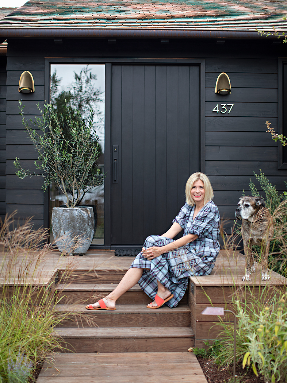
Drought-proof and fire-safe artificial turf surrounds the stained cedar exterior, allowing for a proper dining area and bocce ball set. “I wanted it to be a place that looks like fun,” she says. Camp Clasen is in session.

Photography by Karyn Millet
Our Fall Style issue has arrived! Subscribe now to get an exclusive first look at Ayesha Curry’s Bay Area home—and discover how design can shape our world.

