We may earn revenue from the products available on this page and participate in affiliate programs.
There’s so much we can say about the space we live in. But “home” means something different to everyone. In Domino’s franchise In 3 Words, designers share three words that reflect the emotional side of their project—from the feeling of adding an item to a space to how it changes the room around it—to highlight the big impact little changes can have on where we live.

“This space makes me feel like I just stepped into a modernist hammam spa,” says designer Mat Sanders of the bathroom in his West Hollywood home. But it hasn’t always been the definition of chill. When he first moved into the apartment he shares with his dog, Poppy, inside a historic brick building on a tree-lined street, it was quite the opposite. “I feared I was in danger every time I showered,” he says. “The small tub’s rounded edges made getting in and out of the shower a hazard, and I felt like at any moment I could be taken out by the edge of the sink or toilet with just one slip.” With some imagination and a trip to Walmart, he didn’t just transform the foundation of the room—he added countless little moments to elevate the space.
Here, he shares the three words that capture the journey.


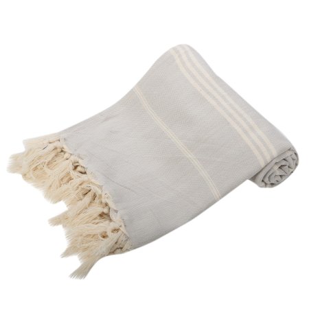
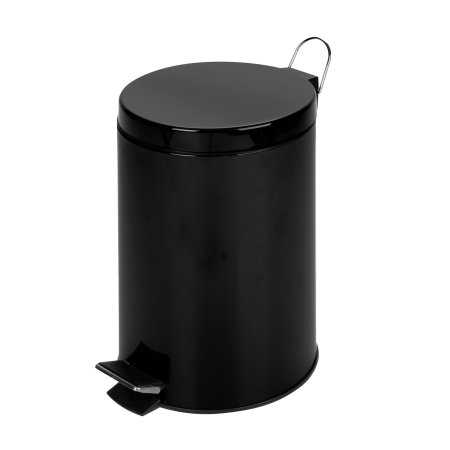
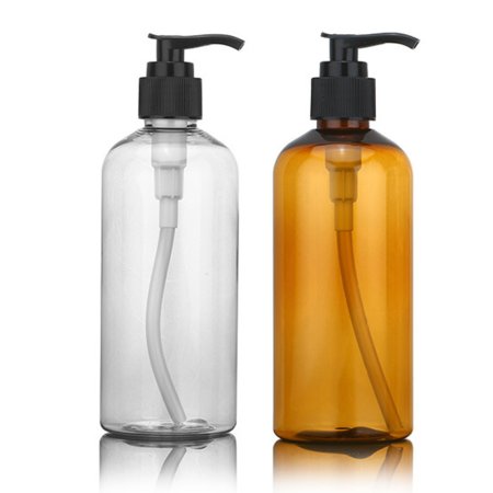
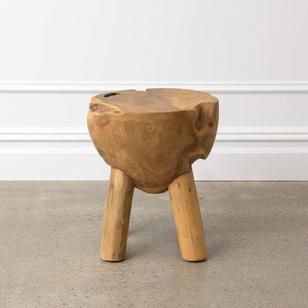
Discovery: “In my hunt for inspiration, I uncovered my building’s distinct design influence,” says Sanders. “The 1925 Monterey-style building combines French, English, and Andalusian roots, so I kept Colonial, Mediterranean, and Middle Eastern details in mind throughout the entire process.” Even the most essential of bathroom accessories reflect his eclectic influences—from the modern apothecary jars, swing-top trash can, and Turkish-style towels to the natural sea sponge and low wood stool, Sanders gravitated toward small items that make the bathroom, despite its size, feel more luxurious.


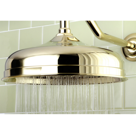
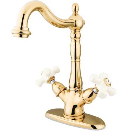
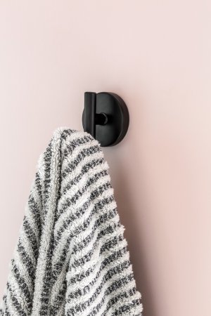
Fantasy: “Monterey style was the brainchild of architect and businessman Thomas O. Larkin, who seemed like an international style guy of the mid-1800s,” explains Sanders. “For my bathroom, I designed into a fantasy that I was the building’s first inhabitant and, like Larkin, a well-traveled design enthusiast of the times.” To bring this vision to life, Sanders opted for a traditionalist faucet and showerhead components that would have been popular when the building was constructed. He added touches like a single-bulb light fixture and sleek robe hooks as a nod to modernism—another design style popular at the time.


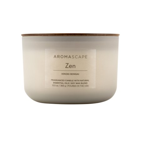
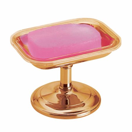
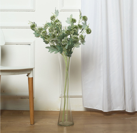
Flow: Sanders’s biggest goal was to improve the function of the 5-by-7 space. With better flow a top priority, he rearranged the floor plan, swapping the tub for a shower and moving the sink to the same wall as the toilet. White walls open up and brighten the room, while flooding the area with greenery, like hanging eucalyptus on the shower head and scattered plants throughout, accentuates the tiled floor. A vintage soap tray, a bowl of palo santo, and a vase of thistle rest inside the built-in shelf. “The result is an experience that’s easy to travel through, wrapped in style that looks so good you don’t mind leaving the door open,” he says.
