We may earn revenue from the products available on this page and participate in affiliate programs.
When architect and designer Susan Nwankpa Gillespie’s latest clients bought their home in Los Angeles’s Silver Lake neighborhood, the couple settled on a cookie-cutter place in the name of shorter commute times (she’s an architectural planner working in Hollywood; he’s a nephrologist who travels between clinics in the Valley). “It was basically a white box with gray wood floors that were trendy a few years ago,” recalls Gillespie. For two people so vibrant, the flipper-grade white walls weren’t cutting it, so the designer swathed part of the main living room and the adjacent stairwell in an unexpected shade: baby blue.

While a mainstay in nurseries and beach house powder rooms, the pastel paint color (Watercolor Blue by Benjamin Moore) serves a practical purpose in this hangout zone: A rich navy or dark gray would have been overpowering given the room’s ceilings are only a mere 8 feet high. “We were trying to find a color that felt light and optimistic,” notes the designer. Ahead, Gillespie shares five other ways she made the space feel less conventional and chicer.
Create Architecture in the Kitchen (Without Putting Up Walls)


While the gray floors and white Shaker-style cabinets weren’t the couple’s cup of tea, ripping them out and replacing them wasn’t in their budget. Gillespie focused on minimizing the neutral features by wrapping the walls with black and white cement tile from Clé and filling the empty center of the space with a waterfall island clad in splurge-worthy Bianco Joy marble that now holds a wine fridge in its core. “I was trying to add architectural interventions and provide anchoring elements,” she explains.
Make Your Sofa Fit You, Not Just Your Living Room

Investing in comfort helped make the flipped house feel like home, starting with a custom sofa from a local L.A. brand. It wasn’t the fabric or even the depth of the cushions that Gillespie was out to change but rather the height. “The husband is 6-feet-5, so it was a bit low,” notes the designer. “We added a couple of inches.”
Pick the Right Wood Tones


The landing at the top of the stairs was a tricky spot to map out. The hallway was too tight to squeeze in armchairs (though the home had been staged that way), but Gillespie didn’t want the area to go to waste. Situating two woven benches in a custom colorway from Nicaraguan company Mayaya Co. allows the pass-through to double as a place to rest and, more likely, a surface on which to fold laundry.


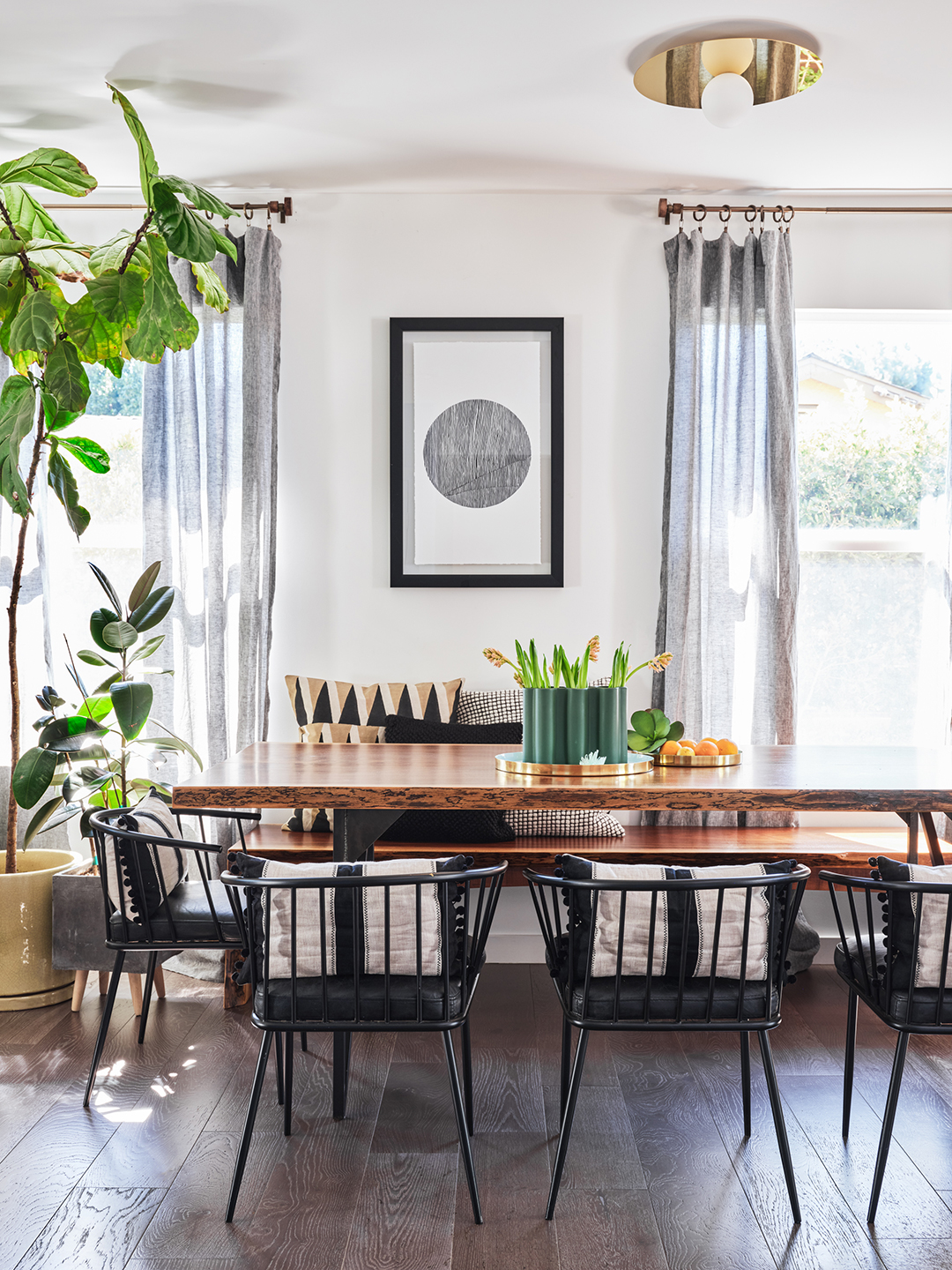
The designer focused on sourcing walnut wood finishes for a lot of the furniture (peep the live-edge dining table) to complement the muddy tones in the gray floorboards. And she overall prioritized items from South American shops (all the rugs in the house are from Awanay, for instance) as an ode to the wife’s Argentine heritage.
When in Doubt (or Tight Predicaments), Float

Opting for a bed with storage on each side is a bonus for storing linens, but the drawers limited the furniture layout in the room. Wall-mounted nightstands (sourced from Etsy) were the only practical choice, so the couple could actually open the cubbies without them bumping into each other.

Let Wallpaper Details Lead the Way
In the couple’s son’s room, Gillespie chose a whimsical backdrop: an abstract mountain scene from Walnut Wallpaper. She even had the tent-shaped toddler bed painted to match the red tones present in the print. The main bedroom, however, strikes a soothing note with its grasscloth accent wall (the treatment is by Phillip Jeffries) that has a bit of a sheen to it. “It’s neutral but there is some sparkle; it feels very luxurious,” she says. Now there’s no sign a developer had ever touched the place.


