We may earn revenue from the products available on this page and participate in affiliate programs.
When Havenly’s vice president of creative and design, Shelby Girard, and her architect husband, Christopher, started hunting for a weekend escape from Brooklyn, upstate New York was at the top of their list. Little did they know that multiple offers would fall through and that instead they’d come across a gem in Connecticut: a Colonial in Fairfield County, built in the late 1800s, that was once a carriage house. “The great combination of country and convenience sold us,” says Girard, despite the fact that the place was in need of a lot of cosmetic updates.


The kitchen was their top priority—and the most challenging and time-consuming project, as they tackled most of the work themselves. (They had done the same for their first home together in Denver.) “We spent hours mulling over details, like how to build out a nook for our fridge; what kind of stone to use on the countertops; and whether to do upper cabinets, floating shelves, or on-counter cabinets (we chose the latter),” recalls Girard. As for where they landed on the other debates, the couple went for custom refrigerator fronts—Semihandmade’s Shaker doors with a coat of Clare’ No Filter paint—so that it would blend with the staircase, and topped IKEA kitchen cabinets with a crisp slab of marble.
The mudroom also needed love. It had an awkward concrete ledge around its perimeter and dated pink ceramic tile all over. “We wanted the room to feel more functional without changing the foundation,” explains Girard. They built a ledge on one side to disguise the bump-out and paneled it to match original woodwork in the kitchen. On the other side, a wall of IKEA’s Pax wardrobes corrals coats and shoes.

A black and white zellige tile floor, another DIY, creates contrast without leaning too contemporary. “I love the raw, rough edges of the tile and how it’s a bit imperfect—it instantly felt worn in and appropriate for the history of the home,” says Girard. Almost too much so: “We used a premixed mortar that didn’t take to the tiles very well, so we had random tiles popping up for weeks after the installation.” Luckily a little glue did the trick.

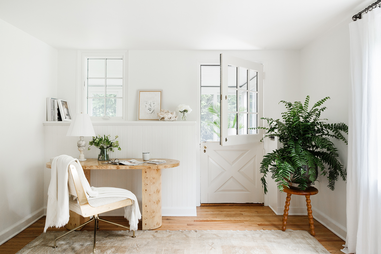
The floors in the sunroom, which came with the house, got an upgrade, too. Clean white tile blends right in with the walls, freshly coated in Benjamin Moore’s Simply White. During meetings, Girard enjoys moving between her adjacent office and the light-filled space. “It’s screened in so it’s really where we hang out most during the warmer months,” she points out.


When it’s chilly outside, the couple spend time with friends in front of the living room’s fireplace, which they loved from the get-go. “We just patched it and painted, and did the same for the molding,” says Girard. The flooring there, however, wasn’t as simple. A tight timeline required an on-the-fly stain choice. “When I saw them finished, I panicked, as they didn’t look exactly how I had pictured them,” she recalls. Reassurance only came once the furniture was moved in and everything jibed easily.

While doing most of the labor on their own was a huge save, the duo splurged on some of the foundational pieces that would get a lot of use, mainly the extra-cushy sofas in the living room; the cozy sectional in the TV room; and the dining table, handcrafted from multiple layers of solid oak.

Rather than going for a classic New England aesthetic like a lot of homes in the area, Girard opted for a more European approach, mixing old and new, rustic and refined. “The style I landed on is warm minimalism–meets–modern château,” she explains. Adding in jute rugs, wood accents, warmer whites, and rattan details softened the modern lines of the furniture and a neutral palette that might otherwise feel too pristine or precious.

However, Girard still remembers that one week when they encountered three separate leaks, forcing them to tear up freshly done drywall and newly fixed floors: “In one day, we had water pouring out of the ceiling where we had just installed our dining room chandelier, a pipe in our basement broke, and we discovered a leak under our kitchen floors where a nail had been lodged into a water pipe.” But those delays are just part of the house’s story now.


“We learned a lot along the way, ate a lot of takeout, and certainly made some mistakes, but the great thing about an old home is that everything is a little crooked and a little beat up,” she says. “My common refrain when we mess something up is: ‘It adds character!’”

