We may earn revenue from the products available on this page and participate in affiliate programs.
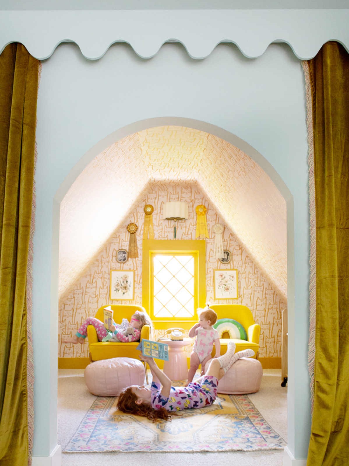
The love child of those free-flowing squiggles you’ve been seeing everywhere and the still-going-strong cottagecore trend, this year’s pattern of the moment is a delightful combination of both. The scalloped edge is back, but it has nothing to do with yesteryear’s preppy counterpart (though we do love a good frill). This fresh iteration is all about bold colors and shapes—and what better place to test it out than in an ever-evolving kid’s room?
Whether you’re DIYing a simple paint motif or adding in architectural details, the sweet scallop mixes form and fun(ction).
Follow New Horizons

The easiest way to give your child’s room a refresh? Switch up the wall color. You don’t even have to stick to the same hue. Instead a scalloped half-wall in your kid’s favorite shade can create a happy focal point. Continue the pattern over the furniture for a playful finish.
Bring the Architectural Drama

Little touches always make a difference—like in this Nickey Kehoe–designed nursery. The scalloped cornices hide curtain rods while also adding a whimsical touch. And painting the beams in the same buttery yellow draws the eye up (and gives baby a sunny view).
Go With a Bold Color Theme

Count on Sarah Sherman Samuel to dream up a kid’s room that parents will want to move into. In the designer’s hands, a cobalt striped wallpaper wasn’t enough. She also matched the pattern’s striking blue to the half-wall paneling with a scalloped edge that wraps around the entire space like a calming wave. Now that’s a new take on wainscoting.
Kid-ify the Surfaces

Can’t commit to paneling or painting a whole room? Make your scalloped detail a feature behind your little one’s bed. This design takes the idea one step further by integrating a narrow ledge where they can display toys, figurines, plants, and more treasures.
Give Furniture Some (Soft) Edge

There is no such thing as a bland piece of furniture, according to interior designer Frances Merrill, who gave a custom walnut daybed the scallop treatment on three sides and finished it with chunky spherical legs, checkered bedding, and mix-and-match print throw pillows. Suddenly the spare sleeping space has serious curve appeal.
Want to read about more kid-approved design tricks, creative organization ideas, and family-friendly living solutions? Sign up for our weekly newsletter!
