We may earn revenue from the products available on this page and participate in affiliate programs.
Designer Nina Freudenberger describes her first visit to the old San Luis Creek Lodge, located in downtown San Luis Obispo, California, as a step back in time—well, more of a leap. “There seemed to be a medieval theme,” she says, recalling the four-poster beds, gray stone fireplaces, and dark wood ceiling beams. “Everything felt so heavy.”
Tasked by PRG Hospitality Group with redesigning the lobby and its three guest buildings, Freudenberger landed on a modern vision for the spaces that called for fresh wall treatments and major bathroom makeovers. Still, even amid all the new white paint, the designer didn’t lose the cozy lodge details. “I wanted to keep it warm, almost like a Danish farmhouse,” she says. All the inspiration you could possibly need for your very own reno is waiting in this newly reimagined getaway.
Heavy Materials Can Be Cured With Paint

Surprisingly, the designer decided to keep the stone fireplaces and ceiling beams (two features that looked like they belonged in a castle). To bring them into the 21st century, she painted virtually everything in Benjamin Moore’s Decorator’s White. “It was a really simple solution to what was happening,” she says of the budget-friendly choice. Before, the dark gray tones of the facade delineated it from the other elements in the room, but now it feels like it was always meant to be a part of the design.

“You don’t want to feel burdened by this idea of warmth,” the designer says of the former cabin-y aesthetic. “It shouldn’t feel physically heavy.” Handmade details, like geometric tiles crafted in Spain, exude that same sense of comfort.
Fine-Tune the Edges

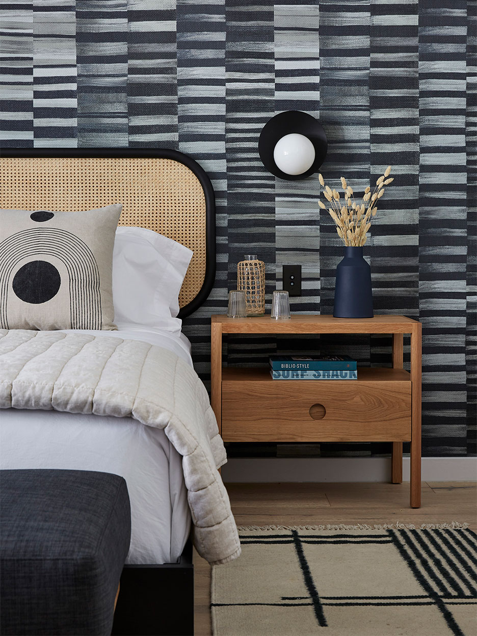
Freudenberger was strategic about introducing her accent color: black. “I used it where the design mattered,” she explains. The hue shows up primarily on light fixtures, artwork, and in the woven grasscloth wallpaper—things you engage with or that your eye is drawn to when you enter a space. Immediately, you read the room as modern, even if many of the old fixtures remain.
Get Creative With Paneling

Freudenberger didn’t go with any ordinary shiplap in order to achieve that quintessential farmhouse mood. The spa-like bathroom walls are swathed in vertical strips of wood of different widths (some are 3 inches; others are 6), with small gaps in between each of the boards.
“With green bathrooms, it’s important to do something like that on the wall,” she says, noting the grooves allow natural light from the window to bounce around and keep the dark space from feeling like a cave. The green marble countertops perfectly complement the hue, but the real beauty of using a softer stone like this on a vanity is that it’s less susceptible to the etching and stains that occur in a kitchen. “Even if there is a scratch, your eye is more drawn to the movement in the pattern,” she says.
Give Wall-to-Wall Carpeting a Second Chance

Hardwood flooring might be all the rage, but in a bedroom, Freudenberger says people still crave something soft underfoot. Grays can quickly look commercial, but there’s something luxe about a soft sage. The bright organic color also helps break up the stark contrast between the white and black furnishings. “I think wall-to-wall carpeting is going to make a comeback,” she says. “There’s something a little nostalgic about it.”

Introducing Domino’s new podcast, Design Time, where we explore spaces with meaning. Each week, join editor-in-chief Jessica Romm Perez along with talented creatives and designers from our community to explore how to create a home that tells your story. Listen now and subscribe for new episodes every Thursday.


