We may earn revenue from the products available on this page and participate in affiliate programs.
Old homes are tricky to decorate. So often, people leave them as is, content to live among dated features for fear of ruining the heritage architecture. Or, maybe more commonly, they steer clear of them altogether, but if there was ever proof that a marriage of historical and contemporary can work in the design realm, this 1925 colonial would be it.

Sally Zwartjes, Amazon’s director of retail PR, bought the home back in 2016 with her husband, Anders. Drawn to the charm of Seattle’s Montlake neighborhood, the couple immediately fell in love with the older home. But when you have a family of four, a 3,000-square-foot home with only one and a half bathrooms (not to mention, a plethora of retro features in dire need of updates), needs to be more than just charming—it needs function.
Enter: Casey Keasler, CASEWORK designer and family friend. Over the span of a year and a half, Keasler worked closely with the family to transform it. The transformation spanned the superficial (new floors and fresh paint) to the dramatic (structural changes that included a 500-square-foot addition).
“They wanted to stay true to the colonial style but with updates for today’s modern family,” explains Keasler. “There were so many amazing period elements, like built-ins, cove ceilings, crown molding, gorgeous oak floors, and a classic exterior. My job was to nail the function first and work with the architect, Paul Crowther, to get our drawings to the city for permit review. Then we focused on making it beautiful.”
While preserving the bones of the home was a priority, so was changing the footprint of the home to something that made a little more sense. In a bit of a renovation no-no, the family opted to sacrifice one of the original four bedrooms to build out a full second bathroom, which goes to show that it’s best to ignore traditional rules and go with whatever works best for your specific situation in every renovation.

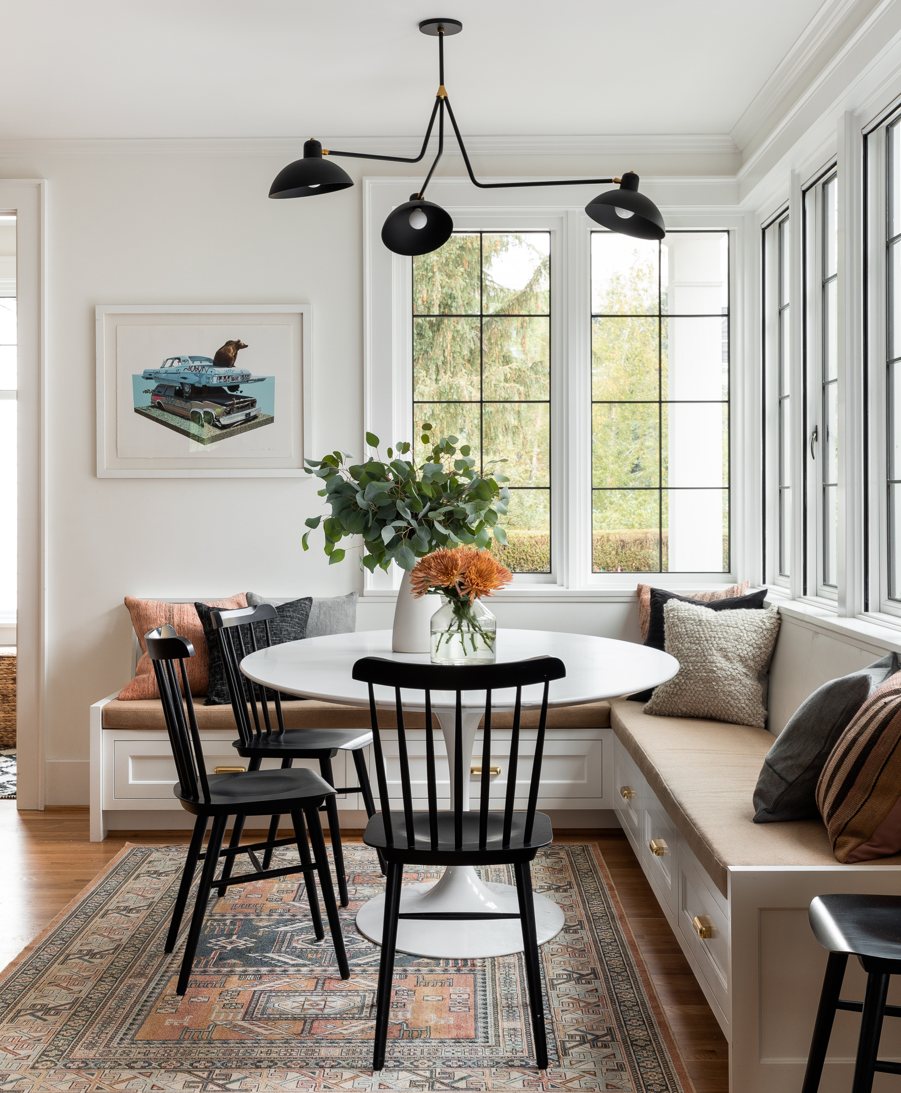
In this case, the family certainly wasn’t starved for space. The addition of a larger kitchen that includes a breakfast nook, pantry, and mudroom opened up the home and made it feel brighter—plus, the classic white kitchen was a big wish list item for Sally and Anders. Featuring a gorgeous window-lined breakfast nook, it’s the perfect gathering spot for their family.

“Family and complementing the symmetry of traditional colonials were common themes throughout the project,” says Keasler. “I wanted to balance the seriousness and symmetry of the colonial with relaxed Northwest vibes.”

For the designer, finding that balance of gravitas and lightheartedness played out in the same way as finding the balance of old and new. “It’s all about creating contrasts,” she shares of striking that juxtaposition. “All the millwork and built-ins followed the details of the original cabinetry down to the bead that’s on the inside cabinet panel.”
Elsewhere, the cove ceiling in the dining and living rooms also keeps the original feel of the house intact. “This house has all of the beauty and charm of an old home—details you just can’t replicate anymore—but all the updates and functionality of a new home,” says Keasler.
Below, she shares a few tips on blending old and new. If you’re currently trying to tackle your own update, take note.
Be Consistent With Your Metal Choice
I usually stick with two. While one metal finish throughout has a more formal feeling, be thoughtful when choosing the finish; they often vary from brand to brand.

Keep the Old But Refresh
Keep the built-ins as long as they function for you, but give them a fresh coat of paint and new hardware for a more current look. Paint all the trim, molding, and doors one color to unify the home. Painting walls and trim the same color but a different sheen (for example, glossy for the trim and flat for the walls) modernizes decorative trim.

Accent With Contemporary Items
Bring in mid-century, Scandinavian, or modern-style furniture and light fixtures to contrast with tradition. Look for graphic-style rugs.
See more homes we love: In This Coastal Maine Home, Thoughtful Textile Choices Pay Off Mixing and Matching Has Never Looked Better Than in This NYC Apartment This Antique-Lover’s Home Is a Master Class in Gallery Wall Curation


