We may earn revenue from the products available on this page and participate in affiliate programs.
A subdued gray grasscloth wallpaper isn’t necessarily the first pick for a 3-year-old’s bedroom, but interior designer Chauncey Boothby knew she could make it work. Boothby had recently reimagined the space as a serene guest room for her clients Sarah and Greg Sommer. But when the Westchester, New York–based couple found out they were pregnant with their second child, plans inevitably changed and layouts shuffled around: The new baby would stay in their daughter Madison’s nursery; the guest room would move down the hall; and a “big girl room” needed to be created—but not from scratch. “Madison loves animals, and that was a big inspiration,” says Boothby, referencing the zebra, ostrich, and duck figurines that she peppered throughout the now-refreshed room. “We did a woodland creature vibe in her nursery, so this was just a different take on her interests.” After coming across a vintage Madeline print from the famed children’s book, the designer imagined a safari theme with a circus twist that would bring the illustration to life. Here’s how she did it.
Design Around a Vibrant Stripe

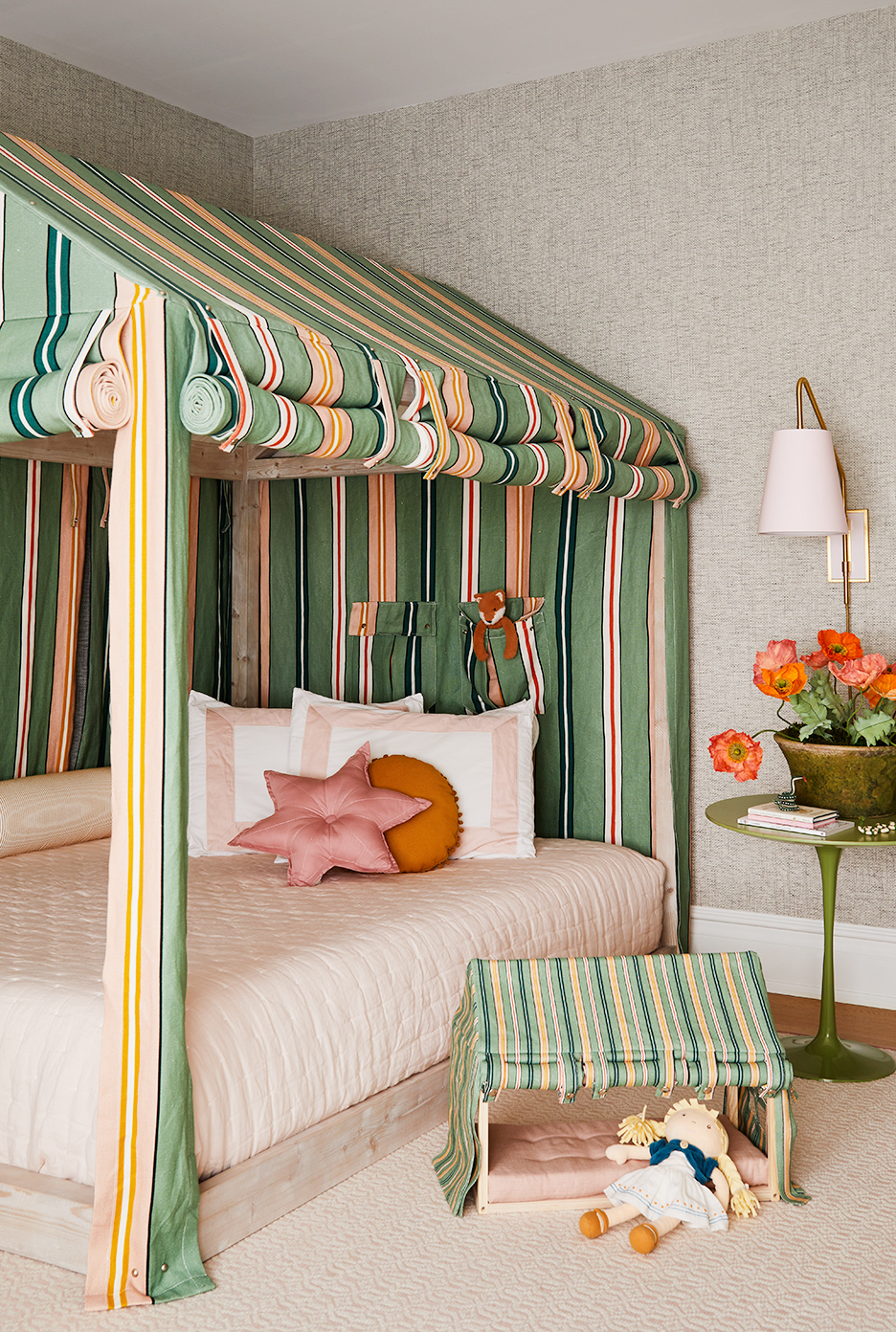
The palette came together thanks to an Ottoline fabric. “I thought this stripe was absolutely perfect because the saffron and green tones worked really nicely with the book print,” says Boothby. To play up the design, she picked a low-to-the-ground house-shaped bed that came with an optional tent cover. “My workroom basically reproduced the canopy in our chosen fabric,” explains the designer, who had every detail covered, from the roll-up flaps to the headboard pockets. (After finding a doll-size version of the bed, Boothby had the striped print scaled down to make a matching miniature version.)


Bolster pillows line the back of the tent, giving it a daybed feel, but they also serve a double purpose. “The Sommers were concerned about Madison being in a new bed and feeling comfortable,” says Boothby. The rounded pillows are a cozy way to ensure that the toddler doesn’t roll into the gap between the mattress and the wall.
Make the Most of an Allover Pattern

Boothby carried the striped fabric over to the built-in storage, where two bookcases flank a window seat (a must-have for the parents). “We wanted the shelves to display all the fun kid accessories they had but also hide things like extra bedding,” she says. She mixed the seat cushion with star- and moon-shaped pillows that, by chance, matched the colors perfectly.
Scale Furniture to Fit the Mini Inhabitant

Ottoline’s fabric makes one more appearance on the desk stool, which has an upholstered cushion. “I’ve been dying to use Chelsea Edition’s Junior collection because it has such fun colors,” says Boothby of the mid-century–inspired avocado-hued piece, which is made to fit smaller children. (A safari chair that the couple salvaged from the old guest room also looks surprisingly at home next to a life-size stuffed cheetah.)
Double Down in the En Suite

In the adjacent en suite bathroom, Boothby ripped out the existing tub (the Sommers preferred a bath in the nursery) and replaced it with a walk-in shower lined with pink candy-stripe tile. Riffing off the scheme from the bedroom, she matched it with a green vanity. “We were on a tight timeline trying to get this all done during COVID, so we didn’t want to go the custom route,” explains the designer, who loved that New England company Oomph had a variety of colors to choose from. Even the tasseled hardware was built in.

To add a bespoke touch, Boothby had sconces made from Urban Electric with a pink backplate to match the tile and wallpapered shades. “I really wanted to introduce the safari theme in fun colors such as oranges and reds in smaller details, like Weezie towels with embroidered tigers and felt figurines I found on Etsy,” says the designer. Surrounded in a menagerie of her favorite creatures, Madison’s love of adventure and animals will surely only grow fonder.
Our Fall Style issue has arrived! Subscribe now to get an exclusive first look at Ayesha Curry’s Bay Area home—and discover how design can shape our world.
